3/29/2022
Data Viz Resources
Edward Tufte

Tufte: Visual Display of Quantitative Information
William Cleveland

Cleveland: The Elements of Graphing Data
Nathan Yau (FlowingData)

Yau: Visualize This
Telling Stories with Data
Telling Stories with Data

One of the best ways to explore and understand a dataset is with visualization.
Telling Stories with Data
- What is Statistics?
- hypothesis tests
- pattern finding
- predictive modeling
- storytelling with data can help you solve real-world problems (predicting unrest, decreasing crime) or it can help you stay more informed
Data viz is more than numbers
Journalism

Art

Entertainment

Compelling - Hans Rosling

Hans Rosling’s 200 Countries, 200 Years, 4 Minutes - The Joy of Stats - BBC Four
Data Viz: What to look for
Patterns

Why so many births around Sept. 25?
Relationships

Design Principles
Explain Encodings

Explain Encodings

What is gray?
Label Axes
](data:image/png;base64,iVBORw0KGgoAAAANSUhEUgAACIQAAAdCCAMAAADeT1H3AAAAGXRFWHRTb2Z0d2FyZQBBZG9iZSBJbWFnZVJlYWR5ccllPAAAAY9QTFRFLS0uWn/A////WcbPxjuW0tolOEJTRFZ3WrpHT2uclpaXYmJiy8vLOjo78vLyVFRVsLCxR0dIfHx8ejRiOFNW2NjYUzFIvb2+Q3p/5eXlo6Okb29viYmJTqCnoDh8Vlgsqa8nOFA0RHQ7gIQqT5dBRERGU1RVYmRlPD0+gYOFamxtNTU2W1xdTExONTxJPkxlMzdAeXt9iYuNcnN11t/vrb/gMDI3p6qsRluAn6KkmJqcg5/QM0BCQC87kJOUPmZqNUpMZjJVSjBCZoKzTE0sMz8xMDc4NUczNy41PmI3QkMta24rRoOJXnqrgzVpNzgtio4p8c7l1GywMDYwbYq7Rnw84OfzrmmWeIur6u/3453L9ff7wc/nt0+UmFOC+OfyvlecorfcVnKjbb/GVmuQr0eMSWCJXa+3h4sxbIKocoCZlptBXmA0cnuIm2eJVFxpakhgTGFkrbJZbXBDdIqveVhv35HEt3OhXXOYp7XNY0BYXIaKT1lqoau7QElatbphp2ORvcJpmHePnKCpnqNJJD6loAABECpJREFUeNrs3XmP9Mhh53kq5HnaTzCCVzeb4iHNSuOxZK23D7ctGFgJkjVjy941vBgYs8AsFpj/9v2/hGUcJINMJiuZlZWVlfx+GuinKpNXJrMYv4yLUQQAAAAAAAAAAAAAAAAAAAAAAAAAAAAAAAAAAAAAAAAAAAAAAAAAAAAAAAAAAAAAAAAAAAAAAAAAAAAAAAAAAAAAAAAAAAAAAAAAAAAAAAAAAAAAAAAAAAAAAAAAAAAAAAAAAAAAAAAAAAAAAAAAAAAAAAAAAAAAAAAAAAAAAAAAAAAAAAAAAAAAAAAAAAAAAAAAAAAAAAAAAAAAAAAAAAAAAAAAAAAAAAAAAAAAAAAAAAAAAAAAAAAAAAAAAAAAAAAAAAAAAAAAAAAAAAAAAAAAAAAAAAAAAAAAAAAAAAAAAAAAAAAAAAAAAAAAAAAAAAAAAAAAAAAAAAAAAAAAAAAAAAAAAAAAAAAAAAAAAAAAAAAAAAAAAAAAAAAAAADgtnQse7G+4SbTot9im9/1ZcRmn7KL049/PjrzSor4fu/f5vl6j5N5DGkr7Z9ezFsB4KgJpCiFVzfL8tteIk9Le/PoRpmkZe23WBYn6w2WWSGXK8aLc7HxnFugEhN12UV9a5f2uXksK052ei4NrWy2WFlkdWO6K6cXklR5cCJWFa8/nnPn69KT2e1IS/Hp+9rrpndj5Vjz4NOYnmytmM5XfNX5Ktbe1rNvXHhM+bkV7aG2J5Fj/tcUZ8l0psuOSxGAAyqCC2FvftFu7WMnNQvydMnZtbYO84BerBeUsFlYdsVixXjJVhvPmdJAnX9uo0Dc2GV8uhl16YblymbVfBEbNKq1Y6rF2gkRZ6lXH8/Z87XjZCbZhV/m7WrLqJMHb/bKsQ6bPn25cnzkFedLrb2tZ9+48JjicyvaQ62XO8qm5/tw1+w+jwDwbNUg1ZnrfXDVFM2+EFIsoka6URgWtwkhaSLeJIQk+o1CSO4e1C+9efcIIefP176TqfTF783ymLvLQ8j8c/fQIeTkTyQJQoguBSEEwNEzSOm/xhZx3MoqWV433bfgelcIcYEgydrYt5CUeqMwLG4RQrQ/Thn3OqmSW4WQ+XZuGEKKkwzm3zy/cGdeiWzUHULIxvnaeTKT9OL3Jl+pF7owhKiPE0KyaKVe0f/i3s6kafsTXciqJoQAOB6XQZqxYGnnnSl8kXjSHrMZQuw2S1fKxMnsWmzXs+VrbBPPrDjSsWO/FWf+l3xWUMQzU0FmK7aToERPL2sb2NplLE5Ky30hpJsf7fw99BVQ1fqbFxx9e9onxOWtPX1CNo9n43xdfDJ954ZaX3gsoluJXkEIKefHqsMQMktuNwkhqd9NGX7G3Eant9l+ALNFn5A4/OCEK7pDTaKVkx4GkqBzTN5yOQJwMM361/FR50NItyOEyNn3ZfdNOl5bT8u1b4urpckQQs5lifWeK5db26UPIdnVIWQzB/kEtiilXNH0UlG+v+7+2vN1+cmMuuRcJ5fVEFKufA7liy9PnFTM3SSEXPIZW38P47NNf+5Q29OPqQjSHX1RARxZ/EIGiYZm6/LyQk0n80DQhWXKYj25Vg5fEUIKsbO02RFCwqqQ24WQdqi7X3z9zV5ML7cOIZvna8/JXMSXF0LIPDLWu0JI+Il98BBSnXxM/Q5yeoEAODy12uv05KvbaRP+RqF2EghUsP5yvWStBmN/CMlWDvFmISR7ixAyDoxY1APVaz1w3jSEbJ6vXSezvey4fAhpTiPZxSGk/jAhZNbzuAxCSPFC/AeAY1SEJBt1//ZKma1cLjcKtXJ56W2DIme5Xnb5hX2rgNgsPF4bQoJ0c7sQUg9vbH1FvrhpCNk8X7tO5iyhvBhC6mWI3BFCgo/jo4eQ4A8nP+nxygxlAI4se6kVwyxQpitt/ecvofnp0slU5CzXk48eQupZZcXNQoh9l9rqtB7o7iFk83ztO5kbJfJKCDmpELs0hMwrix49hAQvpCOEAMBEv1QRYguHzhUR+sJCbaWaOWgsWQ0h+tUhpFrpXXGbENLNcsLNQkhn+8J0p61hyfrkIW8XQjbP176T6ep3ykuOZZ7tCv/IZSGkm/XofOQQUs9rhmr/yJRIGi5CAI6rXR2bsrzCptFKe8z5Qq05rZIvpoiwXK9a6wKxP4R0r+3ldzaE2J6Z6uYhRNkahvy0Paa6pDLhliFk83ztO5mLCUG3jiWbdUiu/COXhZBYhdn5kUNINotL6fDI+Nv2NwAAeG7NS/UHjSsjV8LK+UJt5ToeXKjXOqY2rw8huXgpT10bQuZHfKsQon2sK08K+UJc0GHxliFk83ztO5k+DMYXHEsTvkrzblTq8hAyO1mPHEJUGYbMZqjFmWqNZtPCAcCxqJeq/ktfsp8OpD1fqCUrJcjUs2CxXrE6vcf+EOJngcquvqSfDyGzqpBbhZDWhw95MleEn/q1u1sI2Txfu07m8JYVFxyLnfasCqJLsSOERGFVyEOHkFljXv+S63jageshUnJnYgBHJV4YDpoPNSWnXS7OF2riTLmlVtbTyWpxc0UIyf2Endf29DsfQmaHfKsQkvm+E+npHCx+tKrK7xRCNs/XnpMZDa9HXnAscRYE4NJEij0hJDxbDx1C8qDjhzmxMgghfsBuwnxlAA4cQrbKsm4oKIqTTnRnC7V8rb/dVCs9X89+o81vEULGyb+y675ZboSQMCndKoSMrVD1aWWUn0EkkfoeIWTzfO06meORZRccSxzUmeR2nT0hJKwKeegQYjdYT8EzD0OID85CMUYGwBHFL/XPr4bruz6pMzlbqK1elNXqwET75Xet8n4jhMjQPIUkLxfeV4WQ8Jj3hZBsdrT5osIgHhPH2hws5g0vbhxC1o5n83ztOJk7jsyGkGAgjbTVbIsQUoeHWixDyKJjynuHEBUebByGkKkbr8myZRSGkCgtX5ecAeDDhxD5Qk2JnC7O6a1CiLvnWZGc60CwEUJW7lZ6ckmvi9u8F2OBMZWXr7mL7nJg8rSP5f1Whjx19jvylSFk7XjeLYRMA29qG3DVxl101TKE2GoFV4f2CCFk9dbO9rj0WDVU2A/7LIREuhKvSc4A8MwhpJ2Sx8mkBq8KIcGt39vLD+ylENJvfCy801u8F2OBMc2WcaMQUk7JY3VeEJ2Nk7rrZw0h+dD/NnUfrX0hJB8L98cOIdE4Frmy5zle7KCth+TMLXQBEEJmgrkc8mUHytuEEKV3HNjLISTKx8K7u8F7MRUY4xydtwkheXCE2fow6Xh4tUn8pCFk7FuSuai7L4RMc6Y9eAhpfYDNXe5chpBIj8k5ozIEACEkEM5quZzQ4jYhpN5zYMrNERFYW1Wt3xfudSFkrArZF0K62dFOZUwRvJlnJ4wr6tObj7wyhKwdz/uFkGF4duLi7SKElOGhpqchZKwKeYQQkoUHm89CiP0rqlxdYrsSQoLkzJwhAA4lX+uPMEnDErBZVC+8KoSYDpKVOB+BrhkdMxXeyTUpZDuEjFUhtxkdE04Tq0/nYBm/I59NITccHXPbEKK3P1KzEKJdE1/rP1i7RscEVSGPPTrG/+VoOww5Wg0h/YMlKQTAAW2XZV3YWyFdLLs978SyGEpOp5Zwk3KtT1v9qhAy9vbb1T31hRAyVKrfJoTMpomtzi/pu9om6RuGkO3zdeHJvLhyLQwhPotlvlZobwixA1yzxw8hLsvnPhbH6zuQV1XfAcCHVm8W6+WsG8hiQovXT1bWnr/svi6EDFOf77ovxwshZJjv4SYhpJ11Aym2BkpnYrVAftjJynaFEJfshq3tDSFu7/nDhxD3d9T4Vc+EkChNBHfVBXAw1eqk6UOFwvzqupjQ4nyhVp729QjmvArWq8SuJoIdIcSnkD2dU18KIe6OurcJIc18mObmvLUuhaRvGEI2z9fFJzOsPbvk3jHxUKdSrww8uiyEaDfz+8OHEPue1P59PBdCfAqpuCgBOI5u63trMZ/eqppfI88XatWZe551y/XchJHlW4QQV3bvKaZfCiG+KuQmIaSez8WVbEVBVwMl3zCEbJ6vi09m+L7rC45lmqltWGF3CPFVIQ8fQrR/lc1mCPHBmYsSgONIt76EZ2LFBYXayjPBQ+Gz3bn6iteHkPxsd89rQ4ibZvwWISRfe2PlZqVO9YYhZPN8XX4yp8hUXnIs8fj5G5rk9ocQWxWSbYaQ+gFCiK/yc8OhzocQFzdTrkoAjqPe+L6erJWV7cuF2spk8OV05Z2tV57puvH6EBLu8jYhxO6+vEUI6dbe2LMlt97ulvH6ELJ5vnaczDFVNBeHEPf58x+q/SHE7b8ZF85POxnt7WfxJiGkCM7wRghp6BQC4GC685f7eK2onC7xG4VssqxeCYcCz9aLxXqhdYMQom4eQmwBm9wghKjVd/bs3UPeOoRsn6/LT+ZYe5Zecizx9PlLomtDiB1hFdxe8GQ9vbdy4U1CiMvz3UshRBJCAByMrdBev/A1drbO0KyFY+OKmS2fkkGf1vl6zWq3y1uEkHqrt+dVIWRsn3plCHHTY4RvbLbVizZfG0N00xCyeb52nMzTcdwvhpBc9bqrQ4ivY5gV9rOT3u7tZvE2IUSal6lfCiHZZhYFgCdkr6v1Wk/C8qQrwmwszUahli6aF2wH1GR1PReC1O1DSL531oULQkh+mxDSnuSudGtcRLE25clNQ8jm+dpxMv3UL/FFxxKvlv97Q4hvzxkWPrnNYrZ3wMnbhJDzn6nX5GYA+PhVIfWZC35+WvbNbmK3VXes5tfl2a+L9drVacX2h5DlkVTrd2R5VQgZqkJeGUKy07ImuIldnq+dIP2WIWTzfO04mXF94WHdMIQUsxDSLdJcunvOujuGkOWGuov60wDAU0lP5ot2977oTsu+PBxLs1WopbNkkc16ny7XU2t9U/eHEFEWehkXyj3vwyUhJL9JCElOy5pser9iUYXZSZerRdNtQ8jW+brwZOq4c11dkvyyY7lRCPFVISo8QdnszdtXt3DHEKJqmS9rvBJaYwAcjJ9d1F8Q0652l9lq5RJaBrXd8sXxu6Ixm0zV9qgaN1mIL2VT5dgd1f6XYlZAnLm7qv0KXLjXoP2t3y7qkLi1y5Oq8+wGISRdeaKdvsGbfSZZ66tF3Bwip81ltw0hW+fr5ZM5l154LC+GkPO3pp2tW8w+B66PkbIH6G9Pe1lPz8afedc86F0eQlbvT/xSCDE5ufPvV6uuuvczADxJCrElcDldQtcuiV3w4GYIGfJCqepl5YFc7ejo++PFmzNovBRCfPlRij23jtna5elt15PXhxC5NoHJ1NFiOJ6kfyX+zTu9dcytQ8jG+Xr5ZIaS9NJjuVUIcUenZhVH9t3zP11YrKvNSXHeLIS491VdeednAHgGaX16CW3XeuqHnRS3Q8hwD7nTrpynF/JSzGebelUImYrDC7sC7Aoh7uhfF0LKtcJm6sJyejz1SsF+6xBy/ny9fDLDAdz5xcdysxASz96LIYWIPZ2I3zeETOgQAuCYZBhDKlOSZKt9KuopmsgXLtrdNNdZHW9eyGOxUQJfGkLSpr6mONwbQvSr5wnJV3vMFtP34DabzRKXyLWhS7cOIefP18snc6h7yAq941huFkLseuHtnYO3r7541o13CCF5Nw9MiilCABxW27hq7abVN9qiLio7h3fW3uklpLIq9xaHD3oypGv5qPvTcbedbp6vu5/M1ygy91l+/IPNO3eoQlUdXVIBAAAAAAAAAAAAAAAAAAAAAAAAAAAAAAAAAAAAAAAAAAAAAAAAAAAAAAAAAAAAAAAAAAAAAAAAAAAAAAAAAAAAAAAAAAAAAAAAAAAAAAAAAAAAAAAAAAAAAAAAAAAAAAAAAAAAAAAAAAAAAAAAAAAAAAAAAAAAAAAAAAAAAAAAAAAAAAAAAAAAAAAAAAAAAAAAAAAAAAAAAAAAAAAAAAAAAAAAAAAAAAAAAAAA4NZiabW5/10OCvNzPi7V/xrl45PxtGaRj9vqZBduuqgSkSj7UDGu+f6vOM9KIURZ+ePW/YuPZi8zkEqZzt+o+GHPZKEScfp+x+M5LfL5K5HT6X2UT+LwY+ve5vDULF9ROjwcn/tIu8/wtJ5bdfYZPt3lY/AH2eqTF+9fYVX3H2GVDZ9g1f9Wq/j05MrwQ7t8KwDg/UnhKXfFE+PvUVSK4RpdicZc4MYnZbhm5a+Vuv9ZjxvW/ZWxVH15b35R45rvX1ab16b6Attfhtv+MKc3Q80XboR94eEblciHPI+6NOVQ/36r+fstg3Oq0vkpF/GDfRKHyFG7D154apavSA0Py/MfabPQtJ5bdfYZPt3lg+Sx4RgzHa38+WQmbCrlf0sT84em/AuYn9zh56SNTt8KAHiES38Zx3GRDZd1IbrYSk0RPJQB7mLdXxvdc3E+rtn1l7ZsKt6nmoRS1LaMa91VNPNrvvuXzMRf2bXPS/0rF/m5ENJ/4axnb5R5uc0jnsdGJO69ta8l7Q+1tO95PpzTtklEkk+vxNAPFkKyMRfK5alZviIfoNZCSN4vlNnXmLr14s5/cPPFZ/h0lw8TQvwfZRmd/vn0x9pNp7r/Qyvz6df5yR3PvHkfl28FADzCpV8NCSJ3cSMOr4V6uET731fWlENJYcqMbHo2Ca5z6mEu8c1Kzhij0zKE5GIqBoM36gGrsvXpUU3vuX9O+2qSk6j1MCEkGXOhXJ6a5Ssai2e5+bEeP8grP67t8mFCyFDJIU9fZTn7rRWJPvvChzOfjH+Y8QNURgI4kP/rP07+69bV2l+vZoVZ4suARlTnQ8hY/iWiHq7p5rK3Xny8tT/9fPLvK88vjyQV/VFXZ0JI1z/nv3VOz1Xj4vf0VWCj2NoKIea1pu8QQr75NPjNCyHENY5o31owOzUnIcR9vl4dQua7vI+vA5shpP8AJqevcp43F2dzNYQE0ZsQAuCu/uN/mPwvG1dr7Qqo+RWu8l+galcSr4eQyK/Zlxmt/9HUFyTRu4SQv/jzyc9XQ0i2zBndeKzL4rl//WPkGJ9L3+Uy/uPAerGVvxhC+tcj3yGEfP7R5NNWCPHf1/vPjj3O2alZvqLStZO9NoQsdnkffxbYDiGR67q0DCHF7JXWL4cQOYY5QgiAhwwhhb+WzUKIjxK5L+HWQ0jrCwpzNRxriqt5Wf84IaQbc9IYSqamjGXx3F/u2+E1T8+9S3vMCyGkL62ql0OIew0PG0Jq9xkshfsYzU7N8hUVrih+bQhZ7PLhQojy74ScReM6aIBJx7q6jRBSjssQQgA8YghJEz9OYHbVz12J3fmAsh5ChitkKZqpK2s5uzI+UAjRyeyirU19fDn0NV0Uz30A0XoYQDE9p0TxeCFEiqF/4kYIie2JfNgQktmPWyqUPfT5qTl5RZl9La8NIfNdPl4IkTbMzw+ufzaZRbNhEM3ZEBJP/UYIIQAeLISUdjDBULD2V7RgDgn3/bDyJUF/AQumK/CXu8znDltmtENX1kVtgRLqTtMTvBRC3IjGOMwZU3RaFM/28aEYDEPIO/RhfCmE2G7BUr8UQoT7/j9Oo/FQIUTa97oRhT30+ak5eUW5/cheE0Kmz/Byl48YQtTpn48ZhlaNidMMzk6KoHInOLnuzI/fMAghAB4vhDiNHi7v4RwSrgwYKgPi2XQF0k5WUA/ThBT20SHM+PVTP1RQ3W16ghdDSKSzacqMvuhWQYeKRQip3VwS9YcIIVFbzycx2Qgh0zQajxVCbJVbkrhDn5+a01ckzdf7a0LI9Ble7vJxQ8j8zydVIqz+kH2urtv537N7/XYGEeWmCSGEAHjIENJ/c2r6i1qd+st7F8whYQfpjt0ipjkWgstdHQXF+djv05d7yqeZcaKDN5+e4OUQEkW5Gsd+1n7uq2Kl6MrtsQ/F4MOHkCjqTCWPviCElONUMI8VQkzzX9t/guyhz0/N6SvSpi/pNSFk+gwvd/m4IWT55xObxDmeP92Mo+PnJ9cHkiIihAB41BCifPWAazZetKOYkbbZ0OdxpU9IPPawSOwPw3CG2l34CilWuve/dwhx13BzgH7Q6jAEZl50+dfiXtgshHSPGUJsYTSmkNUQkkTv2yfkm80Q0n9smqo/I+bQF6dm5RWZqpDX9gmZ7fIhQ0h15s+nT5xTCrG5Ojt94fZ9UmFHVkIIgEcMIeMw3EUIMaNc6qHQXeuY2vjw4ssM/880EvYxQ4hpSE+mnNGNA3zU7LVXwT8PPjrGK6Zutw85OibaDiGNG65iDn1xalZekakKeX0ICXb5gCFkbXSMl84HRGVrk8DY9ykPhx8TQgA8ZgiRQytyPC/UknRsll8LIToZyuhZu/UwoOZRQ4itlg9vpxGvfY2cd4F55HlCgoJanQ8h7z9PyAshpH9vTYhStqHl5A43y1ckRf36EBLs8gFDSLLx5yNnH0SdrJzc4X2ahqUTQgA8ZghpVkNIPk4LdSaEDNOYl+b2abajaunXKx46hLhuBa7jnrmdXXNSdLX2Rnf2RmHt/I16jxlTLw0hciOE6PeZMXVHCDEztef20JenZu0V9eVu8uoQMu3yAUNIuzZj6pk8oc6GkP4lKkIIgIcOITpZbY6JzG3vm60QYpqc/QBdX3Tb5pnMN0Q/aghJfZdb7YNFeVJ0BXOeNMFz6fvcO+bSEFKNZ+s0hFTvc++YPSEktR0q+0NfnprVV9SdHW+1I4SMu3y8EKLrtXvHDLpw+LKpNGmjs/OEjH1TCSEA7ur/+E+T//Ps1VoX9XrHVHMz+3GSgfUQkpuCoBif8te7PtSU+TuEkH/5xeQfzy+mS9NpJRuu2H4IzOwKPt7cXQZTfKUyeZ+76P4ksLFYMQ1pXfagaNV4F937hpBvv/j/Pg9eCiHjoS9PzXqsqm8QQpbbfntfBjZCSF7UW7fpS+e3Z3KTt52ZMTUbZysjhAB4KGNfjnGIbtgRws2rEFwbg0kIgt4kIh9H0IwTtqd9AVHJZgghJw387yRRlZQyS+wokrHLrb9VX9ixJR8b0l2nmPG55iFPY6ma/nWV433dwh46i1O86L7zOJ/EMBEsT83yFY3TdsnzH+m1u7bNPsPvFEJeNB6k0lG0/POJa2XmE6z8cBilzERmTe3HysjV92m6jS4hBMBDKVy/h6bw35TUaLg6q7HUTcfnGrvm8ESlZKWG6pJW+TiizRxKvuRrxjXTd369pbtCJ2Zy0Vyp4Uu2VHJ6M3rF9DrM62uH5yqZPuZpTHyp5e+aGryQ4ZyOp7iYPflAn8TxcBoll6dm+YrS4dQU5z7SavrkpuOnef4Znu3ygd4Mf5CyHQ8u+PMx6d7+YQ13uHayfOXkju9TO7yfwVsBAE8u9XOePdpBvf2cafenh0nk8PTGyQSt/H7zzgEAAAAAAAAAAAAAAAAAAAAAAAAAAAAAAAAAAAAAAAAAAAAAAAAAAAAAAAAAAAAAAAAAAAAAAAAAAAAAAAAAAAAAAAAAAAAAAAAAAAAAAAAAAAAAAAAAAAAAAAAAAAAAAAAAAAAAAAAAAAAAAAAAAAAAAAAAAAAAAAAAAAAAAAAAAAAAAAAAAAAAAAAAAAAAAAAAAAAAAAAAAAAAAAAAAAAAAAAAAAAAAAAAAAAAAAAAAAAAAAAAAAAAAAAAAAAAAAAAAAAAAAAAAAAAAAAAAAAAAAAAAAAAAAAAAAAAAAAAAAAAAAAAAAAAAAAAAAAAAAAAAAAA3o6O41jfeZ/9LnPeeQAAnlujrKZ1vxZqkLrfa2Ek6bikU9hnpVJDWBhW6Bfrn0vdUlU3ZolWqXbcpRx21gxLejaBKLtLUXByAAB4Zr7EF0LZ6g45/CpimxeEKKWUVRkHSxouRtRTVPArmMX65+JhuWR4PhMim3bpsokUalrSMmlFiLqRMhuSCgAAeNYQYgr7OPO5wuSCSXxSHxHboOClfWyozoWQ/se8qEXim3KSPpBMISSL5jtTYogcOhnDCgAAeP4QYmoqktMQkp0EglkI6cSULNZCSB9DhOjGvCLSMYS4hddCSCFqTgoAAEcKIT42zEPIlA1WQ4gSaswe6yFk3IIUZTJszIQQdS6EzA8AAAA8fQhpXQ3EPANUJ4kgDCFaiLYWzWYIKX17TimaTJTDEpVbei2EdGMDDgAAOEQI8S0v8xBSDK0pqyGkFULLIVmcbY7Jh7zSP6aHJZTdzVoI6dfISCEAABwnhKQiyU9DSFQKUeXnQkjmBrfkGyGk8hUlhfl96OXaLxHbxddCiB2QE3NeAAA4SAiJEx8QpEj8xCH2V62ESKReDyG1qSYZVlwLIToTpfZ5pTKJJBuXsFUhqyHEpBCRMVcZAADPH0Ks2keIcZ6QIR6Y2cqSbi2EpHa4S+UH6a7PE9KMA3Q7291jXCI31SLrIcTNVtbQJgMAwLOHkFqpZEwDK4NTZDLNMxaGEJcphmRxEkKUKsfHXF5J/SBdu0Qm6nMhJIraPvmUpBAAAJ48hEjbxbQ9G0IiXYlhDEwYQpSNJrlPGmvNMeXQa1W6oTe1ixp2CVMVcjaE2BqZkpMDAMDTh5CoErU+G0LM035gSxBCdJ9M4l7iAspaCEmHwTWlUGZR5YKF22Um6o0QYiZCazk7AAA8fQjJfZQ4E0LyMWJMIaQdb/hSngshUePG3Ojp5jB62qUQ1UYIGapNAADAU4cQ0/yRng8h0UoIMTUZRuYG6Q6zkrlF/WI6sd1WCyHsotIN0vW7zILuryshRBFCAAA4QggxLSbnQ0g73iJmCiH1MI+ZG6Q7jL+N7Yynw2KtjSTZcJs7t5DfZZ9QNkKIHm81AwAAnjqExK7/hhRl7JjqDR8D4vG2L1MISceQ4Abptm791LWiBPeOqbUboGu4oTTT/WRWQojfaF5yDxkAAI4RQkz/DR3ME2IfFnbqsnptiG433u22cNUkmVm49IuOi+V9fkmHWVVNP5B02qVOVkKIMoN7zXYYogsAwHMrpO/toaX5KZYD83CjEjORWTVNo55LOaw3DF7pV7QZI65M+0oxXyxq+y3JcbKzzmx23GUri+VRRIXJPH2cKTg1AAAAAAAAAAAAAAAAAAAAAAAAAAAAAAAAAAAAAAAAAAAAAAAAAAAA96LjOPZ3sIybnbeyzLuWNxAAgEcV1+b22PaukbpyD5m7V6tXb1hVysriV2ykK/stJCKpdNSU7ibdFyuUEDEnGACAx1WKxv0ghX8kFd36onm7b8N9BmhLcXV1RFq6W2jHZe3C0d4cJDi7AAA8sEZI+69OhoqDIllv9yjOhZN1ia25iEV15YEV9XAYsbIbkjs3IErOLgAAD0z6wl0mQ5VIdaa0z0S6KwOo8J/d4qkxJZY2Au2sUslFxtkFAOCB+RoGnbS+5iAX+fqS+5o3Ur/dK6OArqtlWNJ7X1jH2QUA4KFDiE0JsopKV8xLlxq0VJn9vah879JkqNPIMyXtEv3/W7O07swCugjrKlpXcyF9hYbulGqkyxH9Fu1IF/NY559dbuCk4kPVdgk5OwSzoKrS2WEOz5k993uw1TuxW0ZK93y/adkNBzU2+lSqnb0qAADwprRtL9FJHjWu3HdjZbqs7Ux3Dl0VcVE3pnAWpTQltm6aOBNdFCf984VZu01MrYdMZi0v0jbepIlLGWnV9puxHUzbpo0bU6mSqjzqbARa2UC5rPgwNSP9crY2ZjgEkxyK1nQ+GQ9zeq4SUVsrIfJIZ26gTCxMT9dO9M9mZodp/1LjpLTRJK+6uOwPeXpVAADgjdlWGFP94epEWpsUMtMY0hfF2kaSWPYZJBOZKa512dk2nLbr/5cmqolk0YhYV50eOpVYlYjjNqt85URimnjs9jvbzKLM4BdtF8tXNyDqZVbqk4PU9uHhEHznVSWmwwyeq1XRZ6Z+y1GWu5akzjQ0yViKuKvLtj8oE7qyPluZsJTaupPpVQEAgLdWC1cR4gv+ytQWFKa4NhUHnS2989wW4bZJI6ttNYd7vsoj3f8nRaTSPicUwWbLWkqpEpdCbKZJzfOx24oJCdJVmMRrG0iXdRGxiJvU55jxEHKzgk6y4DCnwxM2SbjmoNpurap9HU2c6T68ZEk0LWC2a1t8hlcFAADemqklcP1AlCnX7fjcuuyL9DIzRfSYCzJX0JvaijhxSSXzw2UqJVPTCyQcPeO6mqR24K9LF42JBmqo4Sh8GrEZ4GQD8TKE9AeS+gaV6RAy0UegrNTTYU7Pxa6fre3Pqm0n2aGPbFa7zi6uj4s9KtsDpTO1IcGrAoAHUOUHfeE//OVBX/hf//pYH3ARu4qQqBOdiyOpkLFrSUmFqJW0z5bKLdO2VZa74nsYy1vb/qUymdVcSB9dKrPSkGymFpfKjbWxGeB0AychpBJyqOKYDiFRqVRFeJjTc53LJb52I46mQFX6vrJuF/ZlVSIvlOs22+yej+Qj+6v/fNA/8l//NUUbPopDXZNC3x/1z/SXbxRCfhR4oJcrRdy4z3jaB4baFeCq89k7zkohbFBw8aESWaGHKhT/g+upEalwUO0wukWaor4q7UazoW+oCy7RGBJON5AuJ2l3nVptg8p4CKmoZTo/zOnwXMVN5LOLNjU7fuzxMIlZbSp9bGeQKEmaNlq8qmOEkP/tqF+xfknRBkIIjuVhQ0gzTJGaJIXrPDEviO1QEh8fkmka0nEuVD8jx2xejsY3rTQmuySVGR9jNiDHKch8VUfSrG8gmc9WkrsIlGThIXTzYbzmMKfDcxU3rd2MMnUwVZOER2tykooL2/aShj1iKz6pAAghIITcRyvGj3glEteGMU5L5mbZMPGhc/FhaiaZbjFjG0nCKU6DTZS2/6g0Y2jN88sQ4kLCygay+SRnrgeJ2+V4CNPGxsMcn/PtPm6YiwlBWepvy9eNPU9SWac+l8jTVwUAhBAQQt5YLMZ7xXS+EcQ1SeTSDqX1A2EroXU2tGXERViYK98FNLzDnR9i27oRMTJVaf98m3eujJdplLgWGHlmA3kyVXO02jeu9EFIF9MhSLuIboLDHJ9zuSIuXTWK1KqIkkybeU6qqaEnU8NbYLNKl4avCgAIISCEvHkIaaYfMx9GMq2l1FFquoikZWqDSZbZLNJFedNFY8/SaBgIU4lmnH20Dx9lbmJM2drNiiTtN9AHgdz8FJs2kEY0farJzm0gKhLheoq2pgbD9SDJRNUfw3gIqdlJkeXBYY7P5aJ/rHXDYGJR163ZdeV6s0ZjbcnQQyVJ4v6o4tmrAgBCyDtidMwxQoiZuHSgfPtGkyS2SI4TMUxsXrm5T3Ul6saNlhn+MNrSFuVVPdWD9MHBqFwZrxNl4ovNMkUt3AQhuhHCT2W2sgFTf5EJUSolqtZ0KrXrZHaJ6RD6jdldTIcZPJeIsh1qVVRquqDabaTDo5EussSnrrQUZadnr+oYGB0DEEIe1fdHDSEHGx3zQj1J/I6DRdI4Tt/sMDtlqlAOfqvdw46O+TWjY0AIwcF8yBDytJra1pyU/H0DIISAEIJ78mN++3+5Vx0AQggIIbijsTuu4F51AAghIITgjnSSuPvxldyrDgAh5AExOubGPgf4u3pvaZ1ksvE3jDksRscAhJBH9Z6jY3771eS39975W42O+RTg7+r95XGcH/09YHQMQAjBqZ/8ePKTZ3lRNMcAAAghhBBCCACAEAJCCAAAhBBCCCEEAEAIeQDvOTrmXUPIXzNtOw6C0TEAIeRRfX/UEMK9Y3CYEMLoGIAQggcIIcEcHn9//Vb+8NPJ7989hPx98KK+Od6H6OAvHwAhBB8mhAQB4RUziX21ddx3DyGfgx0ecGaSg798vA2dRlE4v4z51d4L0c57p4uV2wDk5h7PuZ2hNzX/t8u37WKhtqkWe4qZzReEEEIIIYQQAkxhQSqRTL/GQihpQknVlxR5Va/dELFQiVnK/NiUQiRmkVSIxWYrkUUnD4lalaJsedsJISCEEEIIIYApE0Q6/qyEcPUiTZLbTLJaXsjpPomlWzlPllUmrehO91SaRetgfyCEHMexRscEBdZ/ub5j6scOIX/5VwcNIb/6m18d9I+c0TFXSMUUF+JkXqMhRby2SiXaKcGc2ezKqrGrHCn4JkwIOaT3HB3z+60Onh81hNz9BnaEEELISyGE0TH7dWpqcym7sG0mihqx2o9DiaEbSb7WXuODSnQaQjr3DyGEEIL7uv8N7O7QHDO/gd03b387uzu0R3wXvIrfXL+ZP349+ee3efk3OlKgKuohL3RlNA8VqlwvRcak0ormzGZLda5ypBB0CiGE4L4O0Cfk89s3ztwhhHxxm1387M8mX7/Ny/+CHiK4UZGgM99yopNY+xBSKNtvY+hcGitRTx05guoPKQr7SOaySJyppHQL2nRSVGFGyVzYqX2yaUshKjeEJs8SUZpKl7hRotLTERQVgYUQAkIIIYQQgicVl1HrS4Umi2JhUkFaJbbzaOraT3TV6TSoIomn6o/K5hdZ2tWiog8Suk6UMqsWUa7KWcWKqs3GstK15WTduKWm01FraleKPvSkSR9S8sp0l03LmgKLEAJCCCGEEIJn1cjIV3/kSe77a3Ra2QaXwkYRXZrHxDTthxS18hJTuRHHrrdHbBdvRBabVfO0yuNZa42opcxqXwJJZdcwFR2VfUiZEOMqTNKoMUdQVDpe7xkLQsgHxOiYo4WQKzqmPkcIoWPq4bxidEwZm3G2pgXETP0xdBpNKhcHXObQJlRMaSATXewJ17TS2fhR1W5xs2ST5I3pMhK0puR9OonbJqnNYzopIt/xtXDdXFv/mN+AquLMPMcMZ4SQZ/E9IYQQQgghhDxnCLl6dEye2CzQ54K2tmlCurxg22Fc51ITSNq6mNZR48CX2NePZLbixFWoZC7RlE20GF3jE0lqpyJx6cJ2Dxn6iPQ7z6cQIqTpj5LVlNmEEHzEEBKMnXjFfUb+aWtUz91DyDdvPyDk7UNIqkLF1S+f5hjcRFFFfoyLraCQLii4ygltG1NikUklwwoJMSaDYcqPOptCiP/ZTnY2G10zzBxSmpWUa42RJvAMZZJrA3IpJnUdVcuMU0QIQfBl9OLbwn07u9vYZggJ5hD513c40vPH/W30zey3P8yPdCuEXH6ztT9c/vJvdAe3v9+Y32SraP9m/p5uvcMbISQWoT1/jP/2s8kfb3Wkdzf/gN1kM9zN7zWqzqaN0vXRGIJCU7uqi8I+1MxnOE3DwTE2s2g3RqY00aW14SF1nUFmXUKGmUOU+dzbz35pa2DGJpvEbdcmFxdv/IZBCMHJl//Pe75Sb4aQ4LmfvsORnj/uL6JPs9++mh/pVgi5vOXkq8tf/o06pm7V2WwV7Z/m7+nWO7wZQv7v/33w/+76Y5xv9EZHenfzD9h7V1khSlIfH9wPPoS42gxpe3qo5axjwYynys3A7nt1pEkipaszcZ1E4tmMILWvQDHTtscmXTS2zmOaWtWFG22bghq7yVbknCJCCAghhJAbhpC/Hdf7O0IIIeSdtYmv0XCxo08VJhH4LiEmfughhEztMXKqnkjcc9kweZmrBommPqpBhhimILGzjHT9fgpp1xtCiPYhpEhsO4xtyGmSY50O392XEPKcbjE65kOGkF0dU58phJzpmEoIed4QwuiYvTLlP5ZJ7kOIthUQcdzHkKTUso0qVycxfVbVWHWR+94hpdKNTR/l0AfEja7p80sXTx991zajSlv90TVZv17eRIV9XGd5VJv4od3gGfe3oVQkP/bd7tKsFqKuussG+fhm2kXNk5RyX6uUdB41zDA6hhBCCCGEEEKeK4RcNzomL0Qdp1O5EBdCZLHuI0JipwYRZl6xVpRtO01cmrZCyNiUqXmc9avbkSzCTbCqE5HZ0jZ120uEGgvCXAnV9tmmtO01UpjoIczsqP1KXSxNiOn6JVrXW9t3FBGJ+tAZRDdD96/LAoHprV4vQ4jZRrOvlN/f5YwQ8kFcG0I2b2D3UZtj5jewm3f3/KjNMVv9HXcU7fM+pG8SQm50pE8WQrAUh076V8Ry+JLtKjLcF+g8iitb9Ffu+3dbVcX0Rb7zy/i1pfkMZ9JvrivdoJbW1V9kwaCawi3tt5QrO0tZ5yoLVObK6FYpX2XQ2T1ElfzQ04RoMzF9/06khbq8VkIuQ0gngvscX14TcowQ8odgBOee9f7955M/bS86H5f43dnfvot+c/mo1K2xnvN7zYVjVP+wvJx/2rhn2xdn7zb23ezl/+N2CNm6Ldzvgruk/e76EBK+4H/aE0K2bmD3eePl/2b22402umn+yZiHkK0P2I6ifX7c8xvYhSfqn/eEkPlG5yHkRkc6t7XRxd/X2d9e2OjVIWT+WdgKIb/Z+mRsHenlY8B/c/nLv7v5y796MNYVJW6Vmf+JkunFgjqM/aN7TkJIfHFFyqI65Agh5KdBAbJnvZ//+eQv9nz7/eLsb18sr7zXfqWet5ycb4H4vGyP2Aoh8yMNX/4vtkPI1rf2L4NC6cvrQ0j4gr96m+aYO2x0R7XQpRvd1cgxP+55XghP1Nd7QsjWRm90pJfXL9xoo1eHkPlpu/RIv9h+T6+tavt0+cu/u/nLF+JvB//jjQslPydIJpjaY0oPzf61TkKIFuKaQUKEEEIIIYQQQgghhLx3CLmy9W833w1kHASDqBLJFbVCJyEkSk4eIYR8yBASjI45Vgh5oWPq84aQsWMqIeQoIcR2TD1iCAlGx7xXCIl9DYje2X/heWmxUikUN0qpcbhLbnvX5LJ/rDkfQtQ817VmE5VsLw4hdpyM7iqlsoeYduWwIeR7QgghhBBCCHnOEPLLdw8hUWn7P+RMtD6GhdOuHFoN/XOGodH9Is18XO5pCJm1cKX1hV18pgXMT0WyY5AOIYTmGJpjnrg55vKegoQQmmM+TnNMpLO6VlX27DNtvaZdxYyWUUUcyzoIIZkwN+fZCiEyOHO6FknTxnEh1Z4QUvQ7lhkh5OOHkMuvZ+evwych5PIr744Qcrl5CNnh8hvYbYWQG210Rwi5/AN29ZvxJiHk8rzwJht9k2RzdQi5vBQmhNwrhGChEuVJu0rSzhpY+suBspOxyK0QEiouDhJhCOl3HPt6F0LIUWpCvjz7tfUkhFxaRL57TcjmlffampAbbfTD1IRcedzUhFATQgj5YNSyi24fINpoGULckOaLQ0j/7IWdXcMQIpI0IoQQQgghhBBCCCGEEHLYEFKOD4QhJI2ifTUh1WW9S2chpIsIIe8fQu47OuaBQsjNOqZ+tBDykB1TCSF0TH0DDzA6Bi+FkHyauiwIIXKlrmNjo9p0MM3aC3Y/a455qDeG0TGEEEIIIYQQwuiYs+Xc3r0zReqqRszvAdxOc46pcHTMrhASpXaATZK9eE+d+egYQgjNMTTH0BxDCKE55v7NMX83+Nvz1/7UTFSRmdkkUlkl7Z7dpTJLiggrusVEp0G6eEUI6Veq3CDfnBASRb//yWTPev/4i8m/bC/67ReT76JPZ3/7FH0X/Pbtno3OfRW8pq+i3wa//X555Q228sV2CJkfafjyf76dF77d2MXXX06+vj6EhC/4t3vywvzlz490fjk/f6I+3Wqjm+afjHlptvUB21EKz4/7H4JT87vZifrdnlJ4vtGfnf1IveJIFytubHTx93X2txc2enUImX8WtkLId1ufjK0j3bouXPpmfPHuV/j5y79kMFas7JjPzHSbTONa7KrYMCvkEdbemsWdY4J0Ub8mhJiJx0pTG5ITQo7n8qJ9K4RcvdE3OdLzX1tvFkJ2fKe8tgLr6q/Ul5fCO+5NOw8hW+/wDvMQ8vXGLriLLsYSLbTeK1FWeig0bflY79xFnfA2n3ln5mN0p4EtnXhdCLHJ8aUb0xBCCCGXVsF/1BByecvJxwkhV7dHbOWFNwkhX27sghCCy2VTQWnjh6j2FincK+ZcApxHjHYYoZsmrw8hU23KuZQybXothOj4/XryHDaEBKNjjhVCXuiY+rwhZOyYSgg5SgixHVOPKBgds1Mrph6OhS27dt76JeZ77Tm6FnVQ1OfCBbw+gyRXh5Dp7JTbcTGYUGQlhJhjSN/rfTnsJ+Z7QgghhBBCCHnOEPLLa9dMTibUiudfmIeOB7Evs9LxEfdcYb/e+wdz949bNO8LQZ0vVuofdt/B7TPpc5+WPmOU7iXa16+EyLTu00Ejrw4hou7SYbHVDsF1oX3KGG84sxJCTN/W6r3eFmLr0UIIzTGEEJpjsK5YVnxIUwK2pSsbtVS1K+oKVdpCLVb9I034XCPySCZ2NKpuXPFSmxYenfW/pIlZtjW3LfFFYp6pxHwHl3360WX57G9v0pf1Ula1fT9zdxO5/v0bgsaZEDLd4e60ALfPKTNONzu3gOr3KESiCSGEEEIIIYQQQgh5ZNWyEFRlpKvMFZpp/zVem9JQq8JU/0dRZwo+KcPnVK2VjE1qaStlE4s2hUyaKdH2pW6fcQozMXnj5gYtlI5aIXWW9UVx+X7l4L3kbjitqG31RW6yg4qnKUP2h5C2Kd3z5ZmB0ZlPOsEIXppjcKsr78Mmsh/tub/YRzlRryjbtkLIjXz59rvAAZTLqv+k0VkaKWG/uBcmUfS5ozTZo6z7MtN8u46L8DlRVfYGbHGU9v83JV9rCta2/yVVXZFHuXB9TbLcPGX/V8Q6Fl3TxO3zv8N5IWUxlvd5fIPxzGkcb3Urjbt+jy/tho6phJCHqbO5tJriFTe8vZHPb//t95FDyOU1IcDF5cEihPSJoelLp1rZ79Tme3mSR4Wpw4iFyRV6/L7tn8vdN2pp+7cqO74mE/4bvRsT3LjkYkueunKVLfZ3iqKjfugYHXOwELKrY+ozhZAzHVOfP4T86m9+ddA/ckbHvDaEtLYaPzfFhKnnyBuV2joQ3ZWt6UFSFq6zyPhc63qIuOCRmBoT7fu6qtqVNbZWJeqEXbiIUpW528ZmlMaEkGP5nhBCCCGEEEKeM4RcOzpmeWN4aTuqugYVoaostomjrjLbA0Hb+5ZkwXO+BcZVceR2ZenLmMT3jFR2F5WylSJV1biGguoxbugKQsgx0BzzHiHklSeK5hg8v3KRBZSd/rQR9n/tUDsyTc2ZtzIRxfScb4HJ7e+22Sb18SIfqjo6s3prOqdG5TTT+O6JWUEIASGEEEIIwVNpFq0i7tdSRUMzSuQ6nTqpyyRyei5K7AAXWQ/ZRavCVa60Y05pktJVpASTq+oX5hwHIQS3tONmax8nhGzdO+ajhpBPF9/CbNPWvWNuFEK+fotd4HByIcKRmrFNDiYh6CFopEMI6ZdTbpl0ei61BYp2wz1VGeUq76NIrof+qC5xlP5HH0LSMKKAEIK3t3nD2+cIIXfw+dhzQ/yMug/cnvRTWJgpLVrfwyMWsmiizGQPLYuosIVGJyNtM0TVRNNzsa06GSo6yqLfmKpbMxo3mIisGoJObbqJ5Fk6iygghBzEe46OCevOv7x3CLlPx9QHDCFXdEx9jhBCx9TDuf7eMVGXiKyI464yM3+4Gg4pktbMZ5U0jZkDRJcik2aKrT5xxHFmOp+Oz0XmucxnDCFMlYebGksH7TzKbi8ynUZqmTW2dwhdQgghh/M9IYQQQgghhDxnCPnl9evqLlNKSRsT3KxaeafdP53rR6oL6R9Xyg9umZ7r5Niw0toKEfdE3g5VHUXTFsN9TlLp7mwSFXkEQgiOEULu0zH1AUPIk6E5Bh+QVvaWM4koeC9ACCGEEEIIIcAd2alVoygVCe8FCCGEEEIIIQS4Z4HjR+UqQggIIUcKIffNOT/iFANY4edN1TXzguDoIeRYo2MCv/z122z34UPIk3VMvRwdUw/nFaNj3lghSjMtSEkGweFDyPeEEEIIIYQQ8pwh5JcPe2hxo1TVMRgGhJD3RHMMAACEEEIIIQQAQAghhBBCAACEELyp3309eZq7jX0KcIoBAISQ895zdMy7equOqXe/gd1edEw9HEbHAISQR/U9IeS2GB1DCCGEPEoI+WUEEEJwKPQJAQAQQkAIAQAQQkAIAQCAEAJCCACAEPIAGB1ztBBCx9TDYXQMQAh5VIyOIYQQQgghTxpCGB0DQggOhuYYAAAhBIQQAAAhBIQQAAAIISCEAAAIIQ+A0TE39vA3sKNj6uEwOgYghDwqRsccDSGEEHKYEMLoGBBCAAAACCEAAIAQAgAAQAgBAACEkHtjdMzR0DH1cBgdAxBCHhWjYwghhBBCyJOGEEbHgBACAABACAEAAIQQAAAAQggAACCE3BujY46GjqmHw+gYgBDyqBgdQwghhBBCnjSEMDoGhBAAAABCCAAAIIQAAAAQQgAAACHk3hgdczR0TD0cRscAhJBHxegYQgghhBDypCGE0TEghAAAABBCAAAAIQQAAIAQAgAACCH3xuiYo6Fj6uEwOgYghDwqRscQQgghhJAnDSGMjgEhBAAAgBACAAAIIQAAAIQQAABACLk3Rsc8mrTNmmvWy9um1hcsR8fUw2F0DEAIeVSMjrmXQiVClC/mi1iWortmG7IR5SXHQQghhBwmhDA6BoQQYIwJQl2yWCPiq7aRi4z3GAAIIcBqgLjoU6bEdduIz9egAAAIITi0RrSXLJaU121DipT3GAAIIcAKdVFK0JutKhvbyARvMQAQQj4SOqbeT+1SQlvbD1tmKzxiZbqZFlXRpw9Zm/4eplUlz5Ikt083SlT6dBtRWwpRVfbHfmFR9suUyj2ebx8FHVMPh46pACGEEEIIsaNX8qp2fTdEnz50pvpPXq7q/v9pWQqTKqRIi9IPkSmyKEpnzTN+BEzWmbRih8k0nY7axG+wEeqlITKEEEIIIQQghOBoYjuwpdCu70ZsOnfEuv8nzfqH4iLTrmdpJQppnu7/V9hAkQUtMG4bkVTDFqLKfnKV+bWIskrzPgMAIQRYaP2HrDLVFlEjbF6Qom1s7UcWRZ1NG2XdRC6E6KRwi8SLbbgn7BYK1/rSmrVzyfAYACCEAKeksJkiqm1Xjto1mzSJqbyo7GOZTSfCznva9smjcwEjDCFuG4UNMHYL9dj6kiXuYQAAIQSYq1yY0PazVrgOHZGyD9Y2bpQmicTuo2iqOVTi0kWQLdw2lBoWzKcPbllXPuUAAAghHwIdU+/GT0Jm6jgirfx8H7aPhxuVq22XENcmE5X9I4mbHDXsauq2YT+tpdlCO00b0m+pvmRGVjqmHg4dUwFCCCHk8CFEuIoNaXKE8n05Ult54aJEbOOHm+0jN0nFdULV4USodhumC2rU2AqSqanGdFNtXhqeSwghhBBCAEIIDij3d31RdZ804j6KmEYW1+2jEWM68bUZmakacSsUiV5so+uTRyFtD5IhhOj+J91HGu4eAwCEEGAp9gkhUXlZ9FFEZ+kwUqa0DS5KRZ12E4Gkpe15auKHrtvlNqTomiwqVd74riU6y222icok1zFvNQAQQoDQcOs5IZI+JyRC6ch3+/ATtYukik2vDxl30lZ+dEK1rSpOtiGFiR7CTKWqE9HFstF+S4Woq5y3GgAIIUAo8y0nTWZiQmWzRZqZx9LGPlPZ6KEzlQ2VGa1SnT7dRq7sLGWd24JbPM9sf9aKmUIAgBDyYdAx9V6UeIxt0DH1cOiYChBCCCFHDyGieoxtEEIIIYQQgBCCYymCO8C85zYAAIQQHEraJsUjbAMAQAjB0UKIzB9iGwAAQggAAMDBQwgdU4+GjqmHc9iOqQAhhBBCCCGEEEIIIQAIIQAAgBACAABACAEAAIQQAABACDkGOqYeDR1TD4eOqQAh5FH9QAghhBBCCCEACCH4+H77k8nvb7XR776YfMt7DACEEGDFVz+e/PRWG/30o8ln3mMAIIQAhBAAACEEhBAAACHkg2F0zNFCCB1TD4eOqQAh5FExOoYQQgghhAAghOAJ0BwDACCEPJVFKfznAUIIcDg6Nv9PX7OJuJOyyHeuI6VM3cpVe/p0WmTq8o11weHnbVNxVgkhIIQQQoAPIJeVEM31V20t60rKLBFKX75SW2ayqU1ZUchE5KsH1VyeQYSarZlxVgkhIIQQQoAPIRbq+pXTMnPhQ4rk4hRSlGZRXdtKmDJZXUQUl0ca0bo4FLvfOs4pIeSQPsbomDcIIXRMPRo6pj6VYkelw5JOxnXlxVkm9nUfyv6zvpoUu1uIlNusFDHFMCHkkH4ghBBCCCGEkA9H7qh0OCn46yCPiAv7hVSlTz/mf+l6iaGS3ceSuGOpBKUwIQSHCiFv5J++mvxhx3qmx9tkcVn8zafJN3waAFODcHW31FmjSXVpmJnVfbTrFRf1/iYi4TqklopTSgjBwULIN58nf7988l9/OrnZRs/v4g9ShOLNjQbr/WsU/X3w5LufqD/Mjw14K+Ws6kDWIqnMRbyou0gr09qSZ1VdDwGjqIMuqHUyq1GZr6Zl4hp68qZKyiDozHqPSKHNEiqd7V3bbcnaVm7kmUiK4DtGaxZo2/55ZTqDxJV9MvZFj91nUTWcWEIIDhNCNhs5fho0q9xso+d38ZUUf/t3g/+xDCGLjc5bfD4HT777iXqT1ihg5ZJdTj9rFZtc0EY6q0WhS3M5T+vUVHMokxPSvtjvxmt8KqpFCAlWa/vlK/MHmPahRZdJHqSeIJJUfc7oysT+pY577xNFfwgqUWagi8xyXQ9BqVRKlZ2rg+lKIXKzx/533YejUlXmmIooV6WgPoQQAkLIO4WQvxvX+1tCCLAtDYe0KukrJzotRZxVWRrpxIw2aYUq+mWT2ASEblb3EYaQabXCVHeY7qWprfcogjErrRAiqTqXSuosarpImfqQae/9/3Jduo3bCUOGLiK6P9bUJJ/GrpCJuMhtH9Y87n+OU7OjPK3yWFATQgg5nAOPjjloCHnTjqmPHELomPpM2uCS7catlKXLFK3NDZ19zDV2KPNMNramVLO/L/ebX80NmzE9O2xtxthY4nZZmabSxFSHaNGZScvsLoO9V3VUxf6Q2j5iDGvneaRrs5RS7hhNJY0LKL6PbJPkzThqF4SQI/mBEEIIIYQQQj6acEhrZgJA7moRqtrVkCjbElKYUj011RmyHttS1Ozvq7aVE361ro8HulLaNo8sQ4iZp7VJhAseWWyiSDPfe11lvpHIRIy0DOo1qmwqZ2Ril7WPJ+4fZZd1FSUghODhLHpm/kXgZsnmKCHkTdEcg/uogpG1rjuo+6uph9k8bAjJavuMbFQwBGYWQnLXQcSvpkSRVXE0TvhRnFRNpELYp5uhuiPYuxaln/UjEmVXZcEgt9huz9d0mFqW3KWcobJE2M4nquTEEkI+iGAc6Ff3SQHBINHf3GqjfwhexT8tngtHpX63HKMa/PZpexffzTazWbTPN7oVQn47O+75kW6GkD/9fPIOIeQ3G29GdJtRwIsQsrXRN/lIXb7RjzPs+f5Hevnf1/sJBsfE5u8lT2wtgh46nTamkM9t9UefLPJ5fgmSRef6lvrVRN1qv4yvbzmpmrDpprKP22eDvcdC+lARCzX/G85cJnIRxfy/dT/6ob6pq8ahS8i18vzjv4YPFkJ+fOX39KuFJd3NrkuzUngjIXyxLIV/dHG5+8VsM5tF+3yjWyHkJ7Pj3jzSub+YNSPdPYR82ngzotvMh7YIIVsbfZOP1OUb/ThT4d//SH/0SJVr567YwziSxnQH7bOBm0ssHmb90KVoZLM6uakMy3o3s0e8bH1xFSlROY2jGf4mbbcO14hiKy6CvZtQUtZRtDL/qd2NdsmpyIY6mjHldLaiJD5Ml5DYuSw5qJfHDBXi+qnrpNg3T1zqjj29/UeaEEIIIYQQQgghHyOExEONh1a21iKLXR8LObXSpMOIWl+GjXUaqajHn2WSB6sNIUT7EJIHf4nDQBdT2vkeI3aATrB3E0o6+5QPIXqemWK3VTthie8SYh7RbsTv7OCfnJ8P6bJS94IQosT1g5v3hhA1zOZU3jgyHjaEXDg65vlCyEnHVELIk4eQecfUI4WQvR1TP0AIGWf9KCrTx0MVWsi4m03IPvbydBOjy6nImO5YWyQuqPjV3LhfneVmFK1ZMKgy8SVVlgUVFzJvwr2btbUoozx1USSdRhGbY0hT22OkcMNrzLo2nHTdWLMiou4Yd5BRxg1DyM6akFnu2B9CEnf0r6h9IYSEfiCEEEIIIYSQjxVC4lLU5v4Gjeqv3MrMTBq7Ii2Yh0yJMvdppIqLKqg+132x1upIt5XyVQ/DamUfJqS5wW4q6iIOM0gszBZSN8jF9RjpRN3oYO/ufjKZKBudJ0kRZ0GhkomuaM3d8uImdZtLKm2rBMp4vBNNsuxJ8uzVITcLITv7hLwyhLjDiRNx25ormmOOFkIerjlmY9p2QsjtP6c0x3zkEBLcZymOWhMPclt+p82QNXIpM+HrOTqVLWrOi6ovQcps+DsbV9ON8j+mlWrCIiZvSjNXmVujsVORxPa3ae9tY2KFP5BMdeHq2g660VJJ7XOQO6LKJJ6olXanmTzUCN1bhpCdH59bhBCTPG9aFUIIOV4IWYw6mG/0Dxvjj7ZCyOZQhnkImQ0O2gwhi43O75H3zcVDGe4QQhb37yOEEEJ2y7fu5XhxMVPaCUyTNAIh5G1CyMUv4PoQMr+F2e/Du409dAgJb2i2LAbD+Ta+3d7F/OXPL+7/EszT8S+LjZ6/2dpPt0PIP/xs8g/Xh5D/HhzbnzZDyOJI5xudv/zZveY2Q8jmDezmIWR+pN+efRdP3tP5b/Mb2G2d/R0h5PKNXvqefp4d9+c9eWGx0eBz8m/bIeTb2XGf/4B9Xr6nn29zU8DLb2b47YWn7eRogtf0s3cPIX+cvcOb/i1Y9I/zp+KtPH5xKWPrFApRU9Z/iBBi7/AXx+PZ1q2p5MoXpX6wQPiBscZKpNwu1G+gy3eEkMXy/fGcW30thORFf/h6eZDrh7snhMwr5H+y8a39sULI1sV9sxjaevnzjf4iKEx/sZ0Xto50HkK+/LPJl9eHkLCg//mtmmPmR3qj5pitI7305X9eNsdcffav3eil7+nJO3z1RoPPyc+2P/xfzH47/wF74UhvUZh/vrzG7tOeEBK8pj979xDy9ewd3vSzYNGvlyHkf/4/g/95ZQhJfDlRigiPH0LaesicPoLIxP3q53nxZzNbb/9YpFUbKjq7gebiEDJf3h9PpTdDSCvcjHZR7gfM2OY4c5Td8HxFCLmgGDo7OubZQ8iujqmEEELIBw4h9+qYeqsQ8t/Gp/7blSFkqAEpqwgPH0IKU+BLWdU+G+hSiLIxvY7t6R9K/TMZxAy1KRchpF+0Vslqc8msok2tLm9+a2TVH4TeCCF6uOdxmtjDL/3y/eO2FTBPgqHghJCNYugHQgghhBBCCHmuENL4sbYl92J5/BDS9mEgDyooTCnuTrsugpqQbKMfaDwPIdKMWIp0LZLLQsh8+U64Idx9uJDnQ0heDj2Ohh8KX5WSujSi9rYl0hxDcwwhhBBCc8xzhJBIlomqqiLCw4cQnQztGz6EyKGZY1bqb2WQZQjxqaBPE/qi5php+XR+PMlqCDGjw/vD8ZPhFeO+pR+z25k00om9k/B/sBCy1d3zTULIvGvijULIvLvnvIy4tGfm5+0Q8u1GT9xPW90mt0LIvJPy/Eg3S4z/Prvx3t1DyGa35MU7fJu8sNX19/LerjtCyHyjWyFkswvtQ4WQzb7ObxJCru2X+0AhBB8mhHTjdBs+GyQiO6162MwgyxDiqyjic3URyxAyW74bM1C+uv44Y6rrAhKVY0fVPr643FGZyhWxtxrug4WQrTtMvUkImd8Y7EYh5I9fT/55UUZcfQO7edF+oxvYzUPId7M3Y8cN7Oajae8eQnbcwO5GISQ4wX9cFu2X32tuRwiZf6S2Qsj5AdqPFkI2R32/SQi59gZ2hBDsDyHl2H3TZYM+CrQnIWQ7gyxDSBftCyGz5dU0pGp1p64mxHRgScxx6nF1Ez7KIY2IRXXO84WQrYvkx2mOmV+IPk5zzLzE2NEcMy/aD9AcM88Ld2iOmX+kaI45bHMMPkwImQpxlw1O5u3oQ8gLGWQZQqKdIWS2vHDTsp+dWH6cMdX1hl3ddSyumEPksCHkPUfHvGsIeUXHVEIIIeRDhZDjdUzFhwkhQSF+NoSUZVDd8PYhJLARQkxHVkUIuUEI+YEQQgghhBBCniaEXD0eRjOS5p1DSDOEEL0s9c2g3R3NMa8MIdvxYZqszPZmWdu1rq+ZZ4/mGJpjCCGEEJpjPkYIyYs4jgvXn9F3IJD9I12X1cGQhKK6OFfkRZO04cZHl8wb3zQRXh1CTE+KaOWWLKbUN8+19wkh6oUpxoIJXM3ya31Csv6l7Z0lhBBCCCGEEEIIIY8RQl6etj3vr/Glu69M7LsRykyUXVyFRdWOvoF5v6YeD8D0B+h3YO/XfsHK8epQTmxLXazIx5qHyr3b0xDZsNRPk60bAd0yhHQi0ZeFkMJ+wE5Hx9ipUvfOl7oaQua3MPtteLexhw4hW6MONsdHbL38eYnxjz+f/OP2QJavNm4EN78Q/S4Y2PC760PIn4Jj+/db3cBudq+5zRCyOZRhXrTPj/S7s+/i1uCgb5ZDbrbO/o4QcvlGN9/TeV6YD7q4PIQsNjofcrP1kZoPYzr/Afu8fE+vHR6yfMM3Pgtz31142k5CSPCavn73EPLPs3d403wY0+4QYkosOZQJ+VCopeY7aH5lBUU2jomQjduuvQXJJTef0UxIcoXCD81NpuqDcZ6Q7rTU30whO0NIG1arLJcfB9q+FEJ0acfRnMwT0m/AxJjshX4sl4SQR3b321y+yS1PN74N3eMuut9cOovF9tfWHTew+7wxUcbWjCY7bmB3aY3CG91F94/zu8tdPq/YHT5SO4r2h3K0u+heRvpL9lR535iyQV1dJ6HG763Slin+tjMqwm1lLia6bp0ufGT2/itJMc6YKqStjEi7YMbUPjmcraLYGUL0MIlHnK4s303zyav4fAhJh96yyxlTKxdxzASsu0bpHjaEnB0d8+wh5IWOqZ83dnGj5pjzs3te3nD0eftI7x5Cvp7HjocKIb/6m18dNITcq2Pqfb9HS58dhlrv2lz5xdU3i5mKAPcl2c8W0UW4rT4AyDju6qGxzHT3qJWZMSz2D5ni3TSGJfN7xxTn5/+K7fLq0hBilqkbmdXm+dPlzb1jMimH/Z+EkMQ11/nZ3Zf3jhmnSk13zld22BDyAyGEEEIIIYR8tBASu0t2nOjEVX60JjTkKxdyW47k8cnPffE39DrVcZwuypt86piQD4ud39KaPE4jnBrumDt2BLaZQ2TadA9xj+lm9S663dlSPQ7uwXtJCIn8bXrLfHX5wh9j2em1EOKVQyPc7C66wX3rds7cTnPM0ULICx1TCSFPF0JuXbR/nBDy8JeXK6SuZFJFVLmvz1Vni5G+FEldf5FY2bEW5tuuKSWK+c/mfvGqdj9J+71Wr4WcfmuZzOxX3rNbKmrXXGD/KUqXidKqaRLun7d66mSlVFYE700rO9fJeByLpFspZet+S8c0F8fx+juq3UgmH/6mkBmfPQFmB2541erycb/7MwOj0jjY2RBDiv5o9bD7cb3FUoQQQgghhBBCCHmSEBLZEGKGxhS2ZT63IUL2/+8jhbmcN41pUGlkKfryJk9FNfvZfP9OI202ou2NyLJFD1Tpv5SnSpuvtN3ZLenKZhSdqf6fXDWuYiY13+FbsbdvIg7sg4WQLwJ32eG3wQ6/u9VG/+HLybIz/XfBDj/Nfvt2z8v/NNvM5sV9vtGtov3T7M2YH+lmifHt2V3cJYR8t/FmRPN3+EYhJDjB//DuH6nzb8a3D/3Hfv8jvfvl5apLduIqQnzDibTt81UZNW0fIOIozyMTCvJIJWlhM0v4s6k1NzdvN/FB2TXV/KZpQ/1KbvsW6vnasy2lOjb1Ia35J1X9M7ZapLabE2VOXQieM4QczflBmq8Yl7ij0uJNvrbePYTcwddbdR/A7ZjGFjdHSG2aXWzvgb7s7+w4XfNz7NpaytLlgWr+c2YyjEzMjJd2zWWVhR8ck5VTtcuZLfWZx9a/tyI1k6Ml0v7cjqsBhJAtF46OeWfnp6u6eoamk46pRwkhf/lXBw0h846pR7K3Y+oHCSG5rQgxmaONWhsWtChN4e/6aHQuG7hugq6Lx/SzqQPJG5X6NNKnhkXrvfAbbKYQsr6lKKpcS46sM236qrQ2l5jNpTTGgBDyoh8IIYQQQggh5MNpRBy7aoq2TwpuurDY1kxodzWv7LO5G0fZmfqO4OdWqCqzuSPJhnqVkOs3MtSmpGaLZ7bUb8EFFZXYXqq+b4qJIl1CYwwIIc/hDUIIzTFHCyF4Kn05X7vaCy3KPPGPpVOthruLTOwaRsp6/nMzTJlp80XUluV8634aElejYVpazm6pDyRuU4mtEHHtN6lQOsprxuiCEEIIIYQQQvCEOlEPPS5KUfnKiNrVkbgc0LoYYSdvsDUawc9jzUdhB/Vmy36pcljbzV5Vn99SfyDaVbk0U/SJirquOupBQAghhBBCCCF4RvNbwLupGVwOKMtIuy4h/T+VrSOpbONK8LMPIamNGanSiYxm1RbuzjE+hGg7r9aZLZkuIdqmmdTnEpc9spZzBEIIIQTAk4aQcehJ62+B5ntwCBVnOspEmpl7nJoJw4pKu3Qy/pzZW5XJwtyDRiqdikzOOpH6WTRb2/cjyxZrz36uS7M7PySnFXHXuYoaOqWCEHKJA4+OuceRPuBG37Rj6iOjY+qThZDx1rW5L/BdvUXs7j+mhMptmhBKFUOyGH9Ok6Rpqtzddl3369TB6Jjc3Ackk6ZmoxJKVnK59uJnO123axySw2zkUvDFFoSQS/xACCGEEEIIIR+ODlKDn227dQ9JNwW4Hy8ju2KMLdPPUd65mcKjzja4dPNNW3ajhfTzi5/dUmH3qgt37zXXESRuijgRGQUrCCFP4uM0xzx+CAGOowvm/+hEfKctNaa1Ji9JISCEEEIIIcBxNWL95zfdkuujGulaMEYXhBBCCCEEOCqVrP/8plsaxv9KQggIIU9icQ+v4C5lXxJCAJy7sKv1n990S5VvralKTgAIIS/5GKNj3gAdU4+GjqnHE/t7vyx/ftstpYkZIpNWitnKQAh50Q+EEEIIIYQQ8pxaGa/+/MZbyqVSStIWA0II7o7mGAAAIQSEEAAAIQSEEEIIAIAQAkIIAIAQ8ggYHXM0dEw9nON2TAUIIY+O0TGEEEIIIQQAIQQAABBCAAAACCEAAIAQAgAAQAi5CUbHHA0dUw+HjqkAIeRRMTqGEEIIIYQAIIQAAABCCAAAACEEAAAQQgAAAAghN8HomKOhY+rh0DEVIIQ8KkbHEEIIIYQQAIQQAABACAEAACCEAAAAQggAAAAh5CYYHXM0dEw9nMN2TP31LynaQAh5cIyOIYQQQgghTxpC/pqiDYQQAAAAQggAACCEAAAAEEIAAAAh5M4YHXM0dEw9HEbHAISQR8XoGEIIIYQQ8qQhhNExIIQAAAAQQgAAACEEAACAEAIAAAgh98bomKP5X//zQV84HVMPh9ExIIQ8vMOOjvnrX/OpJ4QQQp47hDA6BoQQAAAAQggAACCEAAAAEEIAAAAh5N4YHYODoGPq4TA6BoSQh8foGBBCnj2EHHVUNqNjQAgBAAAghAAAAEIIAAAAIQQAABBC7o7RMTgIRsccDqNjQAh5eIyOASHk2UMIo2MAQggAAAAhBAAAEEIAAAAhBAAAgBByJ4yOwUEwOuZwGB0DQsjDY3TMjf1FgL8rQshDhBBGxwCEEBzDnwfeah9punigS9eX05HW0695/3PKGQIAQggIIVcrZCKEUkmSuYjRCbW+XJOIbvpViaQpOEMAQAgBIeQVpGjt/yv7W2t/W1+uGn+Ohcg4PwBACAEh5FWUyM0/tXhhuUok0zoJn3IAIIQ8EkbHfMwQkvgs8sJyiRKx/7Gtm7Bt5ngYHXM4jI4BIeThMTrmEt99mnz3CCHEdwKpy+3F0roYPtm6buUYSAghxwohjI4BCCH4wL740eSLBwghufu8Fq4vSFy57qZxppJyNvxFNvnQZ1WqqBlCiKxFUrlPfFzRUwQACCEghFwsFiZ2xIlpXtFZ7ZpZilJHuk5UMFJGtVHpWmzyJI+UsAlFq3jo2aqrNtKy4gQDACEEhJDLSJFJWZa2c2qRSxsuYvv/RmRTm4sW0VD9kTVjDxIl7Ra0aaIxz8V89gGAEAJCyIUyEcdxp4SbJ6SyvVSr2sWToN9Hq8zw3cYEjUQPISS2A2tK05sks6vkTGAGAISQd8HomI8YQkrXIbVy3Tlq257iOn9kIpgiNetMbYhZtjTNN4kNIZn5PTfRxP7vOBgdcziMjgEh5OExOubGIeTngbf7uLp+H60QNlAU02N12Mu0NnUcZR9LChtaRDl+1G2FSXGs0TKMjgFACLmNf/3p5A9Pcgr+FNz57V8e7Nh2hJDPgbc6nNR/XGMbQlo3cVlp/mnLoCIktc00jWh1Eo8xJTbJI09MhUkT1poAAAghl/npjydfPckp+HnQjvGLjxtCgiV/9FaHU7i6j/5f0xDjenb0kSORUoaxorPNNK1o/PgXG0KkySqqMpUiL051BgAghBBCCCEzw4Qfmf23HobYzqpBeqWbIFXUrqoktiGk6pNHFtt1fAihOgQACCGEEELIhZRrR3GzhWghc9fBtJzPn5r7qKJ8/9PY/qtErIp+nbjrM4yZKyRlrjIAIIS8Twj5/mEmNr5zCHmr0TF3CCGFEF0ct5mKXbZIKptJdOKH7Dqx6pOG+V2a4blR3v9eF2kfQpLCdCaRds02bg7TJZvRMQAIIY8WQh5ndMydQ8iu0TGfvph8eu8QkkvHT++hVetCh+xKETTI2GVMO0zauaeNImqrfr3c5Ze2Uk1+mL9xRscAIIQ8Wgg566ufTH67Z8UvA48WQoIs8e2e9e4QQr67fBdrdJWZ/4mSHh4AQAj58CHkJ9fu4s8CjxZCgoCwa/zsHZpjPl2+izXK9QfJuBsdABBCCCGEkHuGkGHmEC0Uf8wAQAghhBBC7hdCYl8Dot0NdQEAhJAPEELOjo559hDyXx5sdMwrm2NKO1w3L2mNOYvRMQAIIY8WQs6OjiGEfKgQorO6VlUW86dMCDkNIYyOAQghH83dQ8g93KE55lqf3n4XAABCyA181D4hWxvdLIWD9X782CHkNjUhn649UgAAIYQQQgghhAAACCGEEEIIAIAQ8nAh5L6jYx4ohDx2x1RCyO0xOua56PTVm8iLJtygVNnrDyTt6B0OQsgO9x0dQwghhBBC7h9CnmJ0jKqUNQwBK8VqCmn8YlXxYgSp6nCC4VSppLrmwMIDKZQQKX9rIITcwJvcO+a9Q8iHuXcMIQQ4Le37/NGWwt2xMUnO3CepMVfztBLNixtsg7n90lpHul2v6tjOM/5A/FJKcKJACLmFr4Ms8buNAvPbZdH+nwKvCCFBBvo9IQRAkpj/x8LVV+TnbgBd2boI7ZbeJMXYdKKTs00x6QsVJO5AhqW4cQIIIbfxZdCq8vVGXvi87O75HwKvCCHBkj+lYyoAX76/VMz7uogLqiSqaZFCnK3uKC66F4JfKv//2Xv3ZseNM3EPbu+e8eAOaDAQLrqMLEsrrTwzWsmKdndkXWxJluVdb5XXW+XaJFW/qvyRVJJKKpfKpXJPPnjQ3bh085A4JA+JA7Kfp0ojkmg0QJAH/bD7fbv36IABQEKQECQE4LLoV2mM7lopOtaSUlR31lhMOlPvDuUw+kvu7lUJRMMnBUjIAezMjrl2CXE2MPW9Dxz9G3c4MPW9q3gbjW7fh9a+v2UHaVha7X6k+yICfU/P0m6jrzopgjJsxl1a2fGhSgZpafSbjNu8vOxjYI3+Ei8IgiyRwy9J5EV+bpxIX8oXcmvjZzSqgITsxc7sGCQECUFCrkRCrmPtGF91ViSxNIosFLrRT9MoSkXtT50VgRoXiQoVotGK7lkqb+9Z2QY6j6UrHKRy9CWQ//hChF6Ui8qXdYzbojIP8kpKSh7H/lB9IjqqrpIi9qLuFPzxRIZSadyVKoQgTxeQkHvCcMyVSgjAZVKKIGjSUjbvWR3pyJC6kM9EbCzd2Io2COpQ9VL4gS+Ctiqazl2SvhOlTocOi7ZzkjRMvMgrC1GFYTZti6qg7+RofRH6Q8eG1IxcOo4cEooaEQ4nMpbq3CcvOzOhJwSuW0IW4CwScgC2hJyIC13ALhQGBN+DmxSV7/thrCykEw9f/asGWqw/ilp0xcpYW4j0jjSKPK+SehFWchfZG1LKgJE09mrf7D6ZtrWqe0PlvSRGXGr3KAi9MfJDHlefyFhK+HmuDwRwzRLy2Gixbrx3fjbx7MiG/qee97ZhD2+dSkLsM32089mj+Z4Qewa0x1Zvw1ylR0vIXKXPjOv9zvE9IWa30OuzPSGzEmJf4bPw6PyHALjzJq0CUpNYDXU06t9W/WuHqmoBiAp9T0+rVM7ikUtraGVvSF2NexRhPvw16aGeaZs/Jcvk1tBKFOvjRkOzoU9kKNXJTD6eKgASgoRciYT84/DkH5EQcJM+0tRL1Twhddz3c4xCMt7Lw94dVIlC9MGlWR760hzienAST5Sx6Cc8S1XPx7QtEaIK9SBMbaX6poU3dKR0hZLhRIZSrdAdJTmfFyAhSMishNwRmHq9EnJEYOp1SAjZMZdN3ie/+upPICz1a/LGXZr9DsNEHYEOGBVKGrw4rvXeiawlqmTMRiDKZLCFMLS3eUFaCKEehYXZEaIOGOn50trpRIZSqdqlJSQEkBAkBAlBQpAQLSFXkR0zzORRS8uIdAhGVMRtUFs372Eq9kbph4716PRimEJMBqN6qRqykapQ9YahthvbeqOQNVtDKzpNuNHtRRiMJzKUqoyOEgAkBAnZbQgMx7gmIXDZDDN5FLKbYRiBifJyI/ximFqsVp0crTaXYLzBy3GXvFWzlElVqEUf5trY2/qpRvJxijSrdl+9lpTeeCJ9qT5Q9riF8AAJQUJMCTnR2jFHS4i9dsyJJGT/tWPsSu21Y84iIXNrxyAhAKLq+yJypQFeolv/ONh0FTUUkum1YEodsRHonpA2kSrjp939PsqVKmRyYCXqKs205gzb1F9ZXkVSYxrPTyYJ6Wyl0dXV0XQifSkdniqNpOUDg3tLiLmM7JMHP8EfZ5p2W0LeMkq+tVnNOxM/nExCjAP+eDIJsc90xRKycTFsCfnBeBsnk5AXRtFDJOTlsev3LSAh9hWetdxTmdU5Kr1GzK/by4c7jUYUnShkftFo1SjrvsOjsBbTzWLZ9xHlhb6j91O4e3HnKoGcTCQUIu2cpCojnVsbirpMPL/SlQ7bkiqTc44lyjLKcprRPemkJU8yEWeZCnMdTqQvpeNbcxGWCV8cuLeE2G3EQ/P2zCCHLSE/N0reWsbWKPnuyYZjjP3ePtlwjH2mKx6O2T021Z3bu0bR+S/YAcMx9tvfX0KOngHt0bKdLY/mx/tOBNPBHdXt+mAOEirKPpA0rXQHSFKHIjYa/EwXC1ttJknRz+ieFKJQr/nxMMSSK8fQAzWh6jaZtgWxCEPV0+G1ojYtpxZhIpN9Y+0gw4n0pfpw2ZhppwAJQUKWCkxFQi5EQjYCUx2SkPtlxzxe72BcFrZSC+J7dzvEt1JqgyCiWQQkBAlBQpCQk0nIB85KyL2yY9YrIZlaRkbOCHJPYUgExrHYh2bqXRJsy2UONPf5TPr5Hbet4OMLYR5oPcnUSAjDMWuWkP/wjz3/AQk5EQzHXLyEpL07pPddLq5lgtPF8MU0DX4ktmaEDJNDV/XRHrKfhFRdkfVMK3dhEvL544nn3g/vTnx/iIS8YeB5//L2xG9PJSH2mb7Y+eyF99x6tnGmbxrYlXqzlR7d8NiV2k3k98b1/mHzYjy2zm1OQr40rv6XGxJiXozPN6dttyXEvsJnkZAXex8CCUFCliPsJcS/b0dGyNxiS0rIOPtbu0tCqjAM5WRx9xpoC+6UkFCsabnjC5OQOQ6QkDlOJCFHs/+ZLtDwzHWvzDbtcxKyu5rNQ9ShQb0hIfuz5qV5kRCHJSQwJfuAVsEfVpO5z6/ZqAxSJllfVELG+WSLXRKiXo3a+F4DbXdLiDyX9VyZOyXkifXsqdFCvzm/0Lw9yGHzluULT+z5ueym3ZaQNy1DsH3BlpC37Grspt32hbnhGLvSAyRk7kzthse8pq/ND8fYF+Pn1nnbldofmzc3crK7UZwfODpgOGb3KNo7h1Q6Nxxz3JkeNDZ1s/+SwvtPmvLoHGd6oqG5xTngCh8rpFchITI/1/fL8l4/ZnNRBR4sKiH9eEwiZiVEFUjv9bW6Q0JyoRcYQkKQkIeQkN98iIS4JSGXkx1zaglZe3ZMID4dj/DpYf3jQXBfg4hQkMUlpBgc8g4JkYWje3yt7gxMvb0oORKChCAhSMi5JOQDZyVk5dkx95AQuDwJiYfxmLh7ODS8We77bZ8QM0lINAWOBt32ZBRHVbJ7yYwZ6Z76jWGltyUkaX0/T40hGDGuKTSehJ8/1BcQCWE4BglhOIbhGCQEziwhRT8e04iq6hveLO3H4gpbQryiH49pY50vE0x6EVQqTn/oKWmqYTxvl4TcLtFpkDG9fjIkAMQPM90tEoKEICFICBKChMCZJSSs9CBIKfxeN5JOMULfTwvtB4aElLpoKvN1/TTuO0akXsh4jq6mYTyleypK3y+rnRKypYQXGiUifRJ+WTzQV3CLhLx6MvHqwSXkt29NzDftvzdK/n5TQp5NfD8vIV88nfjdhoR8djPxvHsbE7+1nr11Dwmxz/REEmKf9/4S8tLY8eVGG/HZXKXfG29jXkI+23mIWxLy3Ch6iITsPtOHlxD7Cm+cqf3sRBKyf6WOS4j5dfsMCYF7S0itIj0iITKtG52DFHqAJvM3JEQHcDR9gGpUiDjTeiH9JZKSopdJ7kroPGt/l4RsK+ElxoxodV9Vd5iHmbpui4TY0zg8tISYk3jMN+0/GiV/3JQQY9u/zEvIj9asIbaE/NauZuezt+8hIcbEIP98MgmxZt84QELsyUfmpvTYqNSe0WROQp7vPMQtCflna9KU/SVk95k+vITsnjPm882P7UQSsn+ljkvI52efJWY/CQnUUi+yfYjUv3v3mSd5es/ww8CfKticYjPy92qy9izmhIQ0qkMjF2GvG6GorItzS0Kqob8jipWNqHQq1SeSCLmssXw9NHe4LSFbS1iEDx2k6spwzNzIiX2mP9/57KBKj5YQ+wpfamDq3MjJ0cMxb+6cPpbhGLJjtnAd2TFy9qpK/ZhNwliIYt/JPTK/tMMPD283ayNTtHsi4rBrN/1hwGCv1er2LOaEhHixKGW4R651I9mctnRTQprJJnS6TDDNdKrLtuPcI7skZGuJjU/ogTvhkBAkBAm5cgkhO+aiJUQ2OGMUoihvVbJbNPL7zs0dmfGLeqLWqOxfq+O9plvti2Wp6x0iUkLS7pPM5KepFOJWHu6mhNTTbB6656PTi9IqW4zPd0nI1hIb3xIhwgYJQUIWk5BlAlOREAJTL304ZjUSkkzzffu3btjBzLRWvkjue4LmSYlK6cRRvfd6X9clRI7HqN4lpRC3xkEMCVH+YRZQ2wy90GWn9Wh2ScjWEhueqDJj0gfrDkFCkBAkBAlBQh5GQv5tWKDxH/9tt4QYnnF7ybp2prcjvO+0mK3VbPW/qY+RkEQ4v1SelBA5HlPJLo07JURtu1NCAmu8ZpuEbC+xOXCnE4WrB+oOuVNCvrLCVL+xwybtheBs7GXhbH5rxZCah/jDrXBPq901QxO/8b62ns3GkO4MU31780x/vjNM9cdDJGTuTO1gRPOafr0pIfYCdnaUrh1Ca1dqf2ze3FpzNnML2M3GkD7eGYo6t+7gD/MxpHaltoR8vveigLvP9I7ITPtiPJ9bInCj/Zq5wmeRkLMsZrg4B1zhz/e+wquWkL2mbfenQZHi1kSac70d1X0jDtPCOltf94TUx7zTFgkJVcqt6hPqJaTYKSGVvMqHSEh9p4TUM+vFRLlcNu+BTPHCFrAzE3b/aCXl/nF+ATvbF+xs2t/urGauB+cOCZk7Uzst849WavGGhOw+U2+20qMbHjtD+dHOVNdb2bQ3O/NnNw8xl/f7O+Pw38ylPXveN9aZ7vsD+6AW64u9D3E0LGC3Ws4vIYm5QGO4UyaM7o9hVCNPi7jufzKPP2djUagcmu5BVTYyokPe3f1K7ROEokqGrYYRjKW9oJR9KkGqm4TI716PzVYp16eR6iCPXJ9v0zVepQ4O6dqxWFbsx7JcFKZGMZ8EZCUhjdBzlQ4xIdkOCdEhINtiQnZIiJzsY15CzBI7u0MeZLayC5OQ/UdOZiVk/+GYoyVkrlK74bHHpjYkZHel88Mxuxue33w4e73nBo6OHo7Zt919tDnet3uIa3PA6ywS8treh1izhFxOdsypWXt2zJ6EY/dH0v80TlWmZ9eaJanMWJEKUbeR18TKbDIZPapyKZrOBWJpA1HZRmrnoNualb7hQX3pqJazaEZhoQ+RlEn389jqv/BVk9kqxUjKWDZYUdoVyONhh6xsuwOoLergQ7GsE5owdDxLRkmI10/dPiiEv0NCSqUf27JjLAnJxj3KHTOmbi+xs2PuQT4jJAQJQUKuXEI+cFZCVp4ds+9NWgydJYW+X6eqE6SK5Tp2IlXriWivCOUPXtkAhYW2hqjQi8Or/4nSy/ScV6NbTKX9zBdJEia6Sci0ali/jEPh+3Wls1zaSMWb1Kq3Q4aKJGrteT/w2j4SxZeNZl8sCYoiCDLPabSEJHqJl2GeELvrYZSAvH+0ZZ4QOzA17kd00p3Ttm8tYfWARNuGg5AQJOR8EvL4kHYXCbkCCWE45rIlJBNdC65J1QxVge7FVwMxgY5LzfVLjRx9kW2W6vMvK68MvNEI5HCKr9qhaWZMo7Tnx1EYdUeTh9DBIHZcaiVPw69i3WTE5dh8yENXSkfUZGpqi1cUU7GuoPNxqb2EWM19EotYhxXrPGv9ataEw3q7W2ZMtSUkVQWysKtnh4RMJXbEhASxP00kwnAMEoKEICFICBKy0Utu5EwkWi5GCWl1u1GNIY5VrZxEmkRVDoGlUgWaKpfFU6tDwijthWUa9Tqjo0m80gxs7VUlqpT2ZGqkJo6b4ad7MzlT643hq/qJlxCXuk1CvEYuTxeGoRjWjhkoolEhNteOsWqQgR5VKJeeCyaD6B4Wst9s6EPpS+zIjpHR0VXp+3VBYCoSgoQgIUgIEnK79RqTcCvdVpXeKB6p0G29PzYpweAnUdcU6Q6SQKR+qKZPz1Srl3u3S3dGoZZqrSvlFIm3mQczuFCtGlPd9SJnmKik1qRT+9aoOnWfzdBDkxOXulVCvKy0V9HVVNNU91tW0bVqSHRWi+zBGj0wsNbM7Utku1J0s3RYZDd+oKidOxewe2jshJC5pt1ewG5TH6y15uZ8wc45sfnjziXrbi1gd7SE2OkhJ5KQ/Rcts9vdoxews9eam2t37ZSbWQkx82EOkZDPjl2zbQEJOdECdgew4gXs1sX5F7Dbj9JIjilUt4K+aStFKELd8DdjU6eeFtoaejnxRT38So7yOjTDHcfSwyRkRTqqTWpNQdKKwGhMa90bk8jFWcNx8EVLijx2n0vcF6sFX6csMMY6pgiZLPd9v19Orh90s7OwA99vx09v2jjW0PhtZlcZ9fWMWqhLZEGw89R8eRIPdWUubGL//TstZtl/AbsNI9p/AbujJWTfpfYOkhBjUoX/+ZDA1LkF7Hb/wD5ofi57mpRZCbF580BDeO+Dg79uC0jIAmxkxzjE/bJj1kJlDPaXU5dEo3or+nCOUSvCSv68VqMsMhCkUBIQ2g7Qjnd9o3RXX666T+S/yilyewqStM8nTdXQSjX23Efy/Ixf+XIYICt7++iLhQUSAkjIvhLy0MMx+1b64NkxJ5IQe8LYM0rILz92VUI+dlZCfnEN72Ka8VzbQy8haoVc9TgaJSTy4tCLQh2CIVt+PZ9qLyGRSp/ps2cVRmmvVn0XvdqEciqSXKh9eoreZCqZB6NjPfSPZ3mcXkJkaZF2dUadiozF9GYW0wUkBAk5aUzIpUnIEVyHhMBFE0y9DGkfE6pyPVW6RGcfWZrpOUO8qHskiqZIGhG0gcpIiUThZUmpOjEav5cQf6zQKN0P7PjCa/Lu9chPu8NFRh99n7Dhx4lylSBotYSoLN9KGUzeqsGioEq6gydp1BeTqhTVRIUAEoKEICFICFwUUVCKSkcTBE3cNfCZDBJJg7zoZyJVE3dEsWgDv45kvGJnAL6Imz50JBVFHTWdbDRyVtRAZoS25dgpMZUekl9CFbZaCT1reDGOx0S1qPIgyEOdXeOrKMawzLxMTZXmiyJoUp0/LIpMTvBZj8W61+Iw47MEJAQJQUKQELgoEhky6KsAUfVIdT74YdmHjDb9GuxJGupVUH3pJI2cSL2pVTpMKF9uyjKXz5KyUwRjmbKptBfU/f7ySa7mF/GNvNpAH73tXSIopZ74lYj15GVeG4atehSVMrUj0xOU6GLdSfh8knAlEmKvNTcXQzrvMnsvYHe0hMydqR3uaa/mt/dSe/ML2B0tIfZSe3ML2G2w/5pt9pnaErKxQqL99m3sJQLPwtfnPwQAABJyMfx2Jn/2MD7+aMeGE0mIzb55v7+fX2rvaPYPTJ3rtJjlZiYpdw5bQjYWsDslR2THXAdkxwAAEnIa3j52AOYWn7y3pITsW+nPD6l0XRKy/3DMnIRsDMeckiOyY65EQsiOAQAkZGUSspNrl5CDZsm8JgkBAAAkBAlBQpAQAABAQpAQJAQAAJAQJAQJQUIAAJAQFyRkZ3bMiRawO1pC5pbaOxojc+W/PiQw1V5e7SwSYubDfHFOCSE7xjnIjgFAQtYqITuzY040+cjREmJzIgkxZub4Lw6RkB/tOUzOISH2NClkx5xBQsiOAQAkZGUSspMTTcO6Lgk5djjm53PndhoJsd8+wzEAAEgIEoKEICEAAICEICFICAAAICFICBKChAAAgJMS8uPPJ35/r5qOWjvmaAl5a+a8f29su51WY3AaCTlo2vYDJOSRwfES8sVrE1+f9rtDdoxzkB0DgISsVUKOWjvmaAmZY1ZCTsTFSMgZITvGPQkhOwYACTkplzoc89Ct8MUMxwAAABKChCAhSAgAACAhSAgSAgAASAgSgoQgIQAAgITcq6Zls2NWJCHnCkxdvYSQHeMcZMcAICFrlZBPVnN/Wrgr4KMPz1PvsRKyGGTHuCchrmbHfPgRTRsgISuXkPWw5vGIBXpCAAAACUFCkBAkBAAAkBAkBAkBAAAkBAlBQpAQAABAQpbIjrl2CflwZdkxi0F2jHM4mx3zyfs0bYCEnIUF1o5ZnCXWjjH4aGVrxywG2THuSQjZMQBICFww1yQhAACAhMB1SggxIQAAgIQAEgIAAEgIICEAAABIiM3HroZuffiJoxJCdoxzkB0DgISs9s/U1fvTR66m6JId456EkB0DgISAGzAcAwAASAggIQAAgIQAEgIAAICEABICAABIyAogO8Y1CSE7xjn+juwYACRkrX+mZMc4JiFkxzgH2TEASAg4AmvHAAAAEgIAAABICAAAAAASAgAAAEjICiA7xjXIjnEOsmMAkJDV/pk6mx3j6v2J7Bj3fmmQHQOAhAAAAAAgIQAAAICEAAAAABICAAAAgIQsBNkxrkF2jHOQHQOAhKz2z5TsGMcgO8a9XxpkxwAgIQAAAABICAAAACAhAAAAgIQAAAAAICELQXaMa5Ad4xxkxwAgIav9MyU7xjHIjnHvlwbZMQBICAAAAAASAgAAAEgIAAAAICEAAAAASMhCkB3jGmTHOAfZMQBIyGr/TMmOcQyyY9z7pUF2DAASAgAAAICEAAAAABICAAAASAgAAAAAErIQZMe4BtkxzkF2DAASsto/U7JjHIPsGPd+abiaHfM+2TGAhAAAAAAgIQAAAICEAAAAACAhAAAAgIQsDdkxrkF2jHOQHQOAhKz2z/SXjr5xsmOckxCyY1yD7BhAQgAAAACQEAAAAEBCAAAAAJAQADgpfh4oMi4FACAhM5Ad4xpkxyxA0MQi9P1ChNEK3jnZMQBIyGrbYrJjHIPsmEUohPzXF/W9XCZsTvJLg+wYACQEABy6oxTy30iE96kkFBFXEgAJAQA4hEik+sZyLwnRJgMASAgAwN4EojX+Jx8F0dCrkQTR8Nr2nZMg8yLDZLpHQTJs6/8DACQEAGAbrVCCEVbaN9owrESsHudlKNQoi1/7Vax8wo+720/kV6VWkzAsRCyDQZpOYZSM1HUdF/JRUwnPSxmkAUBCrgWyY1yD7JglqKUoZGWfHJPK/pBKjsxkYacdUSVfy+WD2POSshC5FxS1KLWkyI2daySp6Ci6UnKfRG716+55LeIDT4bsGAAkZLVtMdkxjvELd7Nj/na5g4VC9mekeuAkl9IRyXtMVORqa2cppXaVwMs9X2R5GumbUCbk3CJFqLeq3Qs1pFMIL8k8UTZhkB/6S8PZ7BhX7QuQEABwmVhaRFDqeUIqmaebywEaX4+kZJ1rqORbX43a1FWSyr4O+TgtlImo+1Go4lJzvU+ojERoeQEAJAQAYCu9RXiF/H8gZIdIKQdR4kEham0WWkLCUgagtvKlKG7VQ9WFouNSC50ioyQkEAXxIABICADAboasGF+m6Nax0pJQdnYM95mwUv8rdfdGLIdgVB9Io/SjUi8nupI+RUb1rbTcqACQEACAOXQPh/x/2Qd4lPIWk4shKbefP6QolWwozVCDNioMxFfC0ZcO9L0pUkaSClajAUBCrgmyY1yD7JgFKPss2lLkMo6j8wpfh4TYEpLJzZ1sNOqx/FeGgQR1rG5HOi61l5BcB6weNXsZ2TEASMhq22KyYxyD7JgF0OMpXhQX2iLyuu0kIvJ1OGqU9RLiK6dI48EyIvl6Eiadm3QSU3SvB4OEhLKfJDpuKRqyYwCQEABwhX7JmKiUYaSBkIGnqWjSqFFTgQRp5BWyYyOpVPxp1efjRn7jiaouoly0MrlXFFkadHXJ8JFcz1UmGi4uABICALCTJBRx6vupnhQkEfLuEopUdm6I0i/lq0Ec13WpHGTIxxVF9zQWZeT5nX7Im5JO8G1F5adppEWFkBAAJATOwpOfTrzO5YDLJQsUwxIvrQwEafRATO7nOlok8/1+e9Ios2jy8d9Ep9a0/aRkgd/27tGwagwAEgJICAAAABJyb9aTHbOwhJAd4xqLrh2zKv6O+EwAJGSlrCc7ZmEJITvGOQlZcu2Ydf3ScDU7BgAJgbVKCAAAABICSAgAACAhgIScky9fn3jFJw4AAEgIErIUbxhv8QmfOAAAOC4hZMe4JiFkxzgH2TEASMhaITvGNQkhO8a9XxpkxwAgIbAuCXkIGI4BAAAkBAlBQgAAAAkBd0BCAADguiXk9XP0KLzzs4l3rE6LNzaLGtt+6nmPfzJxM3uIjZ4QY7/HnvdXBvNn+sjY8dHmRrtS+0zfsJ69fg5fuFQJebT3hwgAAEjI/hKyZ3bM9UnIbz5xVEKOyI65DgkhOwYAkJC1Scj7+2XHXKGEvO+ohByRHXMlEkJ2zDJEQXT4TkFc334xsaqdHrbJZskmjTy4egL/iuMmGI5xTUIYjnFNQmAhklAMFGm2507ptluwMGkmBxHhxs6FEFz3yyAMc/UdKfVXpT5oZ3/355yEHQkSgoQgIUgI8INVFKrvokmFyPfbJS62tCtVpBqe7uacBNXUwDSGkAw38JCrfhkUQupHrm2iFSeTEGWs9IQgIUjILJe6dgwScmYy3yS7+DMNVEPj6cam2afeJt5SV1DrhkfVEM5bD+mNl9ITonyxs4lgEMwTSUglRHVtEvLEaDGeeK+sZw/N169NfHGIhDyaeDF/iCdWg7kuCfnhnQnPuzHe1MslJORb4/DPZq5wd/gXO5+9nL0Y5tfty82NdqU2z6xz2/dMXzy4hDybO9NjMb8Zq5anwBp3CC7+TPPpfpqKYp96020dJkGgWy3VB5LOOsx+qgMPTypi9aGqLrJ0346yPSSkq/Kyu8O2SIjdmK9rKq03jTb56SESYrfC3kx2jN0Kr0tC3jXOZrOJXCA75pl1MXYf4if22z/2Yty6wnalc11W2850zI659V14SAl5Z+6anqIH59Gas2MC8ZdfDfzl9BJywuyY/c7Un7Z01rJPyOjMey726GT3BXGpF4L2iEKogZjwwC/7nIT44sCxHSRkJRKyMzvm6iXkfUclZMyOcU5C1psdE4hPxxP99PQScsLsmP3OtBTT4ErfX+JXIi59LwvD0C8jLw9110VeidD0h6ZrnUp7ZKbvSon8OPGSqtstKOXP56YqPS8p9a/fsO+ID0JRXXRw4vXTCvnlELrbohKHfVpzEpIL0SIhlyghO7l2CbnHcMxlS8gR34XrkJAVc2YJWfxMi9izJSQKAx3c0RZhWPheEqumKOlUpDXuvVHaNSN5bNWVCDUQk5SxyLrdgiitusYmKsvu9bYOCuU7sYpBico2SghRXTeB/EIkwlejMoNT5KEQcdoLSS1TZrLuY678yU/z7vMXVaV2KMNpbK4ZU2ICe3hQ7SCKMr+YK4OEICFICBKChJzkTE0REPLHbuh7esxEykIt5/yQHfFJHMgap9+vtWpcyo0fuHLfqO32iIq69PLM72rMo0D4croQNfKTqTqiQpYUJQ39mklkqHL34clhukiZiJcUfYyRFgYZuprHOsW7t5CoGOOQvDGqVfvuGI0amQN/9g5ICBKChCAhSIg7EpIYg/OBbAUC1V1RFJ0ueF6qh2c6kwjlQEsaRxu3YXs0ZowvCcNa/+YtY11x3Qyb8z7VIhoeworb2u5T7j41aaGBstUsFnEeyaE10Ucih7kQYROUom+XpVLIfpIkVU4RxaPlJmJqukNDfevudfltCfIUCVleQmY5VkLWxZyELIBzErIASMgVSUhjdG60smcilbaRaTVpdIhHHXcNSCtjRYyogDi+neQSDvElcdHXWpVaTnS3iVBNjipQykiRy+l+d1ZCai8VWd19+o2SiVDEydgFov5XxbpTpOploxRx0Bup+qRTMXwpaiG25onHIr28C3M9EnJAV4C3d3aMXenNXPv1kyPb3Y0G8yw9IUYt/8kn3s+sauymfc5syI65SAlZdXbMWSXkpNkxe5ypkRzTtShNf3vVr0axtoSilpNE1KHlDF2TIqqNSVarvj89G/rdM91A1TqmsSr6Ppbu1FI/9MmSWTtSNUKh5ilT04QEY0Bpo40iHAdmatF3eg0legnJxOAY8Y7RN4GEXI6E7Jkdc4US8r6jEkJ2jHMSsnR2TDkNzmfyt2yg4jZi9Wqu3SHrmptQ5Ju/YhO/rOzI0mh42kxNldpLJ8So3pRItTi+qEmMuRAJiQs1FKMkJJ1iOfR4TDgOsYwdH5VnvTB2heycC0+O32QXdmGclZCdXLuEvOk5KiFHfBeICblsCVn6TI3kmDBWwaNdexCWhW4+dGvi75pqPaqEfcB0aH/6RiXVLVKsXq9lRImObQ1ZPuYikCGpolRBqWqakEoUQY+2j3DTOeIxxmiQkKErJBTx9oM0MiS1zC+qXwwJQUKQECQECTnFmU52karRfhm3kQY6lEOrQhROxaaGwtdxidYUq2MG7zAVSB8SkumkGTW4Iwd6okFCGI9Zv4SoWfZjkSkJsebg9b0xNGR0jmzq7hjnCdFdIdnu+ckCvYpiekFhykgIEoKEICEP1rT/+6cD/75yCbn7TMfOi6jUUaddWxPmkfCDVgqJ3KmWqhArrfAbW0Ki2Kq1HBqgsVLhZ3U/xOOVtS4TtW0/Q1rDIjIrpxGilDEfoWjUQIwQ4bQaUbBFQowJQEYJ0V0hu8JS9dcwVWm+5cVY6RYJefVk4pX3nfXsofnm6cTvDrnz3kw8nz+E+fa/W5mEfP9swvNeGm/qsyUk5E/G4b+ducLdfs93Pvts9mKYX7evNjfaldp8a53bvmf6/MEl5Nu5Mz0W85vxct0SckVrx2SlqMK6a1DCuA8TDUWce31feyCKpknV67Uog7w04jjCMvOy0BzkD9pY1IHKtRxCQgIRy3bFF3Hql81QfyAbt67mkjVk1k73RajkN6cWOuG22uzNmJGQcJz2oxRx5MXzM9NFcg60y5m87ooWYTzs59/O7Ji5Sh9aQo5++6fJjjmazx9PPH+o78eYHXPcV+pyV9FdcXZMFJic/KfbCbNj9jjTvP9R246K0kjTyEL9PCjHSSzbMLWcQU7tnlp1Tj+P8yHvJdKWUsZTZo2vtzXlhQUBuEnWzyDWCr3s7a0lDrdISD52oohJZfxG3Ln+XVDMdZYgIauQkJ3ZMVcvIe8vLyGP19CYj9kxzknIerNjzswJs2NWQ8Xs7JdKZxKx1ghlG8Fmj9qmhIz5tnKyfzGVineGpRo04mJmr3NWQo6q9Bok5B7DMZctIff89G88gBXcsWuuwaX6Yz9EIsYUl2rowAqybRJS6NnMglgUk4SogcFdX4J27CHJ6QlBQpAQJATgxASCANRLJezloernA1HTtmcyAKgS2wJTZW9GnAdp5yzmKroy3mPXxDC+qOpGps+0MTEhSAgSgoQAnJiWJWIulmFJmHCYCDWphkhn1eNxS0JkQq7u9zAlJBCbwSSmhIwUl5wdc6m8MKIfX5yn0ufGs89vtbQGh8Rifv/uxA9WNd0h3jS4x9s3avlnzzMO+K59pnY1J4shvVQJebGGgFoAsyHLuAgXSh6Gifl/9VAGiPRhynVYTyX1g6YQsZwBNTcWqZsNS03aUq6jG5cXtJSQs517e2bHLMDvjLTjL85/uA8/Wf4trkJCjsiOuQ5WnB1zZk6YHbMWQuJSXWeaWPVKcFZC9syOWYCnxljJa+c/3EfvOyohR2THXImEkB0DcC0Ed+fnIiGwagl5CB4TWwEAcG+iC4o4RUKQECQEAOA6yCIvymMRX1tUEBKChCAhAAArx58SaZAQQEKQEACA5chl4q1/fRP0kx3jmoQ8RHbM/gvYnRGyY5zjCrNjAJCQK8HZ7Jj33nf0Eyc7xjk+cTU7Zj13NwAkZPU4MBwDAACAhCAhAAAASAggIQAAgIQAEgIAAICELMR6smO+MVaX+/r8h3uI7JhVQHaMczibHfOJq9HngIRcDs7Gj5Md45yEkB3D3Q0ACQEAAABAQgAAAAAJAQAAACQEAAAAAAk5M+vJjlkYsmNcg+wY5yA7BpCQ1UN2jGuQHeNeW0x2DAASAgAAAICEAAAAABICAAAASAgAAAAAErIQZMe4BtkxzkF2DAASslbIjnENsmPca4vJjgFAQgAAAACQEAAAAEBCAAAAAAkBAAAAQEIWguwY1yA7xjnIjgFAQtYK2TGuQXaMe20x2TEASAgAAAAAEgIAAABICAAAACAhAAAAAEjIQpAd4xpkxzgH2TEASMhaITvGNciOca8tJjsGAAkBAAAAQEIAAAAACQEAAAAkBAAAAAAJWQiyY1yD7BjnIDsGAAlZK2THuAbZMe61xWTHACAhAAAAAEgIAAAAICEAAACAhAAAAAAgIQtBdoxrkB3jHGTHACAha4XsGNf4hav29bdkx3B3A0BCAAAAAJAQAAAAQEIAAAAACQEAAABAQs4M2TGuQXaMc5AdA4CErBWyY1zjFx86+sb/9hOyY7i7ASAhAAAAAEgIAAAAICEAAACAhAAAAAAgIeeF7BjXIDvGOciOAUBC1grZMa5Bdox7bTHZMQBICAAAAAASAgAAAEgIAAAAICEAAAAASMhCfOBsdszHjr7x9/7O0Tf+N792NTvm165mx3xMdgwgIWvnI2ezY1y1r1+4emP+2w9dzY750NXsmI/IjgEkBPbl1esTT7gcAACAhMBSPPnpxOtcDgAAQEIACQEAAEBCkBB4ACIuAQAAEnIO1pMds7CEkB1jkwcduXqYZOp/QfdSk/tl3FzHGyc7xjnIjgEkZPWsJ358YQkhO2ZDQkohai0hof5f4FeiboJKXElPCNkx3N0AkBBYiYTABokQ+kEg0v6lsuz+qSquDQAAEoKEwFn/BnoJCUWvHZEI5MsllwYAAAlBQuCcVFpCgjgUiXqUF/KpaLk0AABICBIC5yTUEhL6be8dhYwNyVV3yEgS6AiRSHlKkmw+7sh0kUiGtyZcVgAAJGQnZMe4xnu/3rGhVLoRVF6iR2CSWP7rSzVpCq0iTeqHQqpJGwtZVIjMftwpSBrGcecefhx6UVGs6I3/zT+QHeMYZMcAErJ6yI5xjZ1rx/hKNGRqTKX0I63lv2HhRWVaqW15qlwlicpcFF7bRq1ozceySBh5jfCjNBW1V6wqnoTsGO5uAEgI7OK7JxOvuBzL40uLCGRQaiqVI4pVz0ZcR2mih2oa5SadYiSRJ8o8kQEj1mO5MZP/5EEUiLaug4bLCgCAhFwA374z8YzLsTzKIkIdB+LLiUPki5nI68jzqrB7XNVjsUiErddHrZqPK7lTqANaff6mAACQkAvh2c8m3uFyPISEpLojpDOPTiMK1YvRiDCTL6hejmaUkEAPtKgRHONxI3IvCdNIPU25pAAASAgSAvsQidAL9fhJIaJETxaixmg6uQjkQzU+08rHuQpP9Uo5QGM8rkVZ1nrS99LOqgEAACTkFuvJjllYQtzNjvmHnX8ERR7qR7VoUp2mG8b6uTem8NaxcpNIaUtqPy50HIlkfROt/oLsGNcgOwaQkNWznvjxhSWE7JhbxKLqey8aUfYrxuhBlSKcJKSSr6iwDy9XfSPGYxEOdUWiXtsbJzuGuxsAEgIrkRC4RTg6RCT6iI5AxYFIo4h6CQlUZ0csw0CiSvWWGI/7CpIxgAQAAJCQtfDyZuIzJGR1EjKGcRS9Q+g4kED4ee3VMvYjUtOo6nGY1Pc2HldxJKcrS+QATsQFBQBAQtbEo59M3CAha5OQKYwjjQcv0SoSN7KzQ6R+2GfIiDgstbKYj3NR+alM6fUK1t4FAEBCkBDYl2SMKvWyftGXXP0/a/VqMK3fj7H4ovGHXhPzsZf4ue4ByTOuJwAAEnIHy2bHrEhCyI65B6XY/njVkB3jHGTHABKyepaNH1+RhJAdcw+KcPvjVUN2DHc3ACTEbRiOuZI/l3L7YwAAQEIuUkL+9GziWy7VmgmMP5eAPx0AAMck5A9vTHzlff3mxDcXKyHPH0+8ONPxjUN87nnGRXyDP4ED8I1JQHwmBAEAcExC3vjpxBPvtb+aeHqxEnJjbHt0puMbh3jsecZF/Cl/AgfQ+tnWxwAAgIQcwnqyYxaWkN987KiEnCI75iIhO8Y5yI4BJGT1ErKe7JiFJeSfPnJUQn7h6o2Z7BjnIDsGkJDVS8iyMBwDAACAhDwIL4zI0OdICAAAABJyPr56MvHd7AJ2sxJi1PIECTmSz4yr/5y/eQAAJOTaJcQ+06OHY07kC25LyI399gEAAAl5WAk5d3bMaiXEwewYxyWE7BgAQELWJiHnjh9frYQ4mB3juISQHQMASMjaJGTZM2U4BgkBAAAkBAlBQgAAAAk5HDvn5IunE7+7WAkxczdenklC7PSQE6XcICEAAOCShPyztWTdWRawm5vS40QS8sJasm52AbsTSciqFrB7scCKfUgIAAAScmretAZgzpIdM9dpcSIJeWQNwDiXHfNogdnZkJAJsmMAAAlZm4TszI65dgl5+OwYJGRZyI4BACRkbRKyVxN5jRLy8IGpSAgAACAhSAgSAgAASMjVScgfjODPrzaiXQ+QkBPFkLotIc/tuNwjiQKTjHsHAAASsqeE7L+EmS0hr4xs1ld7H6KTl+fWknX2AnazEmKf6e5KvdlV8Y6WkLlK//Rs4tv5t29jZ1YvICH2mZ5mAbtAmJzq7+bbuWsKAICEXIWE3OqQ3zM75nWjvX5970P8xPMe7xyAuWM4xj7T3ZUe1Gezf3bMXKXPfjbxzvzb3+jP2Tk2dSYJsc/0NMMxgfj3Twf+crK/m3fmrulpIDsGAJCQtUnIntkx1ychd2THICG7JeTTsZZfXZKEkB0DAEjI2iRkJ9cuIXcMxyAhVychAAAGtaiRECQECUFCkBAAZwh1NFkc1ktGtftCTI+C4VY2PkRCkBAkBAlBQpZg/3ympEmn34lNGm1uz+QrSf9Y/RvJZ0mSp+e6m7aJcfimLreVyXLf99W73FUC1iAh0kOSB5CQZIqmz2IRryi978Ik5GiObYbOIiEHnOmJJGR/FpCQBUBCnCIPTbbf4cN4aAKqcvZXYOAXou0fp8X4O9I4WvdiFeqH2laSrvIq7fbLz+QgIpxcwy9FuuWsw7JzkK6dC3eVgAeXkFB/vzoLiRaXkKiyvkRrmmLglBLyrnE/PVmlb//1xHxPyM+Nkj/33jKevb3ZtP+1VamNWc1b15kdM+cLc2c627TvLyH2B3Wz82Lc4QuPjz3TI43sVBJiX+F3jj3TxzOfvn0xNrJjju0UPE75f7LELwffyp6eFMPOjhFC3fqDOr6jja6NKow7t1lTX6AqBjGRddfiTL9wG9GodsQP9LN2s0CU1rpZy4p6ewlYi4RIp9Sf56ISUq6q8wMJcVpC/ukjJMQtCdnIjrlKCfmP/3Hg3wyDsLNjRNw/SOL5uLxQGN1f/tYCQa8eov9JW6b2fmdqxTL9bjd7cqJiPEu/3VoCViQhnlhwAKKXkEXFBwlBQu66nSMhTknIsU37JUnIr8aSn+5qgLOpU2OSh63ExWYfxAZlf4yq6gdgIqUHcXjem3Vc9Ue/dT7TCefJ1hJwURISBMH0BZVTNVtbk+D2VzzZNYmzlpBE3JkPc/sgS/WcICFICBKChDggIWanxuzPwsgYrfG32krf05BXQV+0DdV+Z/59K3S4abHpOs1mLEoRerBeCUn6r99kJcOYSSAH+rJUjSoOX9shnrUvG/kyuCmuI0No9Gvbv/iq6qgShfHCVNtwzEgeMx6/v32FCyXRICFICBKyp4T85VcDnyIhFychrdFUh/rzy9MiVj8Qu3uwuh8Xubort11DEKsh9LDqu1FSEefG8VTMRRV4Qm+vGrVf92/Uhrm+jadVJR8lYSzrj2UsovlYSYwII1l392o+xCoGvu833dlFTVebH6qKy9y0KPWbNi9r491s3tXNErJBqc3jeUkpRBHY22A5CSn7b812CUn69n/stBNVGI7akFTyefdPEY0SEhUzwqCqTo2AkG0SMhyz/y6oCkN5FCTkhBLyaOLFIRLy5PWJO/I6jEN0N/4XxrOX3o31bFZC7DPdXam3UemJJGTuTL99Z+LZZoNpn6nNl8ZVfLWEhNhn+tK+pkdLyGnWjrGb9mdz1xQJOaGEmGGjWkLSXN7ka9mRoeNFdL+HL5K86FNkYt354KdZ92Nyo1MlD2V7Im/uQaUtJ+s0plLbIpmjk3ZWUqddixOkTdopkPlYGknT7eJ7Tdi9mo+/fIswDItWnljutV1jkEVpJU8l6hSiCEv5Ozr3srCYmpFsM3jWKtF0Z6KGj4bjeW0adecZmNtgQQlJh364rRLSxiLNxhfyQRf7slEsYvk8GIOrO3PoPulAd2jskJB8s+cvtCUkj2UNmfy2DQ7iR0MnCRLy0BJitsk3i0jIaxNfW89eO42E/OvHR0vIS+tirFlC7DP9/c8l//l/J//98WhfyP7fX03878f/cdpN+83cNT2NhLiQHbNdQv7hPevGaz7umnU9G0gVe0nQj3SEhf6hmvu9aGS6yyOVt+wwNu7bqe4I6Vp1WUDPD5J2LlFHvuoPKRplB2WQeN39PVfVmY9ldGygOl2Spns1qfzhR2gqeyqUM0WqwQryzJf6lAXd466KrkXJkjILph6MYLMzwyyhelhkBcPxvEYZk58Y22AZCSmCIOhccuhT2yohsTLU/oUs7ofghrKdwCSDnWS9hGgfmZGQ5FY62IaE9Nubvop6OAgSsorhmAMm1jrRcIzxnt60nv3Vg2fHzPrCqoZj7Eo3vgtH+8JpJlnb9wqTHXNvCbGyY4xwU5VjG+i7eKjj9qRLRLo1L6p66O3IVWVqnCUzbpWRvIfLjpBux1I+VV3jRdnkvTz4ur9d3eqFUhTdeWI8VsKTqkEY4Zdj5EmWeVGlBoJC/c665qDU+tMPDdVxVlsRs/7mTdwoEanhJjmryXg8XXFmboNlJKSn9WYkRH+Y/QvpOKOILptN8aVxX80wtDIjIeEgLLskZOpV8fVBfA8JQULOJyH3iAlBQi5SQhiO0eJQGuMVXbNeVlMHSa5++uW6YRdVpH4WBtIoVNdIVzopzO4GGeZXqePEsRzf0C+WslkoZGMfp6OEBHr0vhWB9Vhpj1+pqVZFYXVGqHTf/s7sS/+o9Jn3Q0OhOpN6ipi9JSFGibZ7Y1EZRsbxStHqXcdtsJCExGGo5swLs90SolU58H1tGrWlDa0Y+63CfpPowz0yf/sEZF3VjRDFrIQUnikh7Zg7hoQgIUgIEoKEnEhCzOQYX97AeylR841p2ahENBVUbbgyik452jK17vCV0B0haryk15FA38tl1YH+lZqJepw4LJXVGY87c6h1CGvnPql9ook39nSEqawm17X1cak6YrbwdkqIUSIUeaomiJ2O18g8CPnauA0WkhDdB+UPk6ZvlZDG+iqMX2Zdtuw0oWeYAPWu3FtZtS82xmM2JKSxJGTaiIQgIUgIEoKEnEhCWuP2XsWya8DINVE5rb5Wjlb/2CzSIVk3kFF7m+1J1Kcb5MIPCuMAauimFb2WyAQX3RWuujGMx50BDFqzMdFq2nfEq83y30Y/bHSliW50jKYn3whMNUuIqon6Mx6Pl7VpIbv5x22wpISoyfLSnRISWN9ZYe8cmrHxoSEO8xIi5SWfkZDAkpB4rBEJQUKQECQECbnHtO0mRlPvi3zs8GjUy/Jx4xfpJAGZCIYejS3zj3Y38f6nZSYKnUDbR26oBJt+j1q+okd9tEEYj41WYEgDHgxJzTlSqLPI5VHSyhtrHhwpMJQq21iKxCgxdf9siEopgsCVdcNWJyEy8jPaR0L82xIiY1t7kv0lROa7BPtKiLhkCVkzt+5nH3x0cItxMgmZ5SwSYvDJx0c3PDd7tm0Pv4DdiSTkgLd/CiU505LCG9kxV8guCTGzY6bkmFzk06iLSnwJuleSUt4MoyFSM017/YgGpYjsAw79CtWgADoORBlFv0flD07haWcxHvetgIpLtbvK1ZZAn64K2OhDQuQr0SAyvhlqGNp3caPEIBrRdLygD3yMpm2wsIT0jfv0QniXhGS646MW1a0WfB8JkZ0vcXawhKRIyB39Im9t9IQcJiEf/XJHyQV6Qszzfu0BsmPmOoIWkBC7JwQJObeEbGTHOISZHTPevv24D7FQ2S3q1tyKoC26Vjlvah106iUqgrQUUdv2s5wlqXVnH5+l/UOdYNM19lEd5TrArxjvsK0O/zQe6ynY/UYbkInckiRqnRg1B3sk/KzWctKdTB+e2hlJO7YPyTSqL0saJRJ1clGaTcfTEhL63rQNFpaQZkNCWrFzOCYZLSXUO2ZHSYjcs4j2k5AxLTgQSMhZJWQn1y4hd4xGISFXJyEgpwYVcZj6vl/GQ6tbijTIdV6KDNyLulu+0pNQ+EGr5mqS+QyBnKwhzoPUt+/sydRQNP3/A+UDcSmTbGM/8MN+vqfS73c2H9eiDPIy8W5P1JGKNm+6V8OgTvRescrg1dNW9aEssRWn0sTde5GTrKZVY5coujfjp5FxPL+Qk3TLIuM2WFhCSj03XtqLcS52SEgwpPOmQwhIZeR4HSQhdnDqrIT0M/d5ahpVJAQJQUKQELg/wZBUYCwM5od9NIeXqLyRRutJlIZpf+v1tYskadjaP0CDdnyY9XdQ7S1RP2n7WEcr6tCPvFuPvTZMtb347YYvqZSVyB+KRqEuVypfaHxlJqkf2Y4lQxarMo82SkR1qFVmPF5TdCqkXpq2waISkvYZLb5u49vuA9kuIZ1Jxt0nFJWiGua/HWcZifL8IAmRR233kpBW60pntiUSgoQgIUgIXDSp2P4YHJSQyld9ccPISCYXoqsrIfIdganSB7oSUkWMOd/DNgjadMhh2VtCzOBUfSrBdgmJujMKpdWmBKYiIUgIEgIX3vIU2x+DgxIyMIyBqXEYETe7smNUHo0ciUmmvotxfVu9psz+EiLngB+CU0Nj/atbEqIWyVNr6iIhJ5WQW0uY7cyOWWDtmFkJWWDtmDkJmav05dzFOHbtmLOwbe2Y/+//PnjtmAPe/tFmc45Kba4/O2YX1toxD4OZGiuYId1l8tsjglkdlnL+2n6C1C3Tngb9wF44BoNEbRmG9Tg+OHRo7GKoWsqF7zfmqQSbxxxeitowVKclFllYyBUJucWe2TFH87VhD18cIiE2toQczf7ZMQuwgITYaAn5L//Pe0rIpUJ2zMORGDfYhIk54Fhi0S5/0FbEi4i6qxKyVxN5Dwmxp1U7YDjGxh6OOYWE3DEcc40ScqLhGIDDb+P51scAdzN1mSzUJ7Fx1PBWLg4SgoQgIUgIXBB1mGx9DHA3wZCHncQLDuWVQ+bVQnOVISFICBICALA+CRGi8IOg6WwgXk5gQxGneRC01eayd0gIEoKEICEA4ArZmFATLjivbTvk38QLhaE4KyF7Zsdcn4TckR2DhFwdZMcAXKiGtGkYhv7C43iN3x00zZeaTNfZgO2d2TEnYk5CDuBEEmLw3kfOfdaOSwjZMQCwWi66J+REnRYPLCFPrX6R80jIqoZjkBAAAEBCkBAkBAAAkBAkBAlBQgAAkBAkBAlBQgAAAAk5m4R8cOb4zNVKyMNnxyAhy0J2jHN8/CFNGyAhK5eQc2fHfPN04nfey5uJzw6REKOW+8yEsqq1Yxbnj29J/qv/Xv77W/f+xsmOcY5z390AkJDVD8dsuIS1nN0BEnIi3B6OAQAAJMRhCZmbVg0JAQAAJAQJQUIAAACQECQECQEAACTkKiXk7xadvXxFEuJgdozmvX9w9G+c7BjnIDsGkJAz8S9vT/zW+9F6dhjLxo/PScg3b058fabjP574zz7yjMv2tkNt8fuO/o2THeMcZMcAEgJ7S8jvjCzcL7hUAACAhMBSErLEcAwAAAASgoQgIQAAAEgIEgIAAICELI5b2TEGn3zs6CdOdoxzkB0DgISslfVkxywsIe995OgnTnaMc5AdA4CEgOQLazm7B5UQAAAAJASQEAAAQEIACQEAAEBCkBAAAAAk5Ir5u9XEZ5IdswxkxzgH2TEASMhaWU/8ONkxC7XFZMe4BtkxAEgI3MUSC9gBAAAgIXALFrADAAAkBB4EAlMBAAAJASQEAAAACTk3ZMe4hsPZMa7GZ7qbHfMJTRsgISuH7Bjn2mKyY1yD7BgAJARWJiEAAABICCAhAACAhAASAgAAgIQgIQAAAEjIFfNrsmMc4yOyY1yD7BgAJGS1TRLZMa61xWTHuAbZMQBICKxMQgAAAJAQ0LCAHQAAICEAAAAASAgAAAAgIVfJr12NzyQ7xjXIjnEOsmMACVl/k+Rq/DjZMa5Bdgx3NwAkBAAAAAAJAQAAACQEAAAAkBAAAAAAJOTckB3jGmTHOAfZMQBIyGqbJLJjXGuLyY5xDbJjAJAQAAAAACQEAAAAkBAAAABAQgAAAACQkKX4tathimTHuAbZMc7xAdkxgISsvkkiO8a1tpjsGNcgOwYACQEAAABAQnbw1RsTXy5/+Hcn/syHAQAASIhLPPnpxOvLH/5nE+/yYQAAABKChCAhAAAASMgZMLNjnJIQsmNcg+wY5yA7BpCQ9TdJv3RUQsiOcQ2yY5y+uwEgIauH4RgAAAAkZAUS8ur1iSdICAAAABKylIQs3i+ChAAAABKChCAhAAAASMiZ2Z0dc+USQnaMa5Ad4xxkxwASsv4m6ZeOSgjZMa5BdozTdzcAJGT1MBwDAACAhKxOSQAAAAAJWUg76AkBAABAQpAQAAAAJOTaIDvGNciOcQ6yYwCQkNU2SWTHuNYWkx3jGmTHACAhlwDDMQAAAEjICiSEtWMAAACQkC18aSjCq+O1wxINW0K+fWfiGRICAACAhGjeMITh+H6K12cGYJ4ZUvAOEgIAAICEICEn4ZMPHP2qkx3jHH9PdgwAEoKErEtCyI5xDbJj3BNusmMACUFCViohAAAASMh6JOSrNya+XF5C3p34M99IAABAQlySkO+eTLxaXkKeTXx/yH7fGzs+9Mfy8mbiM/6sAAAACdlTQi50OOZdY8eH/lge/WTihj8rAABAQpCQ25wnO+YCJITsGOcgOwYACUFCViYh58mOuQAJITvGOd4nOwYACUFC1iUh54HhGAAAQEKQECQEAACQkLPwlZHJ8t3Rtbyy8mFsCfmTkXTyLRKChAAAABKi+YMxp8dXB+z3pbXfD8bcHD9sSMj31rarkJDPH08gIQAAgIQcx7HDMa9b+71jDblc/XDMY0MRyI5xDbJjnIPsGEBCkJC1Ssh7Z7kxkx2zXsiOcQ6yYwAJQULWKiHneQ8MxwAAABKChCAhAACAhFyMhLx6feLJ8hLyzsRBgbA/GDs+tITcPJp4yZ8VAABckIR8aWiAcxJitN8vDtnvhbHjqSTkWJmw9zOf3azrogEAABIyoxbLS8gDD8cYhnBQAu3+arF/dsyxwyr2fuazR2u5aGTHgCuQHQNICBKyVgmZz465YgkhOwZcgewYQEKQkLVKyCEycVUSAgAASAgSgoQgIQAAgIQgIUgIAAAgIXtKyDmwJWRxzi8hx8oEEgIAAEjI/XtC5lpJW0JurG3PZvpMztKe7j91mS0h+z775IPd224OkJBHM/vZl3fugi4oIYdmx5x/cpXT+N+dXHp2zNIfxBVAdgwgIUjIWiXkvfcclZBDs2OuRkIuPTsGCTkYsmMACUFC1iohc8+uWkLW3vYx8z0SAoCEICFICBKChCAhAICEICFICBKChCAhcDUEQZDs2pb7ORLyYHz1ZGJ5CfnOOPqr5SXkZuL5IRLy3NjxVBLy0qjzswMuqL2f+ezleSTEvmhICBICsHoDKYUizLZuDkWIhDwYcwvCmovbvZqVkCdWyWdGnd/OSsi3Rslnp5KQ/VdYs0vOScjr1jp/9gJ2p8mO2X8Bu0cz+9kL2J1FQuyLts/F3pYdM7ff9WXHvDz/uoJIyCogO2aV5J1/FGEYCxEgIauTkHeNlmm+72NOQnZPSPZsVkLsdvFEErL/eMH+wzE/tUatyI4ZL9o+F3tbdszcfteXHXNz/ulbkJBVQHbMGkk6BVFdIFmbICFIiLsScpUxIcdGiDghISNICMDDkYo4mi2AhCAhSAgSgoQgIQDnIBa1h4QgIUgIEoKEuCshUR7RGMIDNbZ3tbZIyGVIyB/emPjqAAl58XjiufXsxUa7+Nza9v27Ez94XxlH//I8EmIc78+HSMjnxmkf++z5AS3hi5n9bAmZu6ArlhD7Mp0f+4IiIXt/EHUa9tx1M0tDIQ45sl+EEyWtKNyzJ8R2jDocekbyMBwlJPIrUfl6u6+/tan8X9CXDspYiKr7Qiae14ThFOJahvUVS8jTiW82tz2b+H4JCTGTeb87QELsHNIvnv4//+Pwlr7YkJDPrPzS/Z/Ntm9zGaVzJY13+9W8hNgJu7ufffLB7m2fzSbe2ryc2c+WkAMu2gyf2RfmcAnZlh0zt599mebYv+TcJdw/O3rfy9Rf3jE75jIlxBcmO35iBh3tnIToyRkiURxy6DSV9craG7+8pB+pZMeskVKIfHvHh6+/2PKFJlbf8yKSr4bqOytEpspoJRn/FDr9iAyvaTZqvzIJ+auJNze37T+txWkk5DTDMa8Zb+m12eGY/Z8d/VN9rqTxjt5YPjtmrl/k2OGYY1vCm7nL9LDZMceOFzw6ciTswN6OC8+OuVtCBrXw2906IZSEJOKgH4t6OgdRKYvxL+i2TnbMGkmEPSCzTUJyIcKmKYT8ouYi9nReb66+wvrfbrvMr9Fpvv6U7VveFfaKhCAhK5GQQ2JCrkpCtuGEhOy1bc0S8qvxrLdLSCBS/Vsw2FlJFfclD/qxWOqmQzUVQUsrCvdDzRMSzElIFQv5PYs6C4m6b6tQ2lGJUm3s9uzco+2/yco+MtF/92WHSXqhlwUJQUKQECTkoiWkufsu1t/ufZEdfPxA1x4R0Qr3Jag6DSmz3RIyDKnk0jEiJRqV8FWPiNSSKBalZ0qI7BnR1XV6kiAhSAgSgoQgIctLiG9NQJmXYa2FIWrDsO07wvV9row3y+Tqpt/03RxBGpbNrdr73pNcNRlZ3ei65TGjvBkrTNuAVhbu+jbLkI/+u7dNQvrejEwN3MTdVy8TVSD9IpMmkg/KMUrI2BVSHRbuhIQgIUgIEoKEnEhCSqN/IwoDL4hlWJ+XhFn3+1DeorNSlL6801WhXSYpZDvQVH29aRpFqah9yyaGcJI+s0Z3pjSxvHP6fVxgVOZBEx7RywLOEdV92OlWCRnDOpSEhN0/efcNll+2QBYuR9MYJGToCgmGcRok5Fi+N5JsNrfZ+TBzEvLKKvmtUeefZiXkT0bJb08lIXPJHPuXtCXkibXO33EL2M2vHTOX8zLXgu6/gN2JJMS+aPssZ7ctO2Zuv6uRkDE75tjEpLVLSDG9GhWJ6prOpWBEvaAkfnc3lwuURup2N5Vp/Lx7pa6jQt3b60L9tIzT4HbtiR/pJqOUYap+XosgKttIB7oWsq8krNZzzciOWTFJ57zhDgkZc12UhNSi7L7AeScaRVeklt0d9aaE9F0hqRytQULuIyF/NiaPmNv2/ayE7J4L5PmshNgTWZxIQow6P7/jJ/dMSVtCHs/M93Ga7JgXe88a8mhmvxd7X9CjJcS+aPaz7WzLjpnb7/qyY+zv+fVIiKh8iboX6yBSeVvTcy3ooZp+GKZRT6YyMvYvqDuDKFR/if4tuTlh1PDjM9P3ylgWjbp6vTDprEbqRx6PG1YC2TGr7gwpdPzGjIREKjik7b57cWfReWcYqfx2Ttk1o4TorpALDku9iOGYd61hlTkJebT3yIItIcdqx+LDMT85+QAMwzEMx1y6hAQilA4iZwnpPSJQ3djJJCHVEJcaWWXkbb5RPSSteqzCPDbu5skQCqgNpukjRMrQl5NFqYMohWkudZYGWJxGy8TkHOmmhDRKU2QwiEwQl0qikmMmCZlycxP5YrtrYV4kBAlBQpAQJOS8EpJPo+HaI5QQlLpoLUfMo/42p0ZMjDLd3V8JRKBcwu8tI9hoMPzhPHQ7oSM/KhXy6seqFWhUO0L6DOzb7NoSEohNCUnV5DSdfPjKiQtRx/L7NQWuxpN1yEiSQlQXfDWQECQECUFCLlhC6kkbUtHvkg2dH8o7AqGTWFSnhlFG3t2zwSW8XN0My3Tz8H0CTCiHZZqq6rvL1f/VXO6tbB6SS24FYFn0YMsYZprEmxKS9F0eQoSqpC90WHTYf8vkgM74re8UprzgsFQkBAlBQpCQlUvIp78a2Coh4dQHEertZTGGdsT1KBz9CIxRptcS7RLdnT1ug9q/VXs//YKMCUzSfgmZoI8fkf/KgJOorC53TB4W/0r3E7Gr/3UOUtgSklWi6vNn+iJCx7LW2l6yQkpJMH1Fhbjkfri9JOS1ia83t70zcY/lyPaXkC9fn3h1wE395tHES+/pa//Tfzq8pacbN+eXRsmbA57Ntm9GyReHlDTe7ZfzEvLC2HHu2Scf7N72cvaibbRoM/s92vuC7s9L+8IcsXbM3x8mIfZlmmP/knOXcO5iH3eZ+sv7i7+/7rVjYuHZEqLCRfX9vFH38H5oRg/EGGWGGVT7u2CUl7dNohLDj9O2U41hYMfv8yKHgJM0EGua1p3smBWS1IEyhcgXOsklEKJomlSIdAxMlfOpZn4s4qTv2es7Syo9ECNHYfyg215EQowT2sjRnEteXvECVtG1JeQHw3q+vYeE/F9HScgXho89Pf5H9gl05WgJee+9/SVk/xb0/BJydEfTwKFrxxyrFkf3YZxEQrZw4WvHBP/Lrya23K4yI51FzxjiyxdiPV6iM1oKL/FV2Eb3P6OMjlSVLhHlul88uF17P8ySiyApkkTkmWxA1NiMDBPJmk535Dwh3eb1hAaSHbPGL3LnCnEYyn6L3nX7xehqc8ZURe8g3qArsqSvv4WKMvLMZWhCw0iQkPNLiP1sfwk5zXDMU2u/s0jIngM3iwzHzLH0cMy9JeTQD+nYQZZjOc1wzKzmXKSE3PVB+P3UT7rjQ05Qpp7Xoo6iVN/tRZzqgZjCt8r0c3u0ItVTaddGVZporL17UCRdI1Cp6S51M1KKupbNgcjl5toD2E1W6gVyRTHmUeWFiMtATsarnLjWilL4w7cwCUNttkEYai9Jyk5BAlV2arqLyw5IQkKQECQECblYCelu05LhaRsPt3g5M2XZ903ElXpQ6ju6Uaaq9Qt+318ejr9B+0ZC1x4pv0m7/7WV+snZ6ApK9SysElnHJf8WhWWIgo5zdLFcdHo4EoKEICFIyAX3hJzsh6pMuq03LARg9YQXnpmFhCAhSAgSgoRkscp3yaflOwAuAf+SJypDQlyUkPm1Y65YQg7NjrkaCbnw7JiFPohhsrFUXMFiuGTHuEGig0QuPBppVYllh+rKs6Nv8a/NyMSJJOQ0reuxt+pj1445R5t5Fgk5oi1+f41t3wISMmbHXCjLfBDDbCP+Ncx8SnaMG+hA10ufoeYCekLOLyFn6Qk554/6w7TDgeGYy237FpCQS2eZD0LPj+0lMUvAwKVQCZ1dg4QgIUgIEoKEXLaEyPxc3y/LgAsOgIQgIUgIEgILfxDnSJ8EACQECUFCkBAkBACQECTkwSXkKrNj9mFbdowTEjJmxyAhrkB2DCAhZ5OQ759N/OmAI7y8mfjM++Lpf/u/Pu35YqNd/Mwo+XLj2e+eTnxxHgkxjvf8kJvzc2PHuWfvvbd722cHtIQvZ/Z7tPcFXVBCDs2OsS/T+bEv6Am59OyYpT+IK4DsGEBCziYhf3534vsDjvD1mxPfWM++3pCQb6xtC3CapNw5Pn88cZ6f43MSsqqLBgAASMjREnLscIw5APN0djhmgblAlpaQ/UsiIQAAgIQgIUgIEgIAgIQgIUgIEgIAAEgIEnJPCfnkA0cl5NDsmKvh0rNj4GDIjgEk5EDMcNPlJeS5Ebf5YnkJMY7++SH77R9uaq8dM1fyhVHn8wPOxd7vhXVBV3LRDs2OuRouPTsGDobsGEBCFukzOZWE2Im3i0vI/km5NvunLp5/poWz5ZcCAAASctUS8nTm2QKsKSbkWJjuEwAAkBAkBAkBAAAkBAlBQgAAAJAQJGSv7JgrlpD3nc2O+Y9czY75+/ccfeNkxwASgoSsVULeO8uN+QIkhOwY53jfVfsiOwaQkLNx7AJ2XxgZML+znm3mw5xlkbqHlZDzLwHGcAwAAFy/hBy7gJ2NvYCdLSFXuIDd+UFCAADg+iXk2OEYG8eGY5AQAABAQpAQJAQAAAAJcVNCyI5xDbJjnIPsGEBCkJC1SsgvyY5xDLJjnIPsGEBCLkpCvnht4unyEvJo4qDV3l4YOz70x3JjnMtL/qwAAAAJuW4JAQAAQEIuXUIudDgGAAAACUFCkBAAAAAkBAmZ5zzZMRcA2THOQXYMABKChKxMQn7p6o2Z7Bj3vPNvHH3jZMcAEoKErFVCAAAAkJD1sLh2ICEAAABIyG0JoScEAAAACUFCAAAAkJBr49fvOyohZMe4BtkxzkF2DCAhq8eMHyc7xom2mOwY57yT7BgAJOQCYDgGAAAACXkQfvd04ovlJeRm4jkfBgAAICEu8c2bE18vLyGPJz7nwwAAACTEJRiOAQAAQEIWg+wY1yA7xjnIjgFAQtYK2THOtcVkxzjnnWTHACAhFwDDMQAAAEjICiTEDlNFQgAAAJCQhSRkcZAQAABAQpAQJAQAAAAJOTO7s2OuXELIjnENsmOcg+wYQEJWz+7smCuXELJjXIPsGOd4j+wYQEIuCYZjAAAAkBAkBAAAAAlxB3sBu8VhATsAAEBCAAAAAJCQM/NrV8MUyY5xDbJjnIPsGEBCVs9Hrt6YyY5xDbJjnIPsGEBCAAAAAJAQAAAAQEIAAAAAkBAAAABAQhaH7BjXIDvGOciOAUBC1grZMc61xWTHOOedZMcAICEAAAAA1y0hLx5PvLiWN2W8J9aVAQAAJGSlPDIWgnt0LW/KeE8/4dsKAABICBKChAAAACAhR0rIhWTHnF5CyI5xDbJjnIPsGEBCVi8hF5Idc3oJITvGNciOcQ6yYwAJWb2EXAgMxwAAABJyaRLy3ZOJr1Z93uaZvkJCAAAACbl0CXny04k3Vn3e5pm+joQAAAASgoQgIQAAAEjIGSRkPdkxC0sI2TGuQXaMc5AdA0jI6iVkPdkxC0sI2TGuQXaMc5AdA0jI6iVkPTAcAwAASMiF8/Jm4uW1SIjxnm74tgIAABKyTuwF7I6WkC/fmPjqwSWEBewAAAAJWT8nGo553djxyYNLCMMxAACAhFybhOzMjrl2CSE7xjXIjnEOsmMACVm9hOzMjrl2CSE7xjXIjnEOsmMACVm9hOyE4RgAAAAk5D4S8ur1iS9XLSHmmT5BQgAAAAm5BJ4Yzfer4yXkxaOJl8tLyEvj8DdICAAAICGXgO0LRw/HPDZ2vFleQm6s80ZCAAAACblyCTGyY9ySkI/JjnEMh7NjPnL0jZMdA0jI6iXEyI5xS0LIjnENsmOcg+wYQEJWLyEGDMcAAAAgIUgIEgIAAEjIxUmIzdESsjizEgIAAICErF9CZntC5pSEnhDYzqOH1VMAACTkSiWE7BjXOCI75jokhOwY5yA7BpCQ1UsI2TGucUR2zHVICNkxzkF2DCAhq5cQA4Zj4JolBAAACUFCkBAkBAAArkZCDlg7Zk5CWDsGkBAAACTkwD4Eyx5sCTGb9hcuSMjNXDXHXlMkBAkBAEBC9mgjbAkxBzkeu5Ad82jP6UbuyI653naX7BjnIDsGAAlZq4RcXXbMvhJyR3bM9UoI2THOQXYMABKyVgkxcEtCnGh3z/IFAwAAJAQJQUKQEAAAJAQJQUKQEAAAQEJ2N+2P56u5jgXskBAAAEBCzskbO6cnu6Mn5JaS7MyOOVErvL/ZnKUnZKNS49m/kh3jmJG5mx3jLGTHABKyegnZmR1z7RLyT2THOCYh7mbHOAvZMYCErF5CdvrCtUvIYxfa3RPBxQAAQEKQECQECQEAQEKQECQECQEAACTkgLVj5lrhFzurWURCzrJ2zNESwtoxSAgAABJyZgkxsmNOJCFGLY/OJCEvrEMcJyF3ZMfsLyEbV9h++y92PnswsyE7BlyB7BhAQhaRkHVlx9i+cJbhmMcz/SKLZ8fsvsK3zvTxGhpzsmPAFciOASRk9RJi4JaEnCwm5NIk5AgYjgEAQEKQECQECQEAQEKQECQECQEAACQECUFCkBAAACRkdW3EXQvY7Vw75mj2z6Y9QEJ269K8hOzm41OtHXNpEnJEdsx1QHaMc5AdA0jImZjrtDhLdoxd6ROjI+aNC+0JuZUdY1e6gIScaL3fg9vi9/cQu/17xQ5YpnmOd3428c553vhGdsxpzhvWDNkxgISsXkKOqvQaJOSx56iE7NW7dI0SsvsrhYQAABKChCAhSAgSAgAnJfAVwe4XkBAkBAlBQq5IQhL5TxZ5XpToZ+qFKJO3P70lS8ZyNlHT3RzzW3fHpFX/1mpDk0a39wvS+taNN5k/y1AU9gvJPu9t2Guv0uYZ+hHNISShRX2CKvuq0p3fd18o/N0vICFICBKChFyRhISVEFUo5SOMhQg9ry6EiMO831QknSIUIvbzzR2ztKh9v+zKbGhI3L3QhurltKvr1hEzvxRmbU2R+nU1e1fLSz9M7Vd8ebZhHKfRHnvtU9qkvOjgfzhVr4SwCE/ReI+kMz0hpnPcegEJua+EvLyZ+GyjbfvM2PZ8fu2Y5zurOUhCjFpuDpEQ80xfzkvIc+sQNi+tag5YO8Zuhe1ruu95P998+893PvvsoSRkR3bM9UvIRnbMkeed+SbZjlLFoARprH+e1cMNMu+3+FtuOXkVDIU2Ki5U70Oo7WPrnbsRxu/AvJBiEPXVBdt+buaV6oqxt/miUf+WOx2kMjpw7ixtUceZ9qwFO0TIjlkdUaDohEH9PzlBlbquxu/cvZ4r5d/xwvVKyB/emPhqY9tXxrYvj5eQF48nnm+0bc+NbZ9v3nm7137zT/1Gz/t8ZzV3SIh9COPZ480z/fHtid96X1pv3zzTF5uV2hLyuXUI++2/sKqZzY7ZfabzlT7f+ezW2/9857PnsxKyUamNXemf3534fp+2+L7ZMc93XuHbvUszb/8ACZm7GPu//dNkx9i/5IKdpSrdaPcO4kWx9ookHuxEteAWaTy2z/H2u1So6/a3djmbR9cOE2b62ZYfiJm+X29sC/WOldhlYNZd/q7S299DteBtneyYtXJKAxjqirb1ESIh3ua8YjZmY/768RJy9HDMT/ZueGYlZP9Kf/7XE295r1tvf3bkZG6QY9+3f6ZKzzIcc7P/wNG7RvP97DSda/Pfhdm3P9eBNdcrNishc4c4+u0fLSF/+dXAX3ZKSD/4kMRjgVYZRFT4dgtu0Bq1bf1FF2kFaG7rizyg0T1S9rEeeV9vfrt4qyvZ2BbGntHjsnOvPUtvI9nVZQ5IyH3ranb/KkBCkBAkBAm5Fgn5dNzv0933vEzEkZfFRhNfycLF2ASLzc6OLA7vPHSj+zy2DWhU9WaPydRHsqXPO9UOtLGt37EqdpxBapnTXaW3v4eWFhjOIyEBEoKEICFICBIytNd+VJgdGnnXZqfF1KsR3tphs8Mir1ovkvkDkR9qY1AKEPYDGlkqtOR0D0Rh7i3iyBo10X0QoaqkrVQlxbZejEzfBvO+vyPy4374JQhFlUx7bSvdVOqZfodBWMpoXHlqsRyT6k4nDxP9HoK+7rSqchpjJER+SSoZtx2G4/chD0X3lS7bXnkzGdhdpcFddeVilGRVZ9EiIUgIEoKEOCohURyX9shDKNIimqrZHHGJN8Znou42mkdFd2dqQt1tUmoFiHUgqJ9mkQrHyOusu02bXRqFTMAZxj9SeX9vou4+rvYLpSUE+sV+m/HeZDMQxPre3XTaUMp3GJVtlHTSFNjFzdJZWekuDvW2/EKknVSF8swr2TR4SRnLE8w6rQnD7l4bSSVJt44rgWMSko8RVv1LSWW/kMf90/qOusLR7PscXDH9wSEhp5aQuRjSF3Nxg3PhnnPRrnalZkDtH+abdvtMj5aQuRjSOV/YHe36P3wwG+26gITY13QxCdmRHTMXQmt/F27mIp+PlZAfjPjSH84jIRvZMXPnfQIJ6e6DVbSxpyEKtwI1gs3xmTbyRZCWaZLlnvaHqtQdEKq1T+X9VkZlNKrbozX3brrbb9z/jgwCmTsQNVlgWkJnCL4f9duMU059vyiy/tYf6eEaHcfSnUK/17bSeaQHdtSIUZMEws8Lv00aT4RJ5dfdm1EBJElQFEGQdVU26p2UZ76tkx2zfgnpHKTKIy8KhpeSuHuh+1YFrQ6g6jbIr0tS7rKG4fV0HI2phSi7L25nLyESci4Jmcum3Z2j+thKIH0+30bYOap2pbN5v3al3zyd+N3xErI773feFzbyfo1n/817s3m/C0jIy5mc5DNKyI7smLlkYvu7cDOXA36shHz7bOLb80jIRnbM3HmfQkI6q9jo2oiNX/715q7t7cRbXzS6TyJR/jAOfwRDa69e0cEgpbV3U8qfgTozJxBDfGrijVGtjX4xsFUoFUEQtKGQWbRRLOutwj4GRR21sYqbpYdumlrHq3T1psONtYzM/hsdl+rrEaWTzBIxB9kxq5eQRPRfoOGl7s9k7L9Q/6+G56kQ2e66glAMX89gmDHEDBJBQq5rOOaASt/8q4mnDMcwHOPKcExWtRuJIEUbV8bYzC3j6FvkfiIF2a5X49wi2h8C3c4PbX4iY076V+ONG1gU1LGe2rTt+1/SWN/II320zNw2nKEOWSnlictNURlGWh8aFb/hW42AWXropumDVFvRq0cyDAz1/Tdap7w4XUZCYPUSEo4dhv1L/oZq5KNIdHqSbq9LM6TDG3UW0x5ICBKChCAhDklIVATdvdBs4lO/u7+OkXJxtUtCMjljqu6GGO7GaWX0Mui2XxRtmWajW+RbwisSPWtC2utOESoX6M0h9sxtw10wHEZz5I08T0vd55L6oW/0dmwr7UXqDpr3w/ZjkG0+zdGWmd04rRaTmtbYcQnJxu6L4aVqY5CunBYXqEU8JyEiboY6682/KiQECUFCkBCnJCRsZVHjl75fqmDV/hfa7eSY3LjB6tlUo/FurBN7i0rvmaqzCPtDV3r6kW0d1bq3pQj7I/qqc6X2jBeL0LYWf+jElpOKNVF/MvXgUlZxq7TukInC3oXGLJoxXrauvKkbp58RJSAw1XkJacWYcK5fMqyk1/VJVRuxLdt8GI5pq34UJhei1d2JQTpNX4aEICFICBLijoSkqbaAsZXVE6n7ww11mvV0uMNmxg3W7/sL8mGTeqCdRPci+GMXtaqxrs2fiMNJ6ZzcIctW7lEPUR394e2uiGFG+bw70nSCxsCRdZc0S/cTtobDdPNjJ/iQTuz1I0sqN2c4+zqmMXZdQtKpn6N3ic25PgxX2DEPyFiij0z1rUmNkRAkZK0S8q8fOCoh91475lIl5DRrx+w1bXtb9PGZQxuc6PHqYfL2aWCm8ad+i3J6qI0lG5r7pPeWSDfg0dCMR1oW0jwNvSnJJR78JB90J9K15X6g9vaSoSvC94z9hmDZtPv/ICHRICHTXltKa9tIg05FIlOfRhvpQ0LUEM549tXZGwGyY9YuIeHmeMl9JKQfypFL000gIZ731ZOJ7za2fWdse3W8hBy9gF332v/2f+yxvNodEjK3gpstIb9/a+KP3ivr7e9OZHk+v4DdXB7P7Noxcyk3+yYHvTzPAnazOSd2pd8beSV/2uO7c++1Yz6bS7/acKmZt3+AhMxdjP3f/nJrx+RDp0bYt71JP/XGuNpbOeyZjlEiSTw23Xo1lrEXoRZeG8gp04NU7hm1bZ/hm6RyvpGszL0qzOpxQEaYvTFdg5/J4JFuv+6FTkXk2r35EJ6qt1nuoxVCT68edVtL5UJSlnJhz4E2le7EJ8yKvDvlKE0MfRptpBFBoAao/KgOuop8ZWpnv62THXM5EhKMwzHtUcMx+i9F6OGYaK6UexJyFk60gJ3N/gvYHbBomS0hczyfmTZjdkoPm30XsLujf+HFzGJru8/7ZAvYPexX6jpX0T3NcMwemuKLKpeOkQWliLtHSR6LVk7HEQXyR1r3SE5gIH+lpYWhMUklQhmHEdT6xjz2jISiatTvu1Y9kevRZHFXceqre7acNlUM6Sjqbl4mclqFtNeeSqVAhmr3Us98WhfWtkGd5FB6k+pok6I7UV9ubUTRNGUz7bWtdHcC8rS6t6WOFY/jSsnwINY/c2O5qF5UxV3lYeQBEjKodtG/FAtbTvcJTPXH75vQHtMgIQtLyNEjJyeqdM4X9peQm7k2eW6Qw+aAmJC5Vniu3Z1thU8zHIOEXK6EjL3AQf8oV//LZOKLfpQZvcVGQGmUh7EQVZmr1jkZ40FbZQqN7rPoZwtL0lBPRlarl0ujS0ZNch0PrzT9FKe5eqHfO6ytbXq3/oSGZX/rsD+BpuzPKKx3lh5OQ3d8pEO1/vCjNihVwSzsB3nSMA1oiZGQKSE3FVOKbmN3K96douuPIlPY3StICBKChCAhzknIJTQBzXJ7AexWgkb0436iiMfJysYJPw6ZrEwXaHVf4DikEzVICBKChCAhSMi6COLl9gKYE4dCiDLIq048wjGPqxOTPAjytNp32vZUpuP6XVX/P3t31vQ6cuf5HUopzpmTmVircFBYqnqk7tpapTrVY7VaS1VrCbd6saSLGY3GF30xYXvCEb5whG984zdvZCZALA+Jh+Qh+QDI7yei6jzPQxIESBD4MTP/ia7nxkzbbjot62Q87tXeKwxO/oEQ8kIh5B8/9zSE/PlLT0PIe1fHbDWE3KY6Zg8q+bhHvSiqY1YfQmJ3dbo8HjpRLr+AXe8wzKg6/CmZ3UsFJ/9ACLnIjS5g1/rq0xMhZOkCdhdctOxPnwx+d30IWbqA3VIIOX0Bu//js4XX9CEhZOkCdnd0ojrm/AvYTX195YXgZhYvYHcbs+qY26z39oRBeMWQ0Ose9dKojlkrrftSsDCJRG5+yXQ/EjvMtDCDo5qu98WOcipPjiLSTiFHpTNp0iaZUjfp/F7x6T8QQi5yowvYLTWvfLNQT7loehb+nydFuVeHkKVq2qUQslj3u+QBIWQ7rt4XsDppKa847l73KAB7DSEPHxNydQj5j5Ppya4OIQ8YE0IIucGLgbXLRBI+6lEACCGEEEIIIQQACCGEEEIIIQQAQAi5sDpmfyHkSXWMLyHkRHXM/kPIrDoG+0d1DAghqw8hJ6tj9h5C/viZpyHkRHXM/kPIrDoG+0d1DAghDwkhV1/Abmqp5OYC00KW80PIrJBlKYRMr+A2de4F7J7pjjm/IOTqC9htB90xAEAIORVCHnABu6udH0IuuIDdkqsvYHd6MV/7/ukghAAAIeRUCFnXwNRrQ8gF3THnnjAfMjCVEAIAIIQQQgghhBAAIIRsJ4TcvjpmIyHkZtUxW0N1DHxBdQwIIasPIbevjtlICLlZdczmzsVUx8ATVMeAEHIn714PvpmdI16Nbns1CyHqfx38X/Fisnk1eYqr/S9/Pfi360PIaGVeXxJCvpm8GOPFvPPhvHsjN9oXAAC7CCFLJ8ylECLG9GII+auz08OtznT3CCE3ek0JIYQQACCEnHHCXOqOEeKnvb88E0L++ux+lEeEkGu7Ywght9/BAACEkOtCyOGXXxFCOO/yYgAAIeQFQ8jJ6pi9h5C/ozrGsxDib3XML77ydMOpjgEhZPUh5GR1zN5DyE+ojvEshPhbHfP5F55uONUxIISsPoSM0B3jRQjhxQAAQshDzhjzs/BiCJl6eAhZdH4IASEEAAghj/PBDwZvr28Jmc4rttWWEBBCAIAQQgghhBBCAACEkHOqY/wKIc9Ux+wX1THeoToGIISsNYSMqmP8CiHPVMfsF9Ux/uVOqmMAQshKQsjf9/6d7hh4FUIAgBBy/xBy9bVjpiFkq9eOwR3eGq4dAwCEkLNCyNsPBm9nIUSOZYQQAAAIITcMIePfPpiFkEV0xwAAQAh5XAihOsY3V1TH7APVMd6hOgaEkNWHEKpjvDsXf+7phlMd4x2qY0AIWX0IGaE7BgAAQgghhBACACCEbDqSfHD9YriAHQAAhJD3CSEXtIS8cAh5uxSeCCEAAELI3kLIP37uaQihOsY3VMd458u/49QGQsjKQ8hXn3oaQqiO8Q3VMd6hOgaEkNWHkJPojgEAgBBCCCGEAAAIIRuwdO2YCzz82jGLIYRrxwAACCHrN04Pf3V9CHl8eCKEAAAIIds27kf562dDyC9XM0yR6pjHoDrGO1THAISQtYaQr1ZzYKY65kHnYqpjvMudVMcAhJCVhpD1YGAqAIAQQgghhAAAQAh53xDy9ZvBz1e93r/7ZPBbQggAgBCy9RCyE4QQAAAhZG8h5KttVAxQHXMzVMd4h+oYgBCy1hCyEVTH3O5cTHWMd7mT6hiAEEIIWVcIAQCAEEIIIYQAAAghhBBCCAAAhJBr/dtfDf5tLxv1aoS9FQBACMGGUR3jG6pjvEN1DAghWCuqY3xDdYx3qI4BIQQAAIAQAgAACCEAAACEEAAAQAi5WB3y5l3F2+qYz3zdcKpjvEN1DAghZ0kbLYQotUwvfGDVPm7hVjmSnbsuSdmuSrX/d9zb6hhvUR3jX+CmOgaEkDPIwjRnpFkp4ksfGgp9+sa8aMNHIsr2fzo6c/uyvA6COC/ZIwAA2H0ICXVzSBQXPzgWC20WkfmfEoUNOvV5GaS0vTtKs0cAALD7EJIXw48XP7gWC90sdsGZ2zKpzgpEkQtEimG6AADsPoRIMYwsja949OlhJGHq7mHbQM7KIG1iUewKAAD4EUJCkcz+omozUtXc1NgUoVxbR2oTStjnlLSxHSyF7XJJ1fg2NamXKcToIVnc/VJLt/Awk1k4zjTjXpvJCmTmltj16oRN+5jMrVDjRtNm6eGp00b1j794pO0DeVsd4y2qY7xDdQwIIc9pZv0poRY6iCPdntYj2ywRCxtIKjMCNU26YphUVjI3TSi5+asrkakjG0iC2aDSvB9oIhNZdUNfs0omkRlMkiUqi/JwtDajX8YroPL2+cNCi6i/IbE3tguNojSoS5NepPl7u6bda9ndtlZUx/iG6hjvfPYpuz0IIcv0tCJGJY2QYSSSIMlsyggyc4c4qUQV1LoubcJQ2tySu9XOitpEg6qKbNxIZ0NV+/KZRB4aTgqTe0ybRmZaYerRA1JTndvNPDJegUzWQsZVGFRChVV7QyCFSIMwz0zriZJZJeKwaP+epjpLbHNKfxu7FgAA6wwh5bQiJgyUaFNFELc/5XacamJyQ9z+uTaRQZvBpmlkO0UKU/qisqZd+cL0xWi7qGyWarruHmUDRWkeXtnlSrPMdBxT3KONPLarMqyAWa3GvEImVYSBLlVhOn+0tre3S05EmJi/p9oEFfNUw20AAGCNIeTJZGO1SLpxGa6FIiq6dKCqfjWTqL9zI8yADddjE2ibGYppb0xXHBMUZjH2jqnoS4K1DuYhJAizohTC9aKMVyATtvWlsrklt1nI5CWzzMwuStvOoTaJuPUY3QYAADYRQmTfO6Jsr0bWRYYqT+zfTPfGMJY1sT82rvHDZor5QNeuQyS1ccBGiENBTdptsyhmq6Ai+6STFZAuT2ibf7qQkogwrbRdfhTZFYviPruMbgMAAOsMIbOhm7r/Q2N+CPOud0XbMNEIGw76powgt90dXcuIDSHT+pbD4jK7MDt0VfftKHVXvDssbtp8MlmBwvaxuIjTd/GUoqjiLs/ow99ju9jhtrWiOsY3VMd4h+oYEEKeo2ehIYj6Gctsv0qVdC0lwvW1aBsO+gaGrtmjdE0ZpgUijMR0FIYbrRrYxST2jpGeNpJkT6casX0p0xXItbuvi0K1Sx6HRheXZ1yLTGPWIH1Sebw6VMf4huoY71AdA0LIc5rZxV/Sw4qU7Q1NVribu2EfkQzGJSfu3H/oVmn/kfl0cf21ZXK7MHtHMQshxfCIOutbQtL5CrjncKNIulyihtesEofYFCT59DYAALDKEBJGQ1OImeL0MGdp2K6RTEwrh5lNzHaN2J6OuB+eoeLu3G8eotx5X877VupuwEebPJpEiTqMA2GjQph1PTfpqJpGdi+CruYr4NpGalfsUupxCDHzn7no44awloktpjnctkeLNT+3nxolvcVqAQAIIXO16HNDVsaHVgZzitdtFghFngwzo2aiaX+LzYxioWwf5WpoKyGT2D4gied9K1XfShLlSZtkkiIMCpMnVJK2y9Ghm86jl7jEkiRPViATVRrUOh031oSiNOshzU+VjUjS3po0cnTbXtSVbl+PJjazzepRn1dYjCuAUllE1bnRQrZLbJ4NGErqE9cUyopR6gizKs/5HAMAIeQisRZlItuTV5EOrQzmlB5lNgnYs5QbyCHdb4kotblz6Jo5ClHZQaNRFLu+kCGClEK00cQs1iQdV3gTR226sLmnEZEuxgUs7ZpUssrl0xWo2gWVh84a1f8QaRN/2h+yoB+rokSpxrftQ5ZLpVSjRRs/VC1Gr7KcFBelqjh3frZKZ6ouno4KfhJC6lNXShbjKWFCJUXF5xgACCGXxpBMStld8WX4YhzbP7jTjLsW3eHqMKlyF37pHtKX3La/RifOafY+h4vLqGCynNGaNFLW4ZEV0Hl4OLemoxNfeHjmw9/V9LbVuqA6Jiz6vaMxYXAy6jbW06hViPO22zU3BfnzkSU9NdtKNQ0dGbOyLKM6xjtUx4AQ8li1uNOZ/8lcItt3fnVMmB/O9sqVKC80X8wu3XNK1r1T+vk3TInzWpSkiPkcL6E6xjtUx4AQ8ljFnRrkU6+LXarykBTs9YoXz/Zn1ib3VUxn5AYpzlvNwwQwAABCyGOZzpD0XpdqqX1u6Y/n+0ZyNBWEKg4OtdRx2mWWU2/IrDI7iFV6tLil/Xuhn1tD179Waj7GAEAIeZFv62asZHGv9vjK56vhJvOGDzc1rb30YCgjt+OklS7NwFA7ajcubXtImmgzWDgIE/PHNBkP2JkMKg2U1rmwlyW0ywtlN/9cXLR/N4tVpjTHDBGWiXk3TCeOchcsbO9c5KK7onL7VBFRBAAIIQ8/U0qV1PdauhYe7xrRfOPbVBDrylz1pw0Jro2oMaGjyty0bVmUSFPW3EaFut2v6iISadDoSSVMIaLmEEOyInDtK3GbJ7JA5ZUbg2P/bselJpWUiTQNLVWgpKl1qio34YsygaRO3KV+6jwRhBAAIIQ8WJjoKr3b0rMdNoScWx0TPuk5EXWchLZDRXWXA8xsHpDKXkI4y+0bUZtbTD9WFugySJru6oP9QiIhRFR089+7SxO3yzHLy8zCze6o7N/t/xNThmOeyDagtNEmTd3ok9heS1BJO11+JpmqdgHVMd6hOgaEEKzVudUxah5C2iBQHcbqahM/QjdBWWpbSeKukMj2qLh5xvKkybqrDx6kTd7GENuOYid36ZZXlbEJHDavaLskGdlFh7aYt4rcKmX9BX7cE5hi7aRU2WgSFzxBdYx3qI4BIQRb9ySEVLYJojvbR+bn5jDAIxYycuUxpg0k1okdbCoqs3cVTyY0rXPTpRLasSLdMnThFmgvAmi7b7o6mkoPv9hGFjuTfzy6onJpniQRvGMAQAjBbkLILDxoGxfcdXtie/2d4nDmz4R2M+y3txdF10HWLaF8Wj8dmvEmtV1e6ZYhbPeKbRtput4Yu2e6Gcv65hLdZ5rhisqBsIXEOUNCAIAQgr0IxaxxwQ0adWd7N+fYUBxbibQrZ86jwxCdpgsQR8YNm7k9bJyRrqoldtOM2Lziok3iHuYaShr3i+2ZsfcZGj7cDGoh+zEAEEKwH/l0khQ3FqM727sulqHDxkQTFydGnTiJTSrZeDbbvhMlL9ywDlW5Ut+su7Jx3UebxLWHdInEXZjGDlF1bTBD2ZIbIVszJAQACCFYvbOvHZOJcjyNmLRhom4zQGiHhLT/7zpsYhdN3LwiXQixPS226SQxwz8Ou5v7JzWZob1nrOM22pjRpd3Vks3MZWYJSWaGs8Zd2qilzRj2SoeNvU93Pd+4H6Fatb+HvLfHUR3jHapjQAjBWp1/7Rgt+iu8qDx09TBtFKll1oaIKqtMW4mZkqyq7VwdQdzeXYalmb02NRcS7gZy5DpN+h6a0GWHMDeNKqKs8jATjbmv69hpo4Ss27/XOgsKUZuHmWQTx9Isqo5d80rcPqCynTCN7KeL1yJNuILMCVTHeIfqGBBCsH1hJaKqVkrmueqbOLTIY9M1YytbahHJykQFd1UZe1smSplUrh/GdpEIURzaKGpRNko1NoMEkblBCjO7SF/3axfu5lDVwi5EibwNOWm7Il3IaJOReUAkKlmow/jV8ZMAAAgh2L5UFloX0pz+09o2Zyg3TkS6to1Y2tuCzP4/dpePkZnLA7W7gEwzHq1RV+3ymu72bHiMW7j9S/sn2+/TNWwo+1Sp7MendCuQNtKOVVXuSTKGhAAAIQQAAIAQAgAACCHr8xNfx6ydXR2DnaA6xjtUx4AQsnrejh8/vzoG+0B1DEc3gBACAABACAEAAIQQAABACAEAACCE3NsvP/d0w1+iOubd68E3fOgejOoY71AdA0LI6lEd80Bvvjd4xYfuwaiO4egGEELgMUIIAIAQAkIIAIAQAkIIAIAQAhBCAACEkAehOuYMsR6Ltx1CvviJp+841THeoToGhJA7+fj7gw/fa0lnjh//aPSEH91qK16Pzsmvgw/v8RSnXVIdo8SY2nYI+dTX2El1jHeojgEhZPUh5Ez7CyGXUOIvv+r9ZeshBABACCGEbCmE/PSwoj8lhOCGUl4CAIQQQgghBE/f+CISIs9uuEQtDa11EwZB2FRlzqsMgBBCCCGEYC4p4iCoo+SWywyFaINI0f6//VlJ8WThYTj9FwAhZMch5MzqmP2FkEuqY24VQlZx7ZjPf+HpZ3xaHSPHshMZpLvnbQ81wqSLWIi6/ScT86duonry7y1QHQN4HEJ+/dHg20eEkA9HT/h8QLl9dczo6T96jxDyweC3N3szRqv2/11UHbMQQr4ZJYt37UaNTGPHcgj59qK37T2SDdUxXRYY0cffdVeMLdUt1yIUpUs49pAjxbzgOxfTf2+SO6mOAfwNIXfpOVla6F0aLS5Y6Oie33+PEPKDwSc3ezNGT/HxBQ9bDCGvRlvxJghGv31v2gGz3B1zdUMQfTxXNkj8fe/fj4eQRNzjeVX3ZNIecoroyXrp6b8ACCGEEEIIIWR3IeTwqv3q+Alfi+mojFrK2HaRKNuFkmausCWWsus4MT+p8HDf/nGpbEYLarpDTWX3o7J75rSRWWwekYrK/aH714xelfaJsvZmVfPGwQ9xuI1lEkIIIYQQQsh9QkgxGTQaF2Y4adHGg8Ld3TVihEkltR3YYX5KIvvHOM9UIRplUkVYJZUYlcBUwgWJ3PTKhN1xRyayKm3PjBSVTRr9v+amKEqDuGzvmnF1CexElmidNLFL+0c+f4mIFqamluK5ZspUDcIjy1QLHbHjQ79SjzskEUIIIQshZGGyMkLITkNIJkR+GA8Sl6EZTdoEddW4RorSDFsNS3NUq9p7hbm5a2T+GNtDXSSiyjwuNkfZcftK6nap+vD/IOl7ZuKkFFpXh3/bpWbmiKsamQjVHjcz3jjsQB2Npp8+GkLa2+T7hBB5ZI7r8TLPCyGhEOJhrSfehpDbV8dsJIT87xdVxyxM2761EEJ1zJkhpP3iZBT2IGQSQRtL4iAMapsc0jaQtHexj8zau8j88Eedu7RhDmKRObCUo+VHwtTeKlf3K+0RTtn/21BzGIjS/avNI5OofYgUsY7T6w6IVMdgVdpPVtko1SSRuldLSHuPJ1f7erJM/VwIab+IPC74byyE3CgvBPcYP35+CFl07xDyf15QHbN4AbuthRCqY84NIUHaaDNZmdkDbF+J64FxyaGxf9FlHwuipv9j6g4mOrL3TU21bTz6aqXTRJe565PRtlKmsM0nNr8Eebcq7l9ljoCxPQxWUXL15KpUx2BNGiES97mxk+EcjwKL4zfOCiHPL/PZEGK+hySPelneL4QsnXeXQsirSVPAzPTctrTQ15PT0AUhZHrCXPLBKBN8sJwXpi/G9BQ5XszbWUvI7MU4P4RMN//10mt6ZXfM4kIfH0I+Gb0279EdM13v6UI/mbxRU28n+8LpzX9z/i71dnkHu8sn/owQ0h0w2wiRuBEc9njkGjpKG0gqUVa2YzuzvSx2oIdyBxN75zIPVDFOD+ow4NQml8I2n9iQ4bpp+pvdv4kI00orl2noisEupNH0A6cvrwS7MoTMPfvMptcoIoQQQgghhJCXCyFtEGhDQJnY45ptrLA9KY3ND0GYmMNU0aUUJVybhrlDHaUmX0RFk04zTTP6YmYPOza/hG5Iq+oaf7t/S1FUXStKN70IsHWJEOk2QkgsRC5ETAghhBBCCCEvF0JMj4rtYYlzeziyvSNxFfVHjLSO2r+bYR9h0XWpiDpQ2rWPzJsvqvGQosb+Yod/JG5ISNMd8dy/6dAUHE9aUIDtikRxJAqkmcz6Kxa4opZ5ImikzNQ8YsRD8ctiCDm6zOdCSLsQJR5WkkYIIYQQQggh47jQfVszbRx1mxbCorKHtcz+rGx+SJU7VMW21jZxoSIIK93NuS6fzPE/mXwksb+Y4R9NV307HZeqhsNSJlQA7IASon4SBcLKDAKP+nZAa/oo3dUFVJOIkZ0aszEPIceW+WwIyUVu/yOEEELuEUIuqY7ZVQg5VMf4FkLm1TE/7f3l6KHIDcUIQpMn2jCR6ljngTJtGUGs46wNHlmg7GGjyk1cCJNMijC10SWRwTiEjJpDJj3MeRmktZkbtUmUqMM4CMoyCE1rivu3CyFmFrP3mr6V6hish5xXvbZRIMyFyHVfemgKAcppYGjDRmRm6indZ7WPGCczyJMQcmSZz4aQ0ESe6mFFuvcLIb/5cPD7R4SQb0dP+O0LhJDR03/4HiHk7eB3Nwsho1X7fy6ojllc6M9eDb5u39ORIPj65G8/my3m9+e/bdO8sLTQo+fizz0NIRdeO6a0XSt2oo72iJaXcRCVSWYOXFUet4emKgmDzHwtM1OBKFGWWVCIyn5Pq0XeTZxqZzdLhi9+9eRrlYgqGbb/z5OgEYmpBRZlZusG3L+hKNv/yXmV78WojsF6JPPhTW0U0MJMsxOLoaNmGiKyQz1N3IxuPZ1Bjo4JkReGkMyEosfNznO/ELJ0Abu7hJC3o0u/vX2BEDK9gtvVIeT8C9hdEEKm15q7TQi50QXsvjv/bZvmhd+OHvjdJRvld3eM+m+D//vI0LMwErmUiaulzUSemmRg63Tb722mWMUcDCuhpQkjZgSqGipY6sjd1R5wiyQcvo1FQpRDjbcozdJLM5JEumbmvgO6+zcTkU7c6BDmSsU+PDnzmxYQl9qLoaFwEhjC+TASd+tCBhnPE5JdG0ISuzrRo4p0d9Qdc8Hh/C4h5HsLPRAv3R1z/iny/BByo+6Yt+e/befnBULIac/uYErKw4SprpXYHihDmyHS2TVi7G2uL6Yu1DAtUro0lKO7S3pYahB3A1H6f0M1mk8B2GkI6VoORylhEhiaWT2Nu3Upg4xnTJXXhhAXfYpHFekSQgghhBBCyC1am+0BNRNRGgA4J4TEwWII0fPBoebWxQxiC1s66ZUhJHYdMdmjinQJIYQQQggh5P31M31IOlCAYyn9yJiQYDmEPCmTbW9dziC3GBMiXftL+qgiXUKIbyHkzyurjnlYCKE65q4hpK/KVSu62BzVMViPY9UxV4SQZDqKdX51r0tDyPT6YPb5+uLcRxXpvl8I+XjkkhDy9ZvBk4GSo9t+Pr/tD6Mn/E3wbnTXry85nI8e98wZ47efDJ6MEx3d9qf5Wfjnk3UbL+Z3k/V+N38xzj9HTDf/3dJrOlq1P15SHbO00MeHkD+NXsXLQ8ihOma6g00X+qfJGzX1u8m+8PV0MUt77eld6nfLO9htTKtj7hVCsu7QmOTrGcZBdQzW4+g8Ic+FkOppnEiGppC7hJDQXEXbyB9UpLuxC9gtlWXe5Tvld6OK2e9u1bwyXei41PWbO50jru2O+Wa6bi8cQk63i7zlEHe2u40JEUWtMp0wlBQ45viMqUshRM97cOytWixMI/z+3THZKJM8pFVzYyFk6Wx2lxDygD6eq7tjHhBC1tUdQwhZcwix00vXRBDgVEw/de2YUyFEitmEwfZWM8NZdr8QkohIOg8q0iWEEEIIIYQQAHd2+iq6p0JIGJlp+57EiaUU8v4hZGiweVCRLiGEEEIIIYQAuLfmMP+pnf/m+RBiukZyd12mejxjahtnTl1T6b1DSDwEnAcV6XobQn75uachZMPVMe8XQg7VMb55THXMGlEdg1VJhCgbpZrEzDN8MoRoravRryLSOhfTa8fEUT8r4JkhZLxM88zRZErV2Z37TqMHFel6G0LOHD++vxDyx1tdO2ZrIeTTzz098j2mOmaNqI7ButTRqJDlVAiZXNRJ5UevohuLEynkRAiZXihKz6ZUHRsX5j6mSPd+IWTpAnZ3CSEXFLKc74IQMr2C29Uh5PwL2F1geq2524SQG13A7l+ufdt+N3rgv3B4O9tddjAA58gSrZPGtjXEqo8RqTp0rqR2stNxvjADvhs1v2M8mhF1bLSo4OQy49mUqmPjOx5b2JZCyF1cevn2R4aQaxe6OHPbC3t9m3Vbmn0DAOAtQggh5P4hhDGkAABCCCGEEAIAIIS8cAi5fXXMRkLI392qOmZrIYTqGO9QHQMQQtYaQm5fHbOREPKTW1XHbC2EUB3jHapjAELIbU0vC/cAd7m+2G9PXgnt3cpe73e3WTe6YwAA2w8h2CRCCACAEAJCCACAEAJCCACAEOKjX/o6TPGi6pg9hRCqY7xDdQxACFkrb8ePX1Qds6cQQnWMd6iOAQghAN0xAABCCF4G15oDABBCAAAAIQQAABBCfER1jG+ojvEO1TEAIWStqI7x7lxMdYx3uZPqGIAQAgAAQAgBAACEEAAAQAgBAAAghDwI1TG+oTrGO1THAISQtfJ2/PinVMd4xuPqGF83nOoYEEIAAAAIIQAAgBACAABACAEAAISQh6M6xjdUx3iH6hiAELJWVMd4t+FUx3iXO6mOAQghAAAAhBAAAEAIAQAAhBAAAABCyINQHeMbqmO8Q3UMQAhZK6pjvNtwqmO8y51UxwCEEAAAAEIIAAAghAAAAEIIAAAAIeRBqI7xDdUx3qE6BiCErBXVMd5tONUx3uVOqmMAQggAAAAhBAAAEEIAAAAhBAAAgBDyIFTH+IbqGO9QHQMQQtaK6hjvNpzqGO9yJ9UxACEEAACAEAIAAAghAACAEAIAAEAIeZBf/q2nG051jG+ojvEO1TEghKwe1THebTjVMd7lTqpjAEIIAAAAIQQAABBCAAAAIQQAAIAQ8iBUx/iG6hjveFsd85+ojgEhZO2ojvFuw6mO8S53Uh0DEEIAAAAIIQAAgBACAAAIIQAAAISQB6E6xjdUx3iH6hiAELJWVMd4t+FUx3iXO6mOAQghAAAAhBAAAEAIAQAAhBAAAABCyINQHeMbqmO8Q3UMQAhZK6pjvNtwqmO8y51UxwCEEAAAAEIIAAAghAAAAEIIAAAAIeRBqI7xDdUx3vmFr2ORqY4BIWT1qI7xbsOpjvEud1IdAxBCAAAACCEAAIAQAgAACCHAe/twhFcDAEAIOc3b6pgv71Qd8/2RVW441THeoToGIISsFdUxvoWQL7ytjvmc6hiObgAhBLu2+hACACCEgBACAAAhBIQQAAAhBIQQAAAhxAdUx/gWQqiO8Q7VMQAhZK2ojvEthFAd4x2qYwBCCDxBdwwAgBACQggAgBACQggAAIQQ3NXHI7waAABCyGlUx5zj29FV6b5dvuurkVVuONUx8AXVMSCErB7VMef4aNTH8tHyXb83ssoNpzoGHN0AQgg2ZE8hBABACAEhBAAAQggIIQAAQggIIQAAQogPqI7xLYRQHQNfUB0DQsjqnRw//q9/M/jnPZ6S9lId8/M3g6/PuP8V1TG/Hs198pvNvuNUx3B0Awghm/Gj/zD4oe8vxppDyJvRE766/+Z/yEcDAAghhBBCCCEEAAghhBBCCCEEAEAIIYQQQgghAEAI2YKT1TF7DyEXVceMR2b++plMMLLKEHJFdcw+QgjVMd6hOgaEkNU7OX58KYT8fnQ9t9/cak1+Nrry2zcPOCUtV8f80w8H/yX45vx1m17A7jejVyoIvh7d9rOXCiFffHX0z18vXHhvHyGE6hiObgAhZDOWQsiHo5PSza5X/2p0Mn29ss1/ff66TbtjPh69UnfqObnRQt8sdCPRHQMAhBBCCCGEELJvqgqfuYNSS/dMs4oXESCEEEIIIYSQLYt1onVVXPdgbcWXP7DKRbR0e5qUur1LduqeaVGKhGMXQAghhBBCCCEbb5MQ+dWPDYXIrjwQ6aVkVJpWkDiqT9+zFg3HLoAQsh1XVcfsIYQ8Ux2z3xByojpm/yHkwuqY+n3aFIQIr0w+CweiNHI9MbaN5cQ9pVAczQ+ojgEhZPWuGj++hxDyTHXMdkLIpU5Ux7zZ/dV/f/zVuDpGj1VHT+fv0aYgyusel4n69I1Jt9Bq4Z6F4GD+nkc3gBCyCu8m10Ub//bu+hCydCW0q0PIu/Ov4Da658/nt/1htG7LIeTryYvx+BAyXdPzL2D39dLmL4WQCy5gt/QU6/rEj+mjp/Pr2xTUYq/KArnUghLp5++Zaw5dACFkD15PTpjTs/DVIWSpXf/qEPL6/FP76J5PZhKb5oWlELK4pg8IIdcu9NXS5t+oO2bpKVYWQv5z7/89Ghn0pE0hrbRuzEEiTeo2AdhGkqzQST/6NE306BBS98cTleiiyeztdjiHTO3jsv7Gw+PbZZlqF20aO8JMHv6YNOp488qJe4rKLtiOqA2lTkKOZAAhhBBCCCGErC6E/KD3n4+GkMkpP0uUaswgkUaIJkjM4SLMmyDNI2lyRVhVKhl138huXGolVfv3rL09EioItWj/H+fCHW0S+3ibQuqqVpUJPWWbHupI2PwTFpmqtUgPS51Uvhy/pzJPLF3TTpPUjSg4kmFrYhX7uNmEEEIIIYQQMmr6GJ+/axNIzAleKilUU+Z1EOSmzSETZRLaPDIZKdp15VSJDSRp0KTt/+Mi1SKsi9QNHk1MZoltrmjsU2lTVdMmHBm6/JNnfYPHIdqIqGjc8fnEPRsRB4mOg7BdvlmooHcGayTlwhlXn7PbZu0isl29JlTH+BZC/vwlIcSvEDKtjnkuhEyqT8rGnuBTmwRUEoYmfgw1KnbEqBy1WWg7YCO1dylsTiiiuA0tOldt6EhM80UW2Z4S89TK3i+Q5idVtT/bZJLZeUCicYlOFZkBLHkYnLxnEgWVW+/s0DDiMapjVipt9+P0/UJI1S5iXxPzUR1zSQj59qPBr28VQr55PbjoDH1dCPnjZ4un9h/+aPBPwavJui2GkNE929t+PXqlguDd6Lb3uDzOXULIu8l67zGETKtjngshclR9UtsDZm7TRFK6cRauDKU2Z/nUHAxVNDrfu4nEKjtsw/WhaG2eo9TmFzt4tHQNLeaph9YOKbK4jw550i9/pJa5sE00J+6Z66zbljJvVyz3fOYyqmNWqhFiofjsrBCyvAjfQ8j0xLPk6vPujc5mSwu9UQiZLnTpbPbdB4O35y90HkI+HK3bh/OFTk+RH03eqOmp/e3ogd8thpDxm/huHkLenfztm0v2helCzw8h35xc7zeThb5bXtNzs+O7+Ss8ehE/mH4wvp28pt884jM+XdPnQkgihn7pIg+6qNGe5ruiGTdutTLtGY2o6yJJx9/z7AIj12HjphYzOSYUtvnDHGxid8QxESUcvtAV9q+2TSW2j0ue1sBkdhzIiXuKInKPaJevkoI5Q7BKhRALw5XOCiFKiJ3NiXPLEDI9R5z71fSiHogHzHp1o+6Y6UKXzmZvfzD44PyFzkPI+Ck+mi90eor8/uSNmr5tH4we+HaxO2Z2ap92x7w5+durS/aFa/t4zl3TN8trem4v2pOFjl7EH0zX+8NLGrBuY7qmz4WQcXGMTROFa5To51FNzBEwLDN7S5KF0+NjFXThICxtK4ob++E6b5R5ZOYOoKYpY9RnUrquGze6IzQPOzLfSC5O3lOJInZLa4RuUk52WOn51ni/EBIu9ugQQgghhBBCyLZDyGHS9qw9wTftP65ORfVNwHFU1nViWzmi/ElLsQzcINEgcX0tbgSJ7EaVBIeZTU2AGCY57Rpb7OiOIjJVL+WoP6U/4ur85D3NsJUyd181Kc7FWtVCFOL0vHxnhZAgEjubmI8QQgghhBBCDuLD37RttYgTW0LrkoXLBE3etWA8eXjlyl/aB2SNmz0sifr40OYDPYQQM2hjCCEuqtjME5TtvZLJ6Ng+6kTy5D1Ny4h7cs3MqVitSoh0NKw0tXXuqeznLnYhxEyj45oL7c19wD+UxMyiSl21Dy9kTQjZXAgZVcf4FUL+/CUhhBByMoRk/RGh1iYl1DrUOmhcs8PhLpNGE5WNvsnFLgfIpD2yhJkLCl0ti+ncUW2YMXdXbkiJbVyRsSubaX9X7UOENrN/CBUf+r27p2tMdcyJe0ZFV1scdvU5ns88QHXMOpXtJ04PXY3KjO6oxKGPxsSLVNtfK9tAOEyQE4vDqToZT5sTl/3sx9vd5b0NIaPx436FkD9+RgjxO4QsTdseFkKrVi1LaebnaE/8IjIXjhtNnZ73B8GiTRFp1Ywbit2htL2DEmURtodRNxjETQ2ikzpIo1IFqoztMTaK2699cR9VElEkoVm/rH3mvBoOv80hg5y4p3saLaoibkQShlJ63idDdcwqpaaupRmGdJgQkrSfFqkPISSORFSZkvTG7ueHu45+lKOTdli2d6+VyqQmhOynO2bJ1SFkydUhZGoxhEx9f+GNWgoh556F7xVCrjvvLi30zSVrurj5U5sNIcVwcbusG2caFWb8Z35o7q2T3E3ZYRJLWY3GyIWuaUSaol1XBdPkpj1DateHYmt8VSnKLiNk5kdzbM7dTKqleQ5tAkoTDa3Lcd7GIO0ec+KeWT7MXVJFUUJxDNaozR+xadNohhCiRZ7a6fhcCMlLYT9ukS12j4eum+h4UU22h0oZQshDWkKWTjyPaAkZ/fbJPIRMF7oUQqYLfXwImS70k8ma3qUl5PWZ672llpDZvnApldtp2PNjTQ3qTpMohcrP6ayxM4XtiSkPeUL1U/AdQkjfAdOIboRTFPZh4+igj/aB22/0I4QQQgghhJBz1W58anJ0GH8jak40wMmzrY0YyaG6xYSQOJiEkG4UdtdcovqhHvpYzboLJ8Xm63UJIYQQQggh5Fxld5AsjxWh6JzzDHA6wduUXh9aNdRsOKkeBn50t3RNIempmdpDc0GDZOPZn+oY30LIf/+SEEIIuTaE9N/UjuSNMIvoNFkJqmPWqHJ9J+EhUajZiI5R8W0XQrqYUp2cnyy2xTRRsuWPHtUxvoWQ//EZIYQQcm0I0W5e0mN5YzKBO14U1TFrVHYZ49C3shhCmmBoCokWZjFThRtjvt1PH9eOeci1Y5ZOPI+4dsz0xDO9dsz0LLx07ZhpCHn8tWPODyE3unbM6zMvT7Ola8e8XwgJtSik1OQN4EKpEKWtOyv7do3TIeRwS23q0DOxeFXosMlNa8hmP5NCsnPMznsLIWR8av/t9Qu9OoScv9CZpRPPUgh5O1m3xTaba0PIle1gyyFksSlgKdhd/Qqv+Cq6F+wL58QQSlWAKzSj2vjmmRBSiejQfFIGhYieWbbS4k6laYSQlYWQt9cewG/UHfOAEDLtjvlgsm6La3ptd8xLh5CluVcIIQBuoxClcvoi3ZMhJIwOs6JmQshzAkZ51nVnCCGEEEIIIYQQAnhomIS9L9I9GUL0qHPFzst+qqtlmK44Pz6bGSFkxUbVMX6FkP/+JSHErxDy6T98SgjxC9Ux6zNU5h5+PBFCVD4eA5KJw+whR87fZeM6R+XysBFCyBqdHD++9xDyPz4jhPgVQn781Y8JIRzd8LKqYXLTvkj3aQgRwo5bnQSKciFfuMIYPUy1SgjZA7pjCCH7CiEX7AsA7mM8aMPN3340hNhUMflr0c/dfqx5pcrdQ/Jsu68MIeQSb+9xAL86hNzFUgg59yx8rxByF2+uvEYeANyaUmoaOVLxzEk6fvIQQsiuWkIIIasNIee3hFwdQl6vODwB8ECy0BCyD4QQQgghhBACYI3qflIRQsjunFkds78Q8uWXnoaQz3/haQiZVcdg/6iO2Ysm2u78H4SQZ5xZHbO/EPLpZ56GkC++8jSEzKpj4PHRDRsSaR0JkYd73066Y3wLIc+gO2Z3IQTAFk/O5oowMtz/dhJCLjjxXH3tmCVXXzvmLpauHbP8ut3/2jF3CSE3unYMANxS6sllmgghnHjOjCQXhZAHuFEIYV8AAEIIIWSNru6OIYQAAAghp1xVHbMHX/4nT0PIieqY/YcQf6tj/vYnnm441TEghKzeVdUxe/BMdcx+Q8iJ6pj9hxB/q2M+93XDqY4BIWS7aILfaQhhXwAAQsjavXsz+JoQst4Q8qdPBr9jXwAAQggIIVwIDgBACAEhBABACFmfk9Uxe7eb6phLXVEdsw/+Vsf8w+eebjjVMSCErJ6348d3Ux1zqSuqY/aB6hiObgAhBFtEdwwAgBACQggAgBACf3z3dvDd8l1fjfDCAQAIIXiY0awdn/BqAAAIIadRHXNjo46bH6xyw6mO8Q7VMQAhZK38rY6500W9Vh9CqI7xzldUxwCEEPhh9SEEAEAIASEEAABCCAghAABCCAghAABCiA+ojvEthFAd4x2qYwBCyFpRHeNbCKE6xjtUxwCEEHiC7hgAACEEhBAAACEEhBAAAAghuKvRpe7e8moAAAghp1Ed4xuqY7xDdQxACFkrqmN8Q3WMd6iOAQghAAAAhBAAAEAIAQAAhBAAAABCyKNQHeMbqmO8Q3UMQAhZK6pjfEN1jHeojgEIIQAAAIQQAABACAEAAIQQAAAAQsijUB3jG6pjvEN1DEAIWavPvvD1lER1jGeojvHOT6iOASEEAACAEAIAAAghAAAAhBAAAEAIeTSqY3xDdYx3qI4BCCFrRXWMb6iO8Q7VMQAhBAAAgBACAAAIIQAAgBACAABACHmUf6Q6xjNUx3iH6hiAELJWVMf4huoY71AdAxBCAAAACCEAAIAQAgAACCEAAACEkEehOsY3VMd4x9/qmP+JUxsIIStHdYxvfvwVG+4ZqmMAQggAAAAhBAAAEEIAAAAhBAAAgBCCO6M6xjdUx3iH6hgQQrDaUxLVMWy4J6iOAQghAAAAhBAAAEAIAQAAhBAAAICdh5C4kbJRofkpS+T47+N7pXVVhucsLb7pyoVy/KShknm9x3ec6hjfUB3jHapjQAg5ptGJlFUu2udsz/AiG26JhBrdT1YiP2d5VSk6kc7ef/WKyWuRyUiEe3zHqY5hw31BdQxACDlIddfcoSLTwlCJUTtGPg0dqUjOW6YWtrEibkqRX50YQukSUBWlk7+XJbsHAAA7CCFxdGjs0LHND6fvq0RzbgjpkkyYn9d4cnwh6fGXpmD3AABg+yEkLKvDz/anSJ++sxRnjvYoD0kmFeLaERxR+X5JCAAArDmEVLPmhnDpiRNx7toPSUaL6tqX4HiLRzYZpwIAALYZQsJ5w4cyDRdhYweUhrK7MU0iO7YjN7/Xuc0toYxsvEgT+/9qnBji0dgRaQNJVjZBqNt7hi7IqNw9QRSax5p7qMKFi7gQIld2TdxLkGnX/BLKUpTKxCZ3r2xn7zjVMb6hOsY7VMeAEPKkWWH2PE2bMFRemj/XWkT2b1UTBrX50aSOSmgzyqNuo4GJDU1pGixMac1oIfWox8SEkDApRRbm7UKbbpnSVLjURdQ+qrGPrfLI9vU0Sdg+vwrCrBS5Ltq04f4eZFUaxGX7o3n6LMrzeGfvONUxbLgvqI4BCCF9RJiN2EjK9nQfmj+nWdchUthV0aZtIguSwla7ZKYJQ4o4U0o0oa4DrSdLVaOfi6BpF6iSIolj1S3TJIlQmX+qOhA6LNolmHRS23EgMg5SlQil4vah9u9teulWIhBJkO0ugQAA4F0I0fMBFnlRZ6a5w05cZhs0MjdqpLatJNI1cYSR6YMpbTeKiIs2EpTjkR/FaCYPbbekTTXukW6ZYTdQRCRVbLY1af8fmXTisox9Qt2NS7V/T13vS20WkKkkZAcBAGBvIUQUJiS4+UEy2xFSHmpskyjr0kXT3hIW2vwiIxkfQkKfZKLhZ9ebUpTdKBG3zMw1wITCDA2J7RiQ1KaTQjR9wIjcKBP39+QQazKRRTX7BwAAewshyk3r4RoqktKGgMOa5GU/HFSLLCncI4vS3F5PimxGxTHdAsv+djustP01dDfaQat2GGtt00ltplm1S+6f1zXElIclViKJEvYPAAC2HkKS2fM0tolCuYaK3IWDepQtujAgyrpvmSjN6JCgGs/pEY+qchObcsJDua0tsJHdTKxu7IirEq5c60naJLkwi6y7eGSXHA5L1FGYRHvsjqE6xjdUx3iH6hgQQmYyMS3RLYbala6LZRhkaqKJCwxqWLvQVePm48aJUXGMcjerQ2+NLbuR3d0LG11cItFDja8t1pVdB4ztxxk9YRtH6t2V59pTEtUxbLgn/K2O+YJTGwghE+H0EnWB6+lwY0Ld8I0+hIQ2FrgZQPpMEPYNJeFkFtMht8Rdz4nse2NMGokLs3Vh/2zd9Gj2/0oeMpCZPj7sh4QMT2gbaSKuHgMAwNZDSNCIsi93VU1Xu2JqZqvQDN9oVBtFTE9ImKQumuRRGioXRczfujEeSqh4WOHDRV/qqOtF6Std2qdTTR62UaSu+kqZuusBUmnWhRAt7ToETWN7Zdr1St3IElm7OFO1D2FwKgAA2w4h7VndlbdkWscmI5j2CxEVqckSZW3bShol20ziriqTibK9LRdSSVso6/pSpMiHYSC1ELqQUial7ltEDkNCpBDtwxoRZS6RBP2QkHYJMgykmaYscS0jbt5Us3o21yQqM4W8hQk9qYg0c7cDALDxEBKkSS7aM35imhYaaYJFaCdtt5OXmkiS6MSWqyS2ycSW8IaVruxvYeLm7yiGTJDKTn0omImrvrUltouuE3tT5Tpf5LCEul2Vwt23cM+u3K/tExb2mexqBjYUAQCAbYcQrAPVMb6hOsY7VMfAzxDy648GvLKrPSVRHcOGe4LqGMCrEPLx9we8sgAAgBACAAAIIQAAAIQQAABACMGjUB3jG6pjvEN1DAghL7Ap3344+JZ39uQpieoYNtwTVMcAhJDH+Wj09JQIAwBACCGEAAAAQggAACCEEEIAACCEEEI8QnWMb6iO8Q7VMfAzhPxmVJ5yq2VmcuyGIcTXcfNUx7Dh3qA6BvAqhPz8zeA9FvPx4A+BFmM3DCG3N1rvj+e3vRu9NF8Hv/1k8Nvg69Ft79gjAQCEkCu8+d7gPRYzyhIftyHk3/++t/IQ8v2F3qjXo5fmVfDBDwYfBK9Gt71mjwQAEEJWE0J+dVgmIQQAAEIIIYQQAgAAIeSqEPKPf+tpCKE6xjdUx3iH6hgQQl4ghPx6NDD0188+y+3Hj28khHxBdQwb7onPqI4BNhhCrr4Q3FIIGS/099eHkK9fDX62uN6/H/32m+Un/M356/bCIeSffziY3/ZPo9v+6QX2pNE78+ohC13aFwAAGw0hV4+tWAoh44V+eH0IeTM5mS+t94eTxSz6+Px1e+EQ8jf/YTC/7Uej2370AnvS927TDnb+Qpf2BQAAIYQQQgghhAAACCGEEEIITknVwm0Zrw/wIHEjZZ0SQvYfQkbVMX6FkHtVx6w+hFAdMxVmRSREpCsVqKIcHwiSaHQITNvbinOeJkvMlRUSrRO1eIgtzN0qrQsXbcI8v9uWUx2D9VBCqMNP9uOmj8wGrnL3e0kIWU8ImUzbfrsQMho/7lcIuVd1zOpDCNUxE7XO2qgR1lo07W+VGCUHISbfw+pzS+gqEVWyKoV4kkJmyxNtXsm7A7G64+GW6hisMISEpdDBiRBStd8L2k+HjgQh5JoQ8vVCKcMFIWRS1nK3EDJyoxDy4cL1+76ZVHJ893bwXfCz0W3f3D+E3AvdMasR67H4eGBIwu6n3BwZCxGOUkI9uasU6rznlaIK7LLmbRvJeOntwdje3gj31ybmHYNPIaQQUdiFEP3kIyQKd5tHXaAXhpB//pvBf50/cOkCdtMQ8pulKT1GS/n5fKHTE8/0snA3CiHjq8v97pLJR95M1vTnk3W70QXsrg4h09f04SFk+mI8IIRc8Jou7bXvrl3v8727w+UL1SS5H00QVXmIBdr8lC80R0wjxGJLiD1ypvMJfcLpsbYWif23PDfcADsKIW367lL+kxASi/O6Pr0OIT8cnen+ZumssBxCPlxqbBkt5c18odMTz7ST40YhZNxX8vaSZqHvnb2mj++Omb6mDw8hVzdaXLvQC17Tpb329f0bW17fYao6Jf7yq95fjp7plRgaO2xDRJcLjtLnDtrQ3XPNQ4iaHmVk96smhMC/ENIGjSo4EUJ030ZCCCGEEEIIIVsOIT89LPOnR8/084aP2A4MCZQduxH2j4iljPuAEmb2HkEqG3uYjO1d08lgj64fu2/4qGXjbs7EpH+n6FYpt3dPu96YsJFpAOw8hITl0Fs5DyHpkE8IIR6EkJPVMXsPIX9+geqYVYSQE9Ux+w8hT6tj4nnDR20Oj01kjwayyxLKDDLNu4CiInvoDKukMj+k2txVTQ+iYXd0rW2vTFzUdR6ZhBEWIlOjKJS77p3QrESYdIuQiYyiW6cQqmOwthBSiGE3n4eQZjYknBCy7xBysjpm7yHkf3uB6phVhJAT1TH7DyFPN1y6ho/xH9qoIJP2z2FRd+NGExtETDuGCrKoMTEiLmNz5AyyqhB1IIt6EmZU95vtvonNUBMbS+oiirQejbPrymFkezCOi8Z+9wvz7IIBsGejOgYrCyGZGDULzkNI4VNh7mIIWRqLeXUIGS/0N9eHkOkIx+k5Yrre47Gvf1h+Df4wWbc1h5D/OhoXPL/tX0e3/evya3oXbxYGeF4dQpYWujTale6Yxe6YZP5HrcMkbVNAHIRtcqhsc4ZprlCNGW4aZNq1XUTmaFHqIG7vGiZtbpiEmUaYDpUwMc0fYZS5o2zgHjFphtGpvXd7j7B9nto+v1krH/vD4VUIiaNxh8s8hOQ+Dks9GkKWroR2dQiZ1qheHUJ+Nypu/ZfZOeKbSanruPD1mcKG6ULXHEKWiqC/War0fUAIWbrW3NUh5NoL2BFCFkPIkyGhUSXbAFBE7tEmFpTFEFBi3beXpKbTxnSxJHmWmbuOl1MJ1RQ6srW/UgSHEBJODzK1kKq9WxF3ywzNcjITTpiYFfsOIXUu8nD8OSxlx3bDiFte1H7TIWSpXf/qEDI9nF8dQj6ZJITXJ0/0ryenoWfOu9OFrjmEnPsKv36BEMLA1O2GkFTYZBEV01jQHSKSKHI/lXmgisQeLvNCDlHjsNTh+No1fugomJbi2AeNf7V9N4kI00pTK4OdhxAtJklbzwrpCSGEEEIIIcSTEDJtdHBzoqauc8V2jZieGScWeVfd0kaVoqt3CVwpYTFpTe6zim38cI3OtnlZTkfbFSKeH4BKUVRMWYbdh5AsEuPR17SE+B1CRtUxfoUQqmN8CyFPq2PkrBKwsjEhc+nADvwoDm0cZlyqayLJhuii3AKi8dFjPCVZNzNIah9RRJMny8fNJ7HJSOnSLCXvg+oYrCqEqPa/UX/MfExI5GWFrr8hZDR+3K8QQnWMbyHk6YbHszmR3DXkEuEerIJ+RKn9a2RuSYNJ9Upj80o8aWVRoyNoF0Ia+zTTcanBZFJ326Gj7vUFkOoYrCuEmCrc5GQIeTqNOyGE7hi6Y/YTQt7zNd1UCHlu2nY9CgxxP3LUlL2EZkhImLZ3sO3DjYsQLl90IcQ2bpQuioRBPMoTzTyQlE3g2jnienTTuAJA5+0SuhAS0yODvYeQNtAP59x56KiE8PGFuTCE3ORY+x6H82leWDqcXx1C1uzqEPIAXMBuTUe7Z0JIGonuAnZKN12ZbChyKU1HTFOkbb5ov6+lieoCSinqStUmPqSJua/rn0lEnQzBIR8POLUTjyVJlzqkHB9ox03OUSmrMBRlGIRS8s5h9yEkzIeZQuYhpBZeVojdMoTc6Dvl+S0h6wohSyfMD042tnwQvJ38RgghhDxAmIiozQZJaa6hW3WdK6W7nq45JLSHylxXYdAFlMzO7ZGIsrDZJXaHDS2qQ69O1R5bhT7kCxWJfoIyJaIhnWSmICDXo7DiFh/phHYQeBBCzBeAKD4eQoLIy/4YQgghhBDio7SWUtbuCjDdQdL9vfstVjZgpOH4tq5VpftjujDHdKgOoUItzEEWh929macMfoSQYBic+iSESDEtZyeE7DqEnKyO2XsI+fIFqmNWEUJOVMfs39PqGF9QHYP1hRAzdXtxPIQE+aGVhBCy/xBysjpm7yHkixeojllFCDlRHbN/3m441TFYYwg5DE59GkLiSNiLH6jGo6vI0B1Dd4wnIQQAVhBCgm5w6pGS3PQwi6rXIeSHPxr88FYh5NXrwTfXh5DffjD4buEpXgXfjH57t/yESwtdVwh5N9qoYHHzH+/1wrrdZaHvzt+lAOBlpd28qK1QSlO9nskjxTB1EQmRJx6NDbnlNEFvbvNdeCmELHk7yhIvUWn7gBACAAAhZI0h5IMXPpkTQgAAIISccTIfVcf4FULuVR2zelTHeIfqGIAQstYQcvvx4xsJIfeqjlk9qmO8Q3UMQAhZawi5PbpjAAAghBBCAADwKoS8sA84mQMA4GkIeXOP6aoIIQAAEEJ2FUJuXx2zEVTH+IbqGO9QHQNCyOpDiLfjx6mOYcN9QXUMQAhZawgBAACEEEIIAACEkC2HkJe+dgwAAPA0hAAAAELIBkII1TG+oTrGO1THAISQtaI6xjdUx3iH6hiAEAIAAEAIAQAAhBAAAEAIAQAAIIQ8CtUxvqE6xjtUxwCEkLWiOsY3P/Z1wwOqYzi6AYQQAAAAQggAACCEAAAAQggAAAAh5M6ojvEN1THeoToGIISsFdUxvvG3OuYzbzec6hiAEAIAAEAIAQAAhBAAAEAIAQAAIIQ8CNUxvqE6xjtUxwCEkLWiOsY3VMf4t+FUxwCEEAAAAEIIAAAghAAAAEKIj37s7Vv+YzacDWfD2XCAEPKSqI7xDdUx3qE6BiCErPbI7G11jK9npB/7uuGBt2VBP/G1ReBTqmNACAEAACCEAAAAQggAAIDXIYTqGDbcF1/wjrPhACFkXaiO8Q3VMd6hOgYghKz2yEx1jG/fDqmO8W7DqY4BCCEAAACEEAAAQAgBAACEEB9RHeOdL9hwdnU2HCCErALVMb75/B883fCfUB3jG6pjQAhZPapjvPt2SHWMdxtOdQxACAEAACCEAAAAQggAACCE+IjqGO9QHcOuzoYDhJB1oDrGN1THeIfqGIAQslZUx3j37ZDqGO82nOoYgBACAABACAEAAIQQAABACPER1THeoTqGXZ0NBwgh60B1jG+ojvEO1TEAIWStqI7x7tsh1THebTjVMQAhBAAAgBACAAAIIQAAgBDiI6pjvEN1DLs6Gw4QQtaB6hjfUB3jHapjAELIWlEd4923Q6pjvNtwqmMAQggAAAAhBAAAEEIAAAAhxEdUx3iH6hh2dTYcIISsA9UxvqE6xjtUxwCEkLWiOsa7b4dUx3i34VTHAIQQAAAAQggAACCEAAAAQoiPqI7xDtUx7OpsOEAIWQeqY3xDdYx3qI4BCCFrRXWMd98OqY7xbsOpjgEIIQAAAIQQAABACAEAAIQQH1Ed4x2qY9jV2XCAELIOVMf4huoY71AdAxBC1orqGO++HVId492GUx0DEEIAAAAIIQAAgBACAAAIIT6iOsY7VMewq7PhACFkHaiO8Q3VMd6hOgYghKwV1THefTukOsa7Dac6BiCEAAAAEEIAAAAhBAAAEEJ8RHWMd6iOYVdnw4G1hZDG0w33tjrm77ytjvmFpxv+qb/VMV95uuFUx2A7VOjrkZnqGN++HVId492GUx0DAAAAAAAAAAAAAAAAAAAAAAAAAAAAAAAAAAAAAAAAAAAAAAAAAAAAAAAAAAAAAAAAAAAAAAAAAAAAAAAAYBvSlNcAAAD0skLrJlwOD1LrQsZPbxCGPPeZaiHqF9zQsJbtplaHVVBJ+9shFqWV1ona79scKnV8w8OmfXOz3ebedtfVUh19j8/Y87e73WZTsxPv8XQH2D6l0vOObtMdYPt7fqziU7c07aYWTRp4t+dje+em3AaJKF64SyWcpze1B/jo/BAiLwgstye7rRC5+/Ql7rfuIJS535LdvtH68P5NNzyOxi/K3nS7rj7yHp+x52+XnOzqs/d4ugNsX3LyuDJ7j6c7wPb3/Kzfs59E0LI/2GW+7fnYnlzkKkiThT2y3WWjLGy/SVcnTm5nB4swSV7wA69L84U4bQ/PlTs9RVn7Xaj7mNbtcSwM6mi3KaQ5hMjphqeRKNIgzveZQhK766ZZdeQ9fn7P367avMfmPa+OvMfTHWDz4vx0a+z0PZ7uAJvf88NCnAohSiRZ2m5we+hO/drzscVvTJH9CBYn9mZ3zIoXv2HLbWxqOmyy/ZgK5U7O5gUIu/acuPvr7qRRH0KmG96+ffaND8utvI2XJa/Rrjt7j8/Y87erezfdrj57j2c7wA6aQYr8xM47fY9nO8DW9/wmEvmpnTcMD/t849eej80erUxj/Ylu1fSZb0x6a59hZc/GSfcJlHbzsu5zqfbaIaMP3WnTDU+7M1J7nCp3t9HuENybvcfP7/kb1r2rblefvcfTHWD7mxo1J49B0/d4ugNsfs/XogrlcznCvjI+7fnYHNXth83pFs3qyWc0llIqpcJjISTNZD8KsBsKqaS0w6NSZcyW0wzjQut2qY16wHezRuT2MJ11Xw7M51i77BGWR0e+7KFJQMhuy6YbLrt317Ts7q4NKJt815++x2fs+RsW9S0hefDkPZ7uANt/k8OTX4Rm7/F0B9j8nl+nZiP0cztC7deej81xR6kgjaKTbXPz1so474Y8qachJHRD3sr60OQQl339jJyNbY3tl3NR9VFnPILw/l+P23Wz56dcJGalurKdyvy2w/6YuD0puW/F8w3XohsuoXfYH5OIYtI6MH6Pz9jzN/25ts1ckc0b0/d4tgPswokQMnuPpzvALvb850KI64/zac/HVg/TWtTNqUbJ2Vm5PZ+VjVLNsRAS5ua2Oum+a7WHuziKMuV6bJWU46NeuxydqSZyh4L2w1IppTJ598NBu465+5LsnrdqvxGmabumdoXzIBI7rFY129yFkOmGtxGzscEsSov9dUTZXTPs2uxm7/EZe/6GmfqHqv0CkLivEeP3eLYD7DmETN/j2Q6wiz3/mRCS2fjh1Z6PjX5663a3VCe+Fs3/XooinGST0QFAitLe1g15ax8a5ePG0tGywu4A2R0IH3fqT9x4cffpTaN2hdst6VYsbz+seodNlNIchbptnG549zZW7QFZ7u9rUbtxrrzcFGXN3uPn9/zNp5B+fNP0PZ7tAHsOIdP3eLYD7GLPX1712H3F82vPxza/K0ZtZjgzhDRdzjgWQsKon4ss74fh2xP+sRBy6K4v7BcSMR5BeOcMEg+fXu36yLsQIl3H8e5CSGz7wyYhpN9w9zYqNzpkhyGkzkUhq8jsh7P3+Pk9f/PBsx94On2PZzvA7kPI4T2e7QC72PMXVz3uSnI92/OxxU9vYQ5WZ4aQvE8LR0JI7Rp6g37sp+qiRdYPVR0tS/eDQaT9oOj2W9sjDoiH2nj76W3sc/chJLaNkzsMIXn/bjzdcPtfWIp0pyHEtbCFebu9s/f4+T1/08z8XWU38HD6Hs92gN2HkMN7PNsBdrHnL616n0E82/OxxU+v/TZg5rM59TV6VGEQuu7F4yFk+ES4vfvJPj76gxCltkpXwm9aj8vq3pPnDPPzmHW13wbMJrkQYr8cBvnuQojsu4TF0w0P3Eg1s8nVHkNI92a2O3c4e4+f3/O3rDKtIHZgSPdRHd7j2Q6w9xAyvMezHWAXe/5CCDlkkMCrPR8bPFgVYdkNkshPHcnrYzHivUNIrjuuSSSzxTL6rjFkNEegabUp7JaZagGTrRrXNvOyl7e5U3uAeZnbM1L7/2y64aZlK3bv/KFtak9NQP3ISzM6ZPoen7Hnb1fq2iBNClHB7D2e7QB7DiHT93i2A+xizz8dQoYMEvi052N7GpFXrs+kmJQzTo7k1ZEYEb5nCImefglLm/K+1zOQo6XH7VdFt8WN6USKRBPZwS7xoalnT+0BAznb8EJUudvi6FHDch6nmETm6Xt8xp6/5e8W7uzihn9P3+PZDrDnEDJ7j6c7wC72/JMhJBxfgMKjPR/bY2YsyoPFT+JkdufDl6fqSAgZvlm5Bs6lEFIc/fah7nntFjVpfY66UbPuk2hmLKr3dWA+svlHNrzpp2rZYfoyG3doGUhn7/EZe/4OTsqVGwAyeY+nO8CeQ8jsPZ7uALvY80+GED2+waM9HxuUd5/A+mTTbDi+TG7Y7c3Z0cnKym6nbr+AZc+EkOlkluGzH6qbfC9OJl8W3cq6LWo3v3ja7rPLEDLd8Pb/ZTj+8rwnad+3ZmfHnL3Hz+/5Wz4pJ/1eXjx5j6c7wP5CSNhkx49u0x1gF3v+9HiZNeEQv0ZTwHi052ODardD9tN2nPg+mY0+7m6qr/xYCMm6/o7ETYKzFELMguwnIMzMMG3tDofhPTPA9JibRn2TZOk+nl0L9W4vp9C/+LMNr0TfULvDSdqSbuNckcz0PT5jz99wE5D7IHYbPn2PZzvA7kKIHq7/NHuPpzvAHvb8SQiR4nBB4NloD3/2fGzzOB01KiuXrmedtJ/qWtUydx/ZXJoAUQ4hxNS5ZP09C1mV3SHwWAhp7xr3eSNKZLuobg6LSEv7yPtlgNFY2Ng15lSq1sPhuqhVsstT8SwBTjfczCCbKRnt8oBkLk42bNzsPT5jz9/sdud2BuIqcuei2Xs83QE2H0BakT0GVf3nfPgmMX2PpzvA1vf8ytYW2kHnh/TVH76k+3s/7t+fPR/b3JfdNVuW9sfaXgDGjZZQZvSoDIcvH+4SMN0vmb1nkganQsjQjRNW5uryIjdNiGHjliKKO7ZDjIZn2lXI7POX3ZHYXeQm2m0GGb0b0w0PJ9fw2ZnuQkfV0ff4jD1/symk/zyFx97j6Q6wccOnWg9vqzp+dJvuABvf8/Ww5Yd2n/44LGevij97PjYpbaR87nhkLoXbf7DV4uQCqTp/7oHJVXVjpR48a0GYSTnqoamlzPz4WM42fHI1493FkPZdTU+8x+fs+Zvd7myy4dP3eLYD7G3TxyNNZ+/xdAfY2Z6f5qdHmvqz5wMA8ILn4t1WuD2nFCQLAABeUOFr5WnDvB8AALygVPta9JEw0hQAgJekSunplkcJGQQAAAAAAAAAAAAAAAAAAAAAAAAAAAAAAAAAAAAAAAAAAAAAAAAAAAAAAAAAAAAAAAAAAAAAAAAAAAAAAAAAAAAAAAAAAAAAAAAAAAAAAAAAAAAAAAAAAAAAAAAAAAAAAAAAAAAAAAAAAAAAAAAAAAAAAAAAAAAAAAAAAAAAAAAAAAAAAAAAAAAAAAAAAAAAAAAAAAAAAAAAAAAAAAAAAAAAAAAAAAAAAAAAAAAAAAAAAAAAAAAAAAAAAAAAAAAAAAAAAAAAAAAAAAAAAAAAAAAAAAAAAAAAAAAAAAAAAAAAAAAAAAAAAAAAAAAAAAAAAAAAAAAAAAAAAAAAAAAAAAAAAAAAAAAAAAAAAAAAAAAAANzO/y/AAAFRkIcr+f0RAAAAAElFTkSuQmCC)
Keep Geometry in Check

Include Sources

Source your data
Spotting Visualization Lies

FlowingData Guide for Spotting Visualization Lies
Types of Graphs
Why use Graphics
Why do you, or have you, in the past used data graphics?
- Exploratory Graphics
- Publication Graphics
- Presentation Graphics
Basic Plots
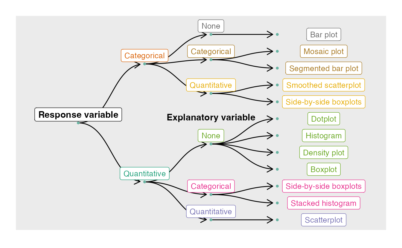
Source: https://mtstateintrostats.github.io/IntroStatTextbook/index.html
Interactive Graphics: R Shiny
Overview of R Shiny
R Shiny provides a way to create interactive visualizations and web applets.
There are two key components of an R Shiny Script:
- The ui (user interface) provides a way for the user to interact with the visualization and for the program to capture input values.
- The server piece takes those outputs and applies them to R code.
Server Code
Under the hood: Server Code
# Define server logic required to draw a histogram
server <- function(input, output) {
output$distPlot <- renderPlot({
# generate bins based on input$bins from ui.R
x <- faithful[, 2]
bins <- seq(min(x), max(x), length.out = input$bins + 1)
# draw the histogram with the specified number of bins
hist(x, breaks = bins, col = 'darkgray', border = 'white')
})
}
Under the hood: Server Code - This is just R Code
input.bins <- 30 # number of bins
x <- faithful[, 2]
bins <- seq(min(x), max(x), length.out = input.bins + 1)
# draw the histogram with the specified number of bins
hist(x, breaks = bins, col = 'darkgray', border = 'white')
Under the hood: Server Code

Under the hood: Server Code - Change # of Bins

UI Code
Under the Hood: UI Code
# Define UI for application that draws a histogram
ui <- fluidPage(
# Application title
titlePanel("Old Faithful Geyser Data"),
# Sidebar with a slider input for number of bins
sidebarLayout(
sidebarPanel(
sliderInput("bins",
"Number of bins:",
min = 1,
max = 50,
value = 30)
),
# Show a plot of the generated distribution
mainPanel(
plotOutput("distPlot")
)
)
)
Shiny Code: Running the Application
# Define server logic required to draw a histogram
server <- function(input, output) {
output$distPlot <- renderPlot({
# generate bins based on input$bins from ui.R
x <- faithful[, 2]
bins <- seq(min(x), max(x), length.out = input$bins + 1)
# draw the histogram with the specified number of bins
hist(x, breaks = bins, col = 'darkgray', border = 'white')
})
}
# Run the application
shinyApp(ui = ui, server = server)
Shiny Output

Demos
- Shiny Web Applet
- Shiny in RMarkdown HTML file
- shinyapps.io
Exercises
Open the default Shiny Web App in R that contains the interactive histogram of Old faithful eruptions. Change the color of the histogram and reload the app.
Open the default Shiny document R Markdown file and change the system file to use a different embedded Shiny application example than “06_tabsets”.
Shiny Apps to Demonstrate Shiny
Bonus Exercise
The babynames library contains a (giant) dataset called babynames, which contains the full baby name data provided by the Social Security Administration (SSA). Type the following to explore the data set and its variables:
library(babynames) # You will most likely have to install this data(babynames) # Load data into environment ?babynames head(babynames)
Using the babynames data set, implement your own version of this app from the SSA.
Graphics in R: Additional Slides
Visualizing Patterns Over Time
- What are we looking for with data over time?
- Trends (increasing/decreasing)
- Are season cycles present?
- Identifying these patterns requires looking beyond single points
- We are also interested in looking at more the data in more detail
- Are there outliers?
- Do any time periods look out of place?
- Are there spikes or dips?
- What causes any of these irregularities?
Capital Bikeshare Data
bike.data <- read_csv('http://www.math.montana.edu/ahoegh/teaching/stat408/datasets/Bike.csv')
Capital Bikeshare Data
bike.data <- bike.data %>% mutate(year = as.factor(year(datetime)), month = as.factor(month(datetime))) monthly.counts <- bike.data %>% group_by(month) %>% summarize(num_bikes = sum(count), .groups = 'drop') %>% arrange(month) monthly.counts
## # A tibble: 12 × 2 ## month num_bikes ## <fct> <dbl> ## 1 1 79884 ## 2 2 99113 ## 3 3 133501 ## 4 4 167402 ## 5 5 200147 ## 6 6 220733 ## 7 7 214617 ## 8 8 213516 ## 9 9 212529 ## 10 10 207434 ## 11 11 176440 ## 12 12 160160
Discrete Points: Bar Charts

Discrete Points: Bar Charts - Code
monthly.counts %>%
ggplot(aes(y = num_bikes, x = month)) +
geom_bar(stat = 'identity') + xlab('Month') +
ylab('Bike Rentals') +
labs(title = 'Bike Rentals per Month in 2011-2012 \n Capital Bikeshare in Washington, DC',
caption = 'Source: www.capitalbikeshare.com')
Discrete Points: Stacked Bar

Discrete Points in Time: Stacked Bar - Code
bike.counts <- aggregate(cbind(bike.data$casual,bike.data$registered),
by=list(bike.data$month), sum)
barplot(t(as.matrix(bike.counts[,-1])),
names.arg =collect(select(monthly.counts, month))[[1]],
xlab='Month', sub ='Source: www.capitalbikeshare.com',
ylab='Bike Rentals',
main='Bike Rentals per Month in 2011 - 2012 \n Capital Bikeshare in Washington, DC',
col=c("darkblue","red"),legend.text = c("Casual", "Registered"),
args.legend = list(x = "topleft"))
Discrete Points in Time: Points

Discrete Points in Time: Points

Discrete Points in Time: Points
plot(rowSums(bike.counts[,-1])~bike.counts[,1],xlab='Month',
sub ='Source: www.capitalbikeshare.com', ylab='Bike Rentals',
main='Bike Rentals per Month \n Capital Bikeshare in Washington, DC',
col=c("darkblue"),pch=16,axes=F,
ylim=c(0,max(rowSums(bike.counts[,-1]))))
axis(2)
axis(1,at=1:12)
box()
Connect the Dots

Connect the Dots
mean_temp <- bike.data %>% group_by(month) %>%
summarize(mean_temp = mean(temp),.groups = 'drop') %>%
mutate(month = as.numeric(month))
ggplot(aes(y=temp, x= month), data = bike.data) +
geom_jitter(alpha = .1) +
geom_line(inherit.aes = F, aes(y = mean_temp, x = month),
data = mean_temp, color = 'red', lwd = 2) +
ylab('Average Temp (C)') + xlab('Month') +
labs(title = 'Average Temperature in Washington, DC',
caption = 'Source: www.capitalbikeshare.com')
Visualizing Proportions
- What to look for in proportions?
- Generally looking for maximum, minimum, and overall distribution.
- Many of the figures we have discussed are useful here as well: for example, stacked bar charts or points to look at changes in proportions over time.
- Another possibility, which we will not cover, are plotting with rectangles known as a tree map.
Visualizing Relationships
- When considering relationships between variables, what are we looking for?
- If something goes up, do other variables have a positive relationship, negative relationship, or no relationship.
- What is the distribution of your data? (both univariate and multivariate)
Relationships: Scatterplots

Visualizing Relationships: Scatterplots - code
bike.data$tempF <- bike.data$temp * 1.8 + 32
plot(bike.data$count~bike.data$tempF,pch=16,
col=rgb(100,0,0,10,max=255),ylab='Hourly Bike Rentals',
xlab='Temp (F)',sub ='Source: www.capitalbikeshare.com',
main='Hourly Bike Rentals by Temperature')
bike.fit <- loess(count~tempF,bike.data)
temp.seq <- seq(min(bike.data$tempF),max(bike.data$tempF))
lines(predict(bike.fit,temp.seq)~temp.seq,lwd=2)
Visualizing Relationships: Multivariate Scatterplots
pairs(bike.data[,c(12,15,8)])

Multivariate Scatterplots

Relationships: Multivariate Scatterplots
par(mfcol=c(2,2),oma = c(1,0,0,0))
bike.data$tempF <- bike.data$temp * 1.8 + 32
plot(bike.data$count~bike.data$tempF,pch=16,col=rgb(100,0,0,10,max=255),
ylab='Hourly Bike Rentals',xlab='Temp (F)',
main='Hourly Bike Rentals by Temperature')
bike.fit <- loess(count~tempF,bike.data)
temp.seq <- seq(min(bike.data$tempF),max(bike.data$tempF))
lines(predict(bike.fit,temp.seq)~temp.seq,lwd=2)
plot(bike.data$count~bike.data$humidity,pch=16,
col=rgb(100,0,100,10,max=255),
ylab='Hourly Bike Rentals',xlab='Humidity (%)',
main='Hourly Bike Rentals by Humidity')
bike.fit <- loess(count~humidity,bike.data)
humidity.seq <- seq(min(bike.data$humidity),max(bike.data$humidity))
lines(predict(bike.fit,humidity.seq)~humidity.seq,lwd=2)
plot(bike.data$count~bike.data$windspeed,pch=16,col=rgb(0,0,100,10,max=255),
ylab='Hourly Bike Rentals',xlab='Windspeed (MPH)',main='Hourly Bike Rentals by Windspeed')
bike.fit <- loess(count~windspeed,bike.data)
windspeed.seq <- seq(min(bike.data$windspeed),max(bike.data$windspeed))
lines(predict(bike.fit,windspeed.seq)~windspeed.seq,lwd=2)
plot(bike.data$count~as.factor(bike.data$weather),col=rgb(0,100,0,255,max=255),
ylab='Hourly Bike Rentals',xlab='Weather Conditions',main='Hourly Bike Rentals by Weather')
mtext('Source: www.capitalbikeshare.com', outer = TRUE, cex = .9, side=1)
par(mfcol=c(1,1),oma = c(0,0,0,0))
Relationships: Histograms

Relationships: Histograms
hist(bike.data$tempF,prob=T, main='Temperature (F)',col='red',xlab='')
Multiple Histograms

Visualizing Relationships: Multiple Histograms - Code
par(mfrow=c(2,1))
bike.data$reltempF <- bike.data$atemp * 1.8 + 32
hist(bike.data$tempF,prob=T,breaks='FD',
main='Temperature (F)',col='red',xlab='',
xlim=c(0,max(c(bike.data$reltempF,bike.data$tempF))))
hist(bike.data$reltempF,prob=T,breaks='FD',
main='Relative Temperature (F)',col='orange',xlab='',
xlim=c(0,max(c(bike.data$reltempF,bike.data$tempF))))